Text Analysis – Lessons and Failures

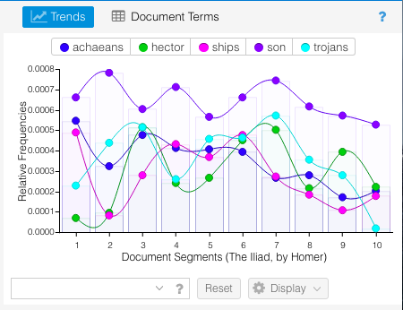
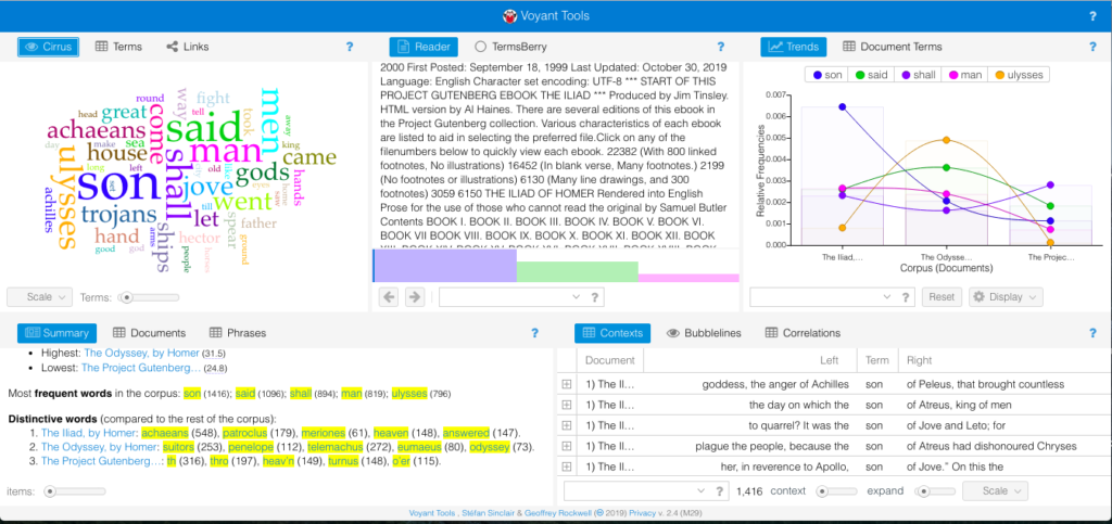
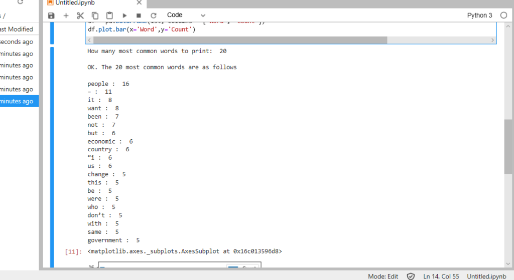
I haven’t done any text analysis work before so I decided to use Voyant since that was marked as the easiest tool to use. The Voyant home page doesn’t have a lot of options to see without text, so I put in the text to The Iliad to see what the output would look like.

Results for the Iliad in Voyant

I chose The Iliad because I have read it multiple times and figured it would be a good baseline to test out what Voyant could do when I had a default skin of a corpus. I used the Voyant guide to go through the different sections at the same time that I had the The Iliad corpus open. I focused particularly on the terms list available in the Cirrus window – which also offers a nice word cloud visual – and the Trends window.
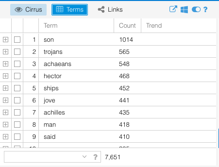
Terms view

Trends view

I was looking through some of the sample projects while trying to decide what to do for this project and saw one that analyzed a group of tweets from Twitter. It reminded of a New York Times article that came out a few weeks ago about NYT reporters that went through all of Donald Trump’s tweets since he became President and thought that would be an interesting experiment for this assignment. As it turns out there was an the accompanying Times Insider article that linked to a website called TrumpTwitterArchive.com (spoiler alert – they already constantly update analyses of his tweets) that also explained how they got their data.

Unfortunately, Voyant couldn’t display the data when important directly from Github – apparently JSON is still experimental – and ended up trying to analyze the source code instead of the text in the tweets.

Default skin results when using JSON files

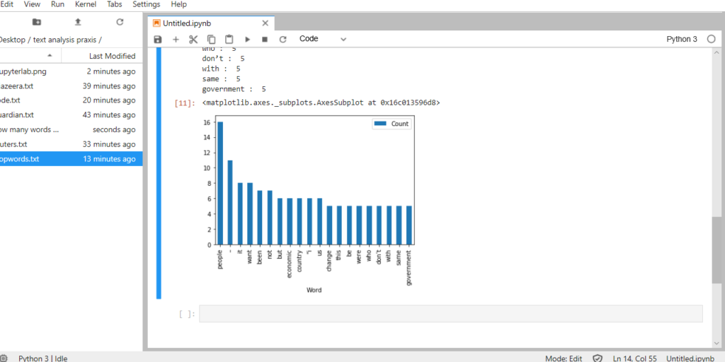
I did a search to see if anyone else had an open data set of Trump’s tweets that were in a format that Voyant could recognize but found nothing. I think this particular idea needed a tool that had more flexibility with its capabilities and user with the necessary skills and knowledge to pull it off. I still wanted to play around with a larger corpus, so I turned back to the Classics theme I had in the beginning and put in the The Iliad, The Odyssey, and The Aeneid. All of them are very well known historical epic poems written by Homer and Virgil. The default skin came out like this:

Default skin comparing The Iliad, The Odyssey, and the Aeneid

I don’t think the Summary told me anything that I didn’t already know. The Iliad and The Odyssey were both written by Homer much earlier than when Virgil wrote the The Aeneid. Given the difference in authors and time period, it makes sense that the first two epics were longer in length and had longer sentences. The Aeneid was shorter, had a higher vocabulary density, and the distinctive terms were much different than the other two (which could also be contributed to the translation). One thing I really enjoyed was the visual representations of the texts – particularly the bar graph of top words in each book.

Trends box with column display

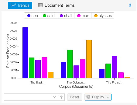
This breakdown visually showed connections about the poems that I wouldn’t have otherwise though of. For example, “son” appeared exponentially more in The Iliad than the other two epics. This is because characters are always introduced according to their family lineage – for example “Achilles, son of Peleus.”

Since The Iliad described the events of the Trojan War, there were a larger number of characters as Heroes from many Greek cities joined the war effort against the Trojans. The introduction and description of the actions of these characters means there were many more “son of…” statements than in the other poems. Similarly, the Odyssey was the story of Odysseus’s journey home from the Trojan War, so naturally that would be the dominant word from that poem. These are connections I wouldn’t have naturally thought of when comparing the two epic poems. Overall, I can see why Voyant is the easiest text analysis tool, but I feel like this could be somewhat limiting to others who may have more coding skills and are able to utilize a wider variety of file types. Comparing these texts in this way though did visualize trends that I haven’t thought of before, and I have gone through these texts multiple times for my minor in undergrad. This exemplified what our readings noted about how distant reading doesn’t replace close reading, but creates a space where new and different questions can be asked.

Project STAND

Here’s the link to Project STAND I mentioned last night in class in case anyone is interested. After looking at it more closely, the project is aimed at creating a central repository for archival collections focused on student activism on college campuses. Although there are more current movements (there’s a few Twitter Archives), there’s also links to collections and finding aids from 1960’s to present.

I’ve seen a few of these types of archival projects where a central repository is chosen to host related collections and materials. The Puerto Rico Syllabus project noted it could be enhanced “by the inclusion of primary texts and historical documents…” so I, personally, feel like the natural next step would be to combine the two project models.

Mapping Clinical and Cultural Bipolarity in Haldol and Hyacinths

Memoir and personal reflections are the texts that interest me most, so I chose to map a memoir I was reading called Haldol and Hyacinths: A Bipolar Life by Melody Moezzi. Melody Moezzi has many identities. She is a manic-depressive, Iranian-American Muslim activist, attorney, writer, and award-winning author. In her memoir she chronicles her experience of clinical and cultural bipolarity, and I wondered how this duality would project on geographical terrain. I wondered about her relationship with each of these identities, and if there was a way that mapping might display patterns in her life that were otherwise not evident in linear text. 

I started the project using ArcGIS StoryMaps, because I liked the idea of making this a scrapbook or personal journal of sorts. I used a map done in watercolor to give it a hand-drawn aesthetic, and to extend the personal. I also liked the idea of presenting different map snippets with sections of her writing, rather than my own interpretation of her writing:

However, this format quickly became problematic, because so much of her experience was of relationships between and juxtapositions: locations in the United States and Iran; locations where she was mentally well, and where she was manic; who she was when she was living American and Iranian culture. Small snippets like that displayed above were too small to show these relationships, and standing alone the bipolar quality of her identity was lost.

I then switched to use the ArcGIS app alone. This gave me some more flexibility with space and relationships, but the first thing that was obvious about mapping a personal narrative that was not my own was that a geographical map created boundaries where they may not naturally exist for the writer. For Moezzi, someone who experiences clinical and cultural bipolarity, boundaries are blurred, and shift regularly. Boundaries and names of boundary lines shift at given points in history, i.e., during the Iranian Revolution, during which time she became a refugee. Mentally, boundaries can disappear altogether in a given day, i.e.,  when she’s at once sleeping in a room in Ohio in college while also being terrorized by a glowing, green spider far away from the bed she’s physically in. 

Figuring out locations to add to the map was also more complex with a personal narrative, and in fact, she opens the book talking about whether or not the specifics of her story should be trusted at all, because of the nature of her mind and her mind on medication. I also knew that names and places were changed for privacy. Some locations were known. For example, she visits family in Tehran. She was born in Chicago, grew up in Ohio, and went to law school at Emory. However, specific streets or locations weren’t named in most cases so where I put markers on the map aren’t precise. Most significantly, a major site of her life and story takes place at Stillbrook,  a mental institution, but the name has been changed. Without a name and location, it would have been left off altogether, and her narrative in visual form would render silent a major part of her identity and activism. Who is she without her clinical bipolarity? It is not for me to rewrite her story, which I would in effect be doing. Therefore, I traced other places in the narrative to create a location in close proximity. For example, she mentioned she was at the Emory infirmary before being institutionalized, so placed a marker on a mental hospital near Emory. It is not correct, and is in fact a lie. But which inaccuracy was less harmful? I decided that it was more important to present her whole identity rather than go with precision.

Deciding on symbols for the map was an area where I pushed the boundaries of a traditional basemap available on ArcGIS, and also found it lacking. For example, I reflected her memories and experiences as an Iranian and Muslim woman with the “General Infrastructure” mosque symbol. Without context, the mosque symbol is definitely misleading! I struggled most with symbols for her mental health. I liked the fuzziness of the “Firefly” symbol, but it gave the impression that anytime she grappled with her mental health she was erratic and fuzzy. That was not the case. In fact, the various ways that her symptoms manifested almost required different symbols from episode to episode or type of symptom, i.e., insomnia, hypermania, etc. As such, I chose regular stickpins, which I wasn’t pleased with. I tried using a color coding of yellow, orange, and red to reflect severity of symptoms, but that was another point where I was making decisions about her life in visual form. Would institutionalization be red, or should moments when she was raging and suicidal prior to institutionalization be depicted as worse? Again, this was another boundaryless area, and adding color coding was something I couldn’t get comfortable with. I ran into the same problem with symbol size, which I attempted to use to signify which moments in her life had the greatest impact. Symbols introduced bias at every turn. I found it harder and harder to add any moments to the map with significance that didn’t distort her story.

As my map took shape — or rather didn’t take shape — it became clear that it was impossible to use this geographical basemap, with its preset location markers (most of which were not important to her story), to reflect the complexity of her humanity. My map would not represent the terrain of her emotional life — anguish, confusion, longing, heartbreak, and unpredictability. It was also impossible to map the silences in her story, i.e., when she was well and thriving, because a) that wasn’t the scope of her book, and b) how would I reflect that? Would all empty space be considered areas where she was well? 

Without the ability to project moments of wellness, joy, and her incredible humor onto the map, I fell into the trap of perpetuating the common story about people with disability or chronic conditions: they are their illness. I was not okay with this, and it felt irresponsible. I felt protective of her. She isn’t a fragile person, and despite several stays in psychiatric hospitals, bombarded with tranquilizers and anti-psychotics, she refused to be shamed into secrecy. Refusing to be ashamed or silenced, Moezzi became an outspoken advocate, determined to fight the stigma surrounding mental illness and reclaim her life along the way. Perhaps if mental illness was not so stigmatized, continuing with the map wouldn’t feel so off limits. After multiple attempts to add her writing to points on the map, I came to the conclusion that not every tool works for every project, and to force a project into a tool does it much harm. We must remember to bring care to our work. 

Here is my map, as it turned out:

https://arcg.is/SrTKW

https://arcg.is/SrTKW

Text Analysis Praxis Assignment –

Objective:
I created .txt files of news reports about the 2019 Chilean uprisings from various sources in order to collect word frequencies for each. Within the .txt files I’ve removed article titles, working only with the body of the report in order to avoid internal repetition and pull word counts most accurately reflecting the content of the news story. This may be unwise however, as it could be suggested that the words appearing in the article headings are worth including in the count. This deserves more consideration, but either choice should not disrupt the experiment too much.

Sources to be used:
The Guardian – mostly direct quotations from demonstrators.
Al Jazeera – regarding a UN commission to investigate the situation in Chile.
Reuters – simple ‘who/what/where/why’ report.

When first running the code, I tested only The Guardian report.  To my dismay, the 10 most common words appeared as:
the : 65
and : 51
to : 35
a : 26
in : 25
of : 25
have : 25
is : 20
i : 19
that : 17

The code worked, but not as planned. With my limited knowledge of programming, I think this indicates that I must adjust my stopwords list.

The next batch is slightly better but still missing the mark. 10 most frequent words are:
are : 17
people : 16
we : 15
for : 14
– : 11
 my : 9
they : 9
has : 8
it : 8
want : 8

Again, I amend my stopwords (allowing ‘people’ to remain because I imagine it significant) and again the results improve but fall short. This time I request the 20 most frequent, to see how far along I am. Individual word frequency has now dwindled to the extent that they do not appear noteworthy:

people : 16
– : 11
it : 8
want : 8
been : 7
not : 7
but : 6
economic : 6
country : 6
“i : 6
us : 6
change : 5
this : 5
be : 5
were : 5
who : 5
don’t : 5
with : 5
same : 5
government : 5

Conclusions:
It strikes me that this frequency measurement has not provided a significant assessment of content. This is likely due to the size of the corpus, yet another concern looms foremost. In the decisions I made regarding my ever-expanding stopword list, I’ve noted an ethical concern – that as the programmer determines what words are significant enough to count (ex: my decision that ‘people’ was not worth adding to the stopwords), they may skew the results of the output dramatically. This is my most important takeaway.

Data vis blogspot

My idea for this data visualization gave rise from an initiative that me and some other parents had in order to establish a dual language program for Greek –American elementary students in NYC public schools. Being a parent of elementary kids and having some of new media technology background I managed to make viral our effort through social media, blogs, website (http:greekdualny.org), digital question forms for parents and kids,petitions,and a word of mouth communication.

After a lot of efforts I managed to dig into more in the educational system of New York, me and the rest team of parents started to  get involved with people that were familiar with those programs. Our main goal was to establish such a project. Being in touch for at least two years with DOE , superintended, principles, politicians, and bilingual New York communities ,we managed to complete our mission. Greek-American Dual Language program will be added to the bilingual education public schools September 2020.

So getting more involved to that type of bilingual education I found quite useful (for me and for other parents who are willing to learn their children natively more than two languages) to visualize some of the interest data sets that I found in New York Open Data.
The data for two types of bilingual education programs that exist in New York City Public schools are dual language programs (DLP) ), in which students “learn how to speak, read, understand, and write in two languages, and also learn about and appreciate other cultures,” according to the NYC Department of Education, and transitional bilingual education (TBE) where students start out learning in their home language with the intent of eventually moving into an English-only classroom. Dual Language program maintain a student’s good comprehension of a non-English language while a TBE program makes the student capable of learning in an English-only environment.

Using all the recent data of school year 2018–19 ,Bilingual Education Programs (Dual Language and Transitional Bilingual Education),  I made an csv file and started cleaning as much as I can. Moreover in order to use longitude and latitude coordinates, I added in the same csv file, school location data that I found from NYC Open data as well.

I firstly started making in Tableau a pie chart to see clearly how many schools in the five boroughs have those types of bilingual education.TBE programs outweighs to DLP but the difference is subtle.

Then I wanted to see which Language predominates in the whole New York City area and how many languages are spoken through those type of bilingual education. Unsurprisingly the Spanish language is the predominant one as the Chinese language follows as a second one:


I tried also to make a map in Tableau showing with color coded dots in every different language. What I wanted to understand here was whether these programs were primary concentrated within neighborhoods with large immigrant populations. In this map the largest concentration of programs is found in the Bronx with Spanish-language being the first one in those programs. Chinese language programs were found mostly in China Town in Flushing in Queens and some areas of Brooklyn showing that those two language programs are located in areas with high concentration of native speakers. But would DL and TBE programs appear in other places with the same way?

Moreover, I found very useful to point out what type of school has those f language bilingual education programs. The above chart indicates clearly that Elementary schools are dominant in the whole boroughs. That could also make sense since the programs has to be familiar from a very early age of the kid (maybe Kindergarten class) as it’s mandatory every child at his age to develop academic and cultural competence and bilingualism from at least 9 year old in order to perform later academic level in two different language.

Another tree map that I found useful was to try to split all the bilingual schools per language (out of the 13 different languages that operate momentarily in the whole city) and then to try to demonstrate information through tool tips regarding the official name on each public school, the address which is located along with the area and the type of bilingual language.

Finally in the Map Info software I created the thematic map as I wanted to show foreign-born population ranges and at the same time with the point data showing the two types of language programs. This contains 36 schools that have Spanish and Chinese as DL and TBE bilingual programs. There is a clear dominance of Spanish-language programs, notably with a presence in both NTAs with a foreign-born population exceeding 50 percent and those with around a third or fewer. However in parts of Queens and central and central Brooklyn which the darker shades of purple, there are large gaps without any programs. In the Jackson Heights, Elmhurst, North Corona areas of northern Queens, there is a notable cluster of both DL and TBE programs unlike most other areas where there is a dominating point color – like in western Brooklyn and western Manhattan where the NTAs with relatively lower immigrant populations have a sizable number of DL programs.

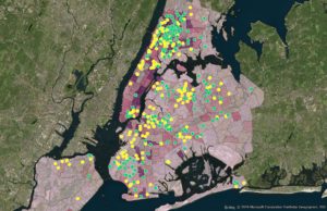
Comparing Bilingual Program Types and Foreign-Born Population by NTA

Leave the gun, take the cannoli. Or rather, leave the Martin workshop, take the Zweibel.

Like Zach, I attended last week’s workshop on game-based pedagogy. I must have misunderstood the description, for the majority of the presentation focused on decades-old theories including Bloom’s Taxonomy from the 1950s (revised in 2001) and Howard Gardner’s multiple intelligence theory from the 1980s. I had expected far more modern thinking and at least some nod to digital games. I left disappointed.

Mid-way through, I shifted gears as a participant, deciding to glean what I could by listening for what I hadn’t heard before. I appreciated Khadeidra Martin’s reminder that there’s a difference between “gamifying” the classroom and using games to help students learn. In the former, teachers simply include game elements, such as competition and point accumulation, in more traditional activities. So, for example, a teacher might “gamify” a class discussion by splitting the students into teams and awarding points for participation or source references. In the latter, teachers use games as the activity or the actual vehicle for learning, which is much more up my pedagogical alley.

I also appreciated her reminder of James Paul Gee’s earlyish work in the field. While the kids I currently teach were born after his famed Good Video Games and Good Learning came out in 2007, his articulation of the many reasons games can be compelling learning tools gave me a quick rubric from which to judge my current use of digital and homemade games in the classroom. For example, I use the brilliant suite of games at iCivics—especially Do I Have a Right?—to have the students learn about the Constitution before we tackle it. The experience is not only great fun for my kids, but it gives every student what Gee calls “performance before competence”—tapping her natural desire to jump right in before really knowing what she is doing. That fun gives the kids exactly the background they need to avoid being daunted by the challenging language of the document itself.

Of course, I might be spoiled. Jeff Allred’s Doing Things with Novels class offered last fall introduced me to Twine and Ivanhoe*—two really exciting, completely open-ended game platforms. Jeff had us experience Ivanhoe as players, and I’ve never been so excited about archival research. I spent countless hours (those fantastically absorbed hours when you forget to eat) digging at the Schomburg Center and in digital troves so I could make good moves.

In fact, I realize now that I was spoiled even before last fall. Until 2009, I worked with a dynamite pedagogical gamer, Jeremiah McCall, who really broke ground both in creating historical simulations and in using video games such as Rome Total War as ways to turn students on to the living reality that primary sources represent.

So, while I wouldn’t recommend this workshop unless you are new to teaching, I would recommend Steve Zweibel’s “Research for Master’s Students” which I took earlier this fall. In addition to sharing some helpful library resources, he reminded me of some research basics and tossed in some real gems such as an iterative process for refining research questions. I think he offers the talk each term.

Here are a few things I needed to hear Zweibel say:

  • When it comes to finding a research topic, don’t be afraid to start with what you’ve done before. The point of grad-level research is to push beyond familiarity into original discovery, so you’ve got a head start researching what you think you know.
  • Pursue debates and uncertainties. That’s fertile soil.
  • Research is iterative. Get your topic, find a question, learn some, refine your topic, find new questions, learn some more. Repeat, repeat, repeat.
  • Make sure your research is meaningful. A helpful exercise he offered is to fill in the following blanks: “I am studying ___________, because I want to find out what/why/how _______________ in order to help my reader understand ____________, which matters because __________________.
  • Take notes proactively. Include a summary of each source and thoughts on how you might use the information you took notes on so that you don’t have reread the whole source to remember how it might be valuable.
  • Finally, remember that citations are a big part of scholarly work. In addition to proving that your argument is evidence-based, citations position your ideas in a scholarly and collegial conversation.

*Yes, yes. That’s Drucker’s name on that linked Ivanhoe article!

Heritage in Peril – Digital Approaches to Preservation

Heritage in Peril – Digital Approaches to Preservation
Institute of Fine Arts, New York University
Wednesday, October 23rd, 2019

(I apologize in advance for the long post, but I was really excited about this talk and the topic)

A few weeks ago I went to a talk held at the Instituite of Fine Arts which was promoted by Professor Gold on the MA in Digital Humanities forum. The talk, hosted by swissnex, the Swiss Consulate for Science and Technology based in Boston based on the research done at the University of Lausanne, discussed the topic of digital preservation of cultural heritage through the use of Virtual Reality. This research focused on the sites in Palmyra, Syria which were recently destroyed by ISIS in 2015 during the Syrian Civil War.

The project, known as The Collart-Palmyra Project began in 2017 “with the aim of digitizing the archives of [swiss archaeologist] Paul Collart, one of the most extensive collections of pictures, notes, and drawings from the Temple of Baalshamîn in Syria” (swissnexinnewyork.org).

A little background of the site: The Temple of Baalshamîn was dedicated to the Canaanite sky deity (possibly related to the Greek/Roman god Zeus/Jupiter). The temple’s earliest phase dates to the late 2nd century BC and has been expanded upon and rebuilt over time. In 1980, UNESCO designated the temple as a World Heritage Site (Temple of Baalshamîn, Wiki).

Temple of Baalshamîn before it was destroyed (Wiki)

During the main keynote presentation by Patrick Michel of the University of Lausanne, he discussed the benefits of having digital archaeological archives. Michel mentions that digital archaeological archives can help keep objects from being stolen, moved or sold in the black market. This is due to the fact that objects can be easily searched, which will minimize or deter the amount of goods that are stolen and sold on the black market. This is an important point for archaeological finds because most of the history about an object comes from the context in which it is found. Once the object is removed from its original location (if not properly recorded) that information is forever lost.

The digital reconstruction was created through the combination of photographs originally taken by Collart. These photos were held in the TIRESIAS database created in 2005-2006 by Michel (MIT Libraries). When discussing the creation of the digital reconstruction of the Palmyra site, Michel explained how they worked with multiple digital modes in order to keep track and record of the different iterations of the Temple through time. This topic came up in the discussion where someone asked if the digital reconstruction would be used to help reconstruct the site. Michel responded that, although it can be used to help with reconstruction, the question arises as to if it should be reconstructed? And if so, which iteration would be used as the basis for the reconstruction? The beauty of the digital reconstruction is that it allows for views of all iterations during the temple’s lifetime. Before the site was destroyed by ISIS, the site had some reconstruction work done, but it was based on the last iteration of the temple as that was the reality of the last time period. Now that all of the site is destroyed, what would the reconstruction be based on?

Red circle highlights the identifying feature in front of the temple. Shown during the presentation.

In addition to showing multiple time periods, Michel discussed how they decided to keep key identifying features that are still at the site in order to be able to match up with the digital reconstruction. An example of this can be seen to the left where the digital reconstruction aligns with a base of a column that is still in the same place now as it was before the temple was destroyed. If they were to use a VR overlay at the physical location, the digital reconstruction of the temple would be in the exact same spot as the original was, with the help of the markers.

Michel also discussed the fact that there is currently a traveling exhibit surrounding this topic in which visitors can use VR (with the help of Ubisoft) to help raise awareness of the challenges of preserving sensitive sites.

He also discussed that, although this project was done by a French institution, this panel was published in Arabic. This allows for people to be able to learn about their own culture, as opposed to the information being closed off and possibly lost to its own people.

Michel ends the discussion with mentioning how all aspects of the project are as important separately as they are together. This goes back to the discussion of the importance of the digital archives. The archive includes pictures of every item that was found at the site. The combination of the pictures of the temple is what allowed for such detailed digital reconstructions, as seen below.

Michel also brings up the negatives of this type of work where, as the web develops, this data can become outdated and be lost. He ends with asking the question, “How can digital heritage last for decades?”

Panel:

The panel held afterwards consisted of the people listed below:

Patrick Michel – University of Lausanne
Isaac Pante – University of Lausanne
Sebastian Heath – NYU Institute for the Study of the Ancient World
Dominik Landwehr – Author and Expert of Digital Culture
Patricia Cohen – The New York Times (moderator)

I will be paraphrasing what was discussed during the panel and what really stood out to me.

  • When asked if they believed in open access data, the panelists had the following things to say:
    • Michel – In regards to this project, the information had to be open access because they were publicly funded.
    • Heath – He was for open access data, expressing that the information belongs to human kind, this is why it should be public.
    • Landwehr – Although he was also for open access, he wants it to be open to those who are able to see the data in the way it is supposed to be seen and for people to have the highest quality of the information available. This can be difficult for those who do not have access to high quality graphics or technology.
  • Landwehr – If the information is not open access, then who has control over it? He brought up a story where a museum in Germany got so upset when some visitors created a digital model of the Nefertiti bust and put the data on the internet for everyone to see. Questions arose surrounding this as to who has access to the data if the museum owns the physical bust. (You can see the NY Times article here)
    • Heath – In response to this, Heath discussed using the Nefertiti data in his classroom, asking his students to change the point-of-view of the statue (i.e. as a kid from below, looking through glass, etc.) He brought up the point that sometimes we are too sensitive when it comes to ancient artifacts, in the sense that we feel like we cannot manipulate the original. However, using the digital data with his class in different ways led to new ideas.
  • Someone asked if they felt like the digital reconstruction could ever be compared to a physical reconstruction (worried about the reliance on digital technology as opposed to the “real deal”):
    • Michel – Sometimes the replica gives you the same reaction (whether it is a physical or digital replica compared to the actual object)
    • Landwehr – Every new media brings up the question of if the new media is as good as the original. Take the Ancient Greeks for example, Greek philosophers argued against the discovery of writing.
    • Heath – What constitutes a real image? Even photography is a rendering of life, There is no “real” image.
  • Someone brought up the idea of ethics in digital projects or computer science:
    • Heath – No digital act is neutral.

I had a question that I did not get a chance to ask during the panel. I was wondering, when/who decides on what sites can be digitized? I was thinking of 1) our conversations in class surrounding the fact that western areas tend to be digitized on Google Maps more so than third-world areas due to popularity and 2) the dangers of digitizing sites that need to be protected. If a site’s location is released, and is not a protected site, it can be destroyed or looted.

Thank you for reading! Please see a few more images below from the talk:

Multimodal & Game-Based Pedagogy

This past Monday, Nov. 4, I attended an ITP workshop entitled, “Multimodal & Game-based Pedagogy,” led by Kahdeidra Martin, who proved to be a kind and enthusiastic steward into the world of student-centered praxis. The crux of the workshop involved integrating cutting-edge learning theories with hands-on pedagogical methods, in turn marrying theory and practice so as to facilitate a more intuitive, learner-centric approach to instructional design.

Kahdeidra began her workshop by requesting all participants to find a partner for a word-association game, in which each team chose two words from a bank of indigenous terms and proceeded to reel off as many associated words as possible within a limited time-span. We then went on to reflect on how this process inspired us to think collaboratively about the game-based logic of word association — which itself amounted to a fascinating conversation about the value of team-based, generative learning prompts. From there, Kahdeidra spoke about how teachers today might benefit from the practice of situating learning concepts and outcomes in the context of constructive game-based activities.

What’s more, Kahdeidra focused on the evidence-based value of student-centered pedagogy, citing an array of research from cognitive science on how communal and active learning experiences often serve to motivate student in ways that transmissionist pedagogy does not. Some of the key elements of student-centered pedagogy, Kahdeidra clarified, involve inquiry-based activities, strategic grouping and reciprocal learning, distributed knowledge production, as well as a personalized and interactive sense of student agency. At the center of these elements, we concluded, lies an impetus to tailor learning outcomes to actual student needs rather than pre-established lesson plans.

We further discussed how, in order to afford attention to learner needs, teachers ought to allow their students multiple points of access beyond that of a solitary text-based modality. Underpinning this approach to instructional design are two educational frameworks, both of which date to recent developments in cognitive neuroscience: namely, multiple intelligence theory (MI) and universal design for learning (UDL). Either framework confirms that using multiple entry points to attain knowledge demonstrates an equitable yet effective way to engage a diverse range of learners. Correspondingly, Kahdeidra cited scholars in demonstrating the manner in which “learning activities that include repetition and multiple opportunities to reinforce learning support brain plasticity, the continuous ability to adapt to new experiences” (Singer 1995; Squire & Kendel 2009). Using MI and UDL as a theoretical springboard for the rest of her workshop, Kahdeidra then provided each team with the handout below, otherwise known as the Martin Multimodal Lesson Matrix (TAPTOK):

After explaining these categories and how they constellate to enable an interactive learning experience for students, Kahdeidra asked each team to annotate one of her lesson plans with TAPTOK in mind. A fascinating question that subsequently emerged concerned the extent to which we as instructors can fit these categories into one cohesive learning activity without overwhelming students. In reply, Kahdeidra thoughtfully noted that the multimodal categories one employs will depend on the the nature of the subject matter and its associated learning outcomes. Put differently, it is invaluable for instructors to recognize, given the subject matter and time-constraints of their lesson, which multimodal categories might best facilitate dynamic and engaged learning habits, and which may rather serve as a distraction to students.

We discussed related topics, like Gee’s 16 principles for good game-based learning and Vygotsky’s zone of proximal development, but I’d like to wrap up at this point by expressing excitement over the contents of this workshop. Student-centered pedagogy, particularly in the context of game-based and multimodal learning, seems to me an important and valuable step forward for postsecondary education. The process of teaching is not about the teacher; it is about the student, the learner. I am confident this credo is one worthy of our attention — and so deserves our vested support and implementation if it is to eventually become a standard instructional practice of future educators. That said, multimodal and game-based learning only seem to be the tip of the iceberg, if only because student-centered pedagogy is so much more than a set of methods or practices: it is a mindset, a disposition, an enduring sign of respect for the learners we aim to enrich and support in these trying times.

A Peace Through Understanding Viz

For the data visualization project, I wanted to put together a data set to create a visualization of the 1964-65 World’s Fair.

The audience of this visualization are individuals interested in the World’s Fair.

For this visualization, I started with locations depicted on the Official Souvenir map of the Fair. I created an excel for these pavilions and then added information from the Official Guide book of the Fair that I found online. This was the longest part of the project. I typed exhibit information for each of the pavilions and created a field for the page from where I found it. Initially, I was adding the page number of the Official Guide for each exhibit I added but decided to just create a column for references. Also, in addition to exhibit information, I added hours of operation, price of admission, restaurant, and snack bar info. Something I did in Excel but ended up being pointless was boldening the names of exhibits and restaurants for all the applicable pavilions. However, these formatting changes were not picked up in Tableau. Another major addition to my Excel was longitude and latitude dimensions for all the pavilions. I knew that I wanted to add much of the data I was creating to a point on the map where the pavilion was and the only way I knew to do that was by adding longitude and latitude. I have never done it before in Tableau but tried it out first with a few sample locations, to make sure I wasn’t wasting my time, and was happy to see it worked! I was able to do this by looking at my personal souvenir map I recently bought online and clicking that same exact spot on Google Maps. The points on my Tableau map could be positioned a little better, but it works for what I was trying to do. At this time I had been pulling my data into Tableau and playing around with it, but realized I wanted to add a couple more rows to my Excel for two small visuals in Tableau. These were focused on remaining pavilions from the Fair still at Flushing Meadows and traces of the pavilion that still remain in some way. With my data side of the project finished and there not being a pretty way to showcase it in Tableau, I created a repository for my data in GitHub that I have made accessible.

My first visual I made was my map. In my Excel I created a column for the area of where the pavilion was, so once my plots were where they were suppose to be I added the area dimension to the color field. This breaks the pavilions up by “Federal and State”, “Flushing Bay”, “Industrial”, “International”, “Lake Amusement” and “Transportation”. In the tooltip I added the exhibits, notes and reference page from the Official Guide. I wanted to have more, but I found it to be way too much. Information I took out I made sure to utilize in other visuals in the visualization. Lastly, I never edited the map layer, so I took some time to play with the background I wanted to use and how visible to make it. I decided to use a satellite image and washed it out 50%. The original background is not very informative, and I knew I wanted the viewer to be able to zoom in and see features of the map, but I wanted points to be the most visible. I then created visuals for price of admission and price of exhibit. The visitor to the Fair paid an entrance fee, which was able to get you into most of the pavilions and their exhibits, but not all of them. I wanted to showcase this in these two visuals. I had to format and clean my data a few times when playing with these due to inaccuracies in how it was being read. Also, most of the Fair’s pavilions were open from 10am-10pm, but not all of them. I wanted to showcase the hours of operation for pavilions and their exhibits and restaurants that ran before and after the ordinary hours of operation. The final data dashboard of my story includes restaurants, snack bars and traces from the Fair. Not all the pavilions had restaurants, so I wanted to show which ones had restaurants, how expensive they were and give a brief description. Even less of the pavilions had snack bars, so I added a visual to inform the viewer of the snacks available at a given pavilion. The Still Standing visual informs of the pavilions that are still in the park and Traces Remaining inform of the traces that can be found around the park of where that pavilion lived momentarily. These two visuals are the colors of the Fair and the Traces Remaining visual reminds me of the Column of Jerash with its sections slightly separated, so I decided to space the Still Standing visual the same way. The last visual I made was the cover page. I added images I took a few days ago, a title with a color scheme used on the Official Guide book, short description and simple text of three important bits of information.

This was a big first step for me. The data helped me visualize some things I never considered before. I hope to do more with this Fair and to create a data set and visualize it is very powerful and exciting. This visualization is looking at all the, what I consider, “nice things” about the Fair. However, there were a lot of negatives that surrounded the Fair, as well. I want to try to visualize the whitewashing that took place under the guidance of the Fair’s President, and NYC’s Master Builder, Robert Moses, as well as inform of the protests that took place and other issues people had.