Author Archives: Ashley Rojas

Final Proposal – Reflection

I realized from the beginning that what I was thinking of doing would be a lot of work. I ended up splitting up my project timeline into three parts: semester, post-semester, and future. For the semester, I decided that building the website and database alone can and may take up the semester. Thus, we would only end up putting projects of institutions/companies that have already posted their VR or AR reconstructions on their own sites. This would mean less data that we would have to hold or maintain, and we can still have the database as a one-stop spot for reconstructions. The post-semester plans would be to add in VR/AR, video and images of other institutions/companies that do not have their own sites but would like to share their own projects. The future goals, depending on how the database evolves through public interaction, would allow for the database to hold images and/or datasets of projects that would like to make this information public with the hopes that it can help others and, if there are people who know how to create VR/AR reconstructions from the photos, they can do so and help contribute to the project and the database. This feature can also allow for communication between the public in the form of adding to the intellectual conversation around projects hosted on the database.

While writing my proposal and searching for what is already out there that would be like the database that I want to create – as opposed to a regular database – I ended up coming across a site called Scan the World (STW)created by MyMiniFactory.com. This site houses 3D reconstructions of artifacts from different museums all over the world. STW is the closes thing that I have found (so far) to what I want to do. I ended up reaching out to the founder of the project, Jon Beck, to find out (briefly) his process for STW and how he has been able to expand the project to what it is now. He responded, indicating a brief history the STW went from his computer to MyMiniFactory and how his dedication as an artist has helped to expand STW and persuade others to help contribute to the cause by uploading their own 3D scans of artifacts.

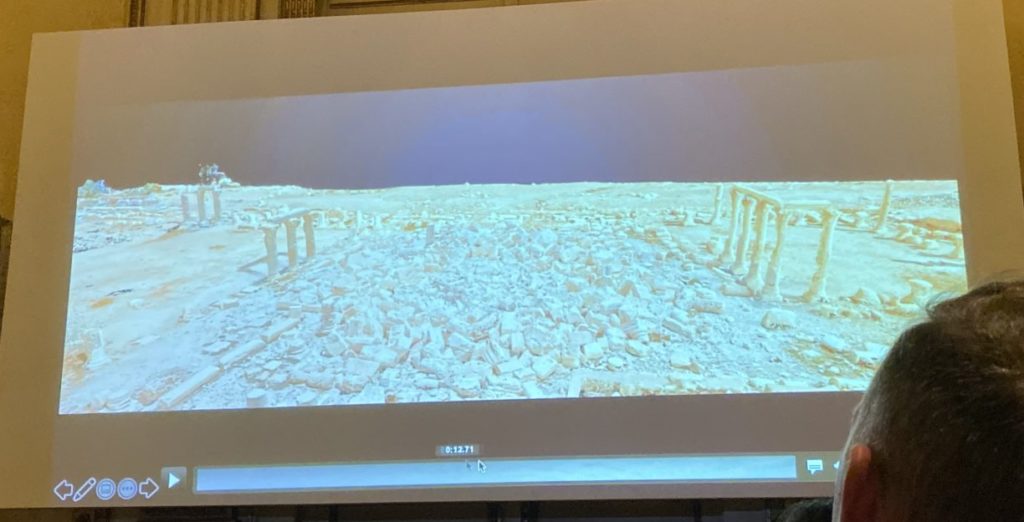
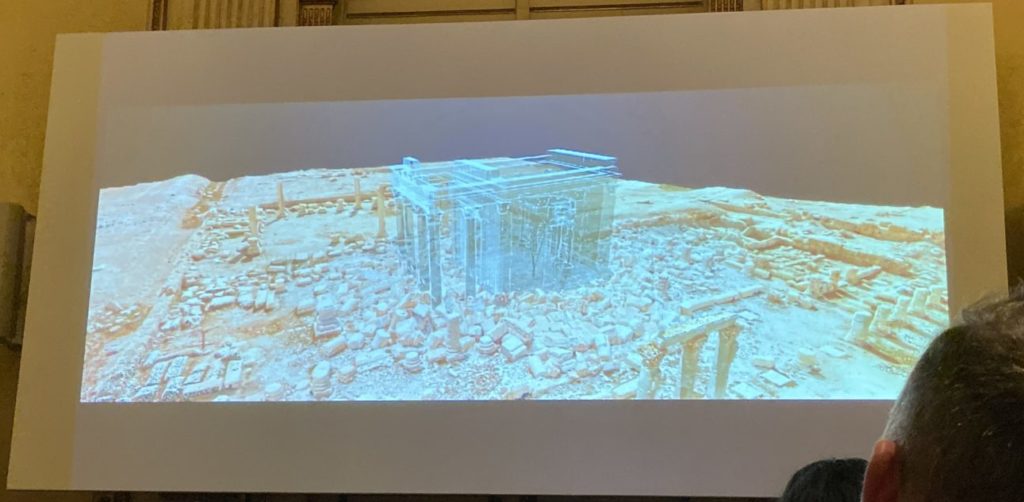
Another company that has pushed this idea for me, that I did not include in my proposal, is LearningSites Inc. I mentioned them before in the beginning of the semester but, my bias towards them is that one of their projects was the first thing that got me interested in DH (although I didn’t know it would be considered DH at the time). Since I saw LearningSites Inc. present years ago, I had constantly looked back at their website over the years to see if they had made any updates to their program. For years nothing changed, and I was not able to see anything on their site except for pictures. Then, suddenly earlier this semester, they updated their website, added new videos, and I was actually able to look at some of their VR reconstructions on their home page. I will not begin to guess why it took them this long, as I am sure there were many factors. If, however, one of those factors included funding and/or public interest, then I hope that the creation of my database would be a way to help companies like LearningSites Inc. so that they may continue their projects for another student like me.


Although the idea for this database briefly started as a selfish thought of wanting all that I am interested in to be in one central location, it quickly grew to wanting to inspire others. Inspire others by showing them what is out there and how much there is. Inspire them to explore topics that may seem foreign to them now but may end up changing their paths. Inspire them to understand more of the world around them though the world’s history. Should this project be created one day, I hope that it helps, not only those who are within the field of Archaeology/DH, but helps those trying to discover what they are truly interested in.

Workshop: DH Playshop

DH Playshop
Wednesday, November 13, 2019

A few weeks ago I went to the DH Playshop hosted by Micki Kaufman, the program student advisor. When we went, we were able to discuss topics that we thought would be interesting. This was our chance to be able to ask someone who has been in the DH world about their experiences.

We started with talking about Micki’s experience over the years that led to her dissertation topic. She showed us a bit more of what she showed us in class and was able to show us her VR project. She also showed us the website that she made.

She described the website as containing data visualizations that did not directly connect to her dissertation but were created based on the data she collected. Although she did not have any use for these visualizations, she said that it felt like a waste to discard them, and what may not have meaning to her could be meaningful to someone else. This is what really stuck with me and is part of my reasoning for my proposal.

There were other topics that we discussed but it was just great to be able to have an open discussion about the DH field and I cannot wait for the next DH Playshop!

Text Analysis Praxis: A look into the world of Harry Potter

The idea for the Text Analysis praxis assignment came after trying to do the Data Visualization praxis assignment a few weeks ago. I had originally planned to do the Data Viz praxis, but I was having trouble finding a dataset or even something that I was interested in using. Unlike the Mapping praxis, I did not have an immediate topic in mind that would allow me to understand my dataset enough to create visualizations in the way I wanted to. Thus, I decided to forego the Data Viz praxis and focus on this week’s Text Analysis praxis.

The first thing I had to think about was what large text I was interested in enough to analyze. Not only would I have to be interested in the topic, it had to be easy enough to get access to the text itself. The first thing that came to mind that I was interested in that would also be easy to access the text was the Harry Potter book series. With the popularity of the text, I knew that I would be able to find the text somewhere online and I know the text enough to be able to spot some interesting patterns.

The tool that I used was Voyant because, from sampling a few of the different tools, I realized that it was, not only easy to use, but had many ways of looking at the text. This was also, unfortunately, determined by the fact that I knew I would not have much time over the past few weeks due to work to mess with other techniques using coding (such as Python), though I was very tempted.

I found each book in the form of a text file and saved them separately. The first thing that I did when I downloaded the text files was to make sure that some items were consistent across all the files. This includes the following:

  • Making sure all chapter numbers were spelled out instead of numerical (i.e. Chapter 4 would be changed to “Chapter Four”)
  • Making sure that there was no other text except that of the book.
    • For example, the top of some of the text files included the title and author of the book and the publisher information.

Once that was done, I uploaded each text file into Voyant and just tried out as many of the tools as I could. One of my favorites has always been the Word Clouds, or Cirrus as Voyant calls it. I created a 155 word cloud for each book separately as well as the corpus as a whole.

Harry Potter and the Deathly Hallows 155 Word Cloud

One item that stood out to me right away, which is obvious from knowing the content of the books but was still interesting to see, was how Voldemort’s name was used the most in the last book, “Harry Potter and the Deathly Hallows”, compared to all of the other books. This makes sense when understanding that the last book is when Voldemort is the most present and where people are more willing to say or think his name compared to the other books.

After this I wanted to see the trend of Voldemort’s name across the corpus.

Trend of Voldemort across the series.

Then, after seeing this, I wanted to see the comparison between his name and the other main characters in the series. I didn’t realize that I could add labels at first but, when comparing to the other characters, it was necessary in order to tell them apart.

Trend of main characters across the series.

There were a few things that I noticed when I was first experimenting with the word cloud. One thing was that the largest or second largest word originally was “said”. This was obvious as the book is set in third person. However, I did not want to include “said” in the findings, so I was able to use Voyant’s edit feature to exclude “said” from the corpus. There were many other words that I wish I could have excluded as well but it would have taken a lot of time to go through it all. One other thing that I noticed in a few of the word clouds (such as the corpus one) is that there must have been typos in a few of the text files because “harry’s” and “harry’ s” showed up twice (there is a space between the apostrophe and the “s” which is making them count as two separate words. Of course, it was bound to happen when relying on text files put together by others.

Corpus 155 Word Cloud

I took some time to mess around with other tools and I have included screen shots below. One of which looked at the location that a word(s) show up in each text file. When looking at the use of “Harry”, what jumped out at me was the gaps that can be seen at the beginning of the Sorcerer’s Stone, Goblet of Fire, Half Blood Prince and Deathly Hallows.

Location of “Harry” throughout the series.

Of course, with knowing the story, the start of each of these books begins with a chapter or two that do not focus solely on Harry.


Below are other items that I pulled from Voyant in case you are interested. There is so much that can be done with this information, I am sure.

Statistics across the series.
Mandala comparing the frequency of use across the series and amongst some of the most used words.
Harry Potter and the Sorcerer’s Stone 155 Word Cloud
Harry Potter and the Chamber of Secrets 155 Word Cloud
Harry Potter and the Prisoner of Azkaban 155 Word Cloud
Harry Potter and the Goblet of Fire 155 Word Cloud
Harry Potter and the Order of the Phoenix 155 Word Cloud
Harry Potter and the Half Blood Prince 155 Word Cloud

Heritage in Peril – Digital Approaches to Preservation

Heritage in Peril – Digital Approaches to Preservation
Institute of Fine Arts, New York University
Wednesday, October 23rd, 2019

(I apologize in advance for the long post, but I was really excited about this talk and the topic)

A few weeks ago I went to a talk held at the Instituite of Fine Arts which was promoted by Professor Gold on the MA in Digital Humanities forum. The talk, hosted by swissnex, the Swiss Consulate for Science and Technology based in Boston based on the research done at the University of Lausanne, discussed the topic of digital preservation of cultural heritage through the use of Virtual Reality. This research focused on the sites in Palmyra, Syria which were recently destroyed by ISIS in 2015 during the Syrian Civil War.

The project, known as The Collart-Palmyra Project began in 2017 “with the aim of digitizing the archives of [swiss archaeologist] Paul Collart, one of the most extensive collections of pictures, notes, and drawings from the Temple of Baalshamîn in Syria” (swissnexinnewyork.org).

A little background of the site: The Temple of Baalshamîn was dedicated to the Canaanite sky deity (possibly related to the Greek/Roman god Zeus/Jupiter). The temple’s earliest phase dates to the late 2nd century BC and has been expanded upon and rebuilt over time. In 1980, UNESCO designated the temple as a World Heritage Site (Temple of Baalshamîn, Wiki).

Temple of Baalshamîn before it was destroyed (Wiki)

During the main keynote presentation by Patrick Michel of the University of Lausanne, he discussed the benefits of having digital archaeological archives. Michel mentions that digital archaeological archives can help keep objects from being stolen, moved or sold in the black market. This is due to the fact that objects can be easily searched, which will minimize or deter the amount of goods that are stolen and sold on the black market. This is an important point for archaeological finds because most of the history about an object comes from the context in which it is found. Once the object is removed from its original location (if not properly recorded) that information is forever lost.

The digital reconstruction was created through the combination of photographs originally taken by Collart. These photos were held in the TIRESIAS database created in 2005-2006 by Michel (MIT Libraries). When discussing the creation of the digital reconstruction of the Palmyra site, Michel explained how they worked with multiple digital modes in order to keep track and record of the different iterations of the Temple through time. This topic came up in the discussion where someone asked if the digital reconstruction would be used to help reconstruct the site. Michel responded that, although it can be used to help with reconstruction, the question arises as to if it should be reconstructed? And if so, which iteration would be used as the basis for the reconstruction? The beauty of the digital reconstruction is that it allows for views of all iterations during the temple’s lifetime. Before the site was destroyed by ISIS, the site had some reconstruction work done, but it was based on the last iteration of the temple as that was the reality of the last time period. Now that all of the site is destroyed, what would the reconstruction be based on?

Red circle highlights the identifying feature in front of the temple. Shown during the presentation.

In addition to showing multiple time periods, Michel discussed how they decided to keep key identifying features that are still at the site in order to be able to match up with the digital reconstruction. An example of this can be seen to the left where the digital reconstruction aligns with a base of a column that is still in the same place now as it was before the temple was destroyed. If they were to use a VR overlay at the physical location, the digital reconstruction of the temple would be in the exact same spot as the original was, with the help of the markers.

Michel also discussed the fact that there is currently a traveling exhibit surrounding this topic in which visitors can use VR (with the help of Ubisoft) to help raise awareness of the challenges of preserving sensitive sites.

He also discussed that, although this project was done by a French institution, this panel was published in Arabic. This allows for people to be able to learn about their own culture, as opposed to the information being closed off and possibly lost to its own people.

Michel ends the discussion with mentioning how all aspects of the project are as important separately as they are together. This goes back to the discussion of the importance of the digital archives. The archive includes pictures of every item that was found at the site. The combination of the pictures of the temple is what allowed for such detailed digital reconstructions, as seen below.

Michel also brings up the negatives of this type of work where, as the web develops, this data can become outdated and be lost. He ends with asking the question, “How can digital heritage last for decades?”

Panel:

The panel held afterwards consisted of the people listed below:

Patrick Michel – University of Lausanne
Isaac Pante – University of Lausanne
Sebastian Heath – NYU Institute for the Study of the Ancient World
Dominik Landwehr – Author and Expert of Digital Culture
Patricia Cohen – The New York Times (moderator)

I will be paraphrasing what was discussed during the panel and what really stood out to me.

  • When asked if they believed in open access data, the panelists had the following things to say:
    • Michel – In regards to this project, the information had to be open access because they were publicly funded.
    • Heath – He was for open access data, expressing that the information belongs to human kind, this is why it should be public.
    • Landwehr – Although he was also for open access, he wants it to be open to those who are able to see the data in the way it is supposed to be seen and for people to have the highest quality of the information available. This can be difficult for those who do not have access to high quality graphics or technology.
  • Landwehr – If the information is not open access, then who has control over it? He brought up a story where a museum in Germany got so upset when some visitors created a digital model of the Nefertiti bust and put the data on the internet for everyone to see. Questions arose surrounding this as to who has access to the data if the museum owns the physical bust. (You can see the NY Times article here)
    • Heath – In response to this, Heath discussed using the Nefertiti data in his classroom, asking his students to change the point-of-view of the statue (i.e. as a kid from below, looking through glass, etc.) He brought up the point that sometimes we are too sensitive when it comes to ancient artifacts, in the sense that we feel like we cannot manipulate the original. However, using the digital data with his class in different ways led to new ideas.
  • Someone asked if they felt like the digital reconstruction could ever be compared to a physical reconstruction (worried about the reliance on digital technology as opposed to the “real deal”):
    • Michel – Sometimes the replica gives you the same reaction (whether it is a physical or digital replica compared to the actual object)
    • Landwehr – Every new media brings up the question of if the new media is as good as the original. Take the Ancient Greeks for example, Greek philosophers argued against the discovery of writing.
    • Heath – What constitutes a real image? Even photography is a rendering of life, There is no “real” image.
  • Someone brought up the idea of ethics in digital projects or computer science:
    • Heath – No digital act is neutral.

I had a question that I did not get a chance to ask during the panel. I was wondering, when/who decides on what sites can be digitized? I was thinking of 1) our conversations in class surrounding the fact that western areas tend to be digitized on Google Maps more so than third-world areas due to popularity and 2) the dangers of digitizing sites that need to be protected. If a site’s location is released, and is not a protected site, it can be destroyed or looted.

Thank you for reading! Please see a few more images below from the talk:

Intro to Photoshop Workshop

GC ITP Skills Labs: Intro to Photoshop Workshop
Monday, October 21st, 2019

Last week I went to the “Intro to Photoshop Workshop” as part of the GC ITP Skills Labs taught by Jessica Brodsky.

As some background, I have never really worked with Photoshop, but I have worked with other photo editing programs such as Lightroom. I had always been interested in using Photoshop to be able to edit photos or create items.

The first thing that we learned about was the differences between vector and raster graphics, which I had heard of before but was never quite sure about. Vector graphics (such as logos) that are made using mathematical formulas. As the image is enlarged the image retains its figure. Raster graphics (such as digital photos) are made up of pixels (units of color information). As the image is enlarged it becomes pixelated.

Next, we went over color theory which showed how colors mixed with print as opposed to digital media. Then we discussed hues (colors) as opposed to saturation (how vivid a color appears. Finally, we went over brightness (how much objects appear to be reflecting light) and contrast (differences in brightness and colors that make image distinguishable). Brodsky also mentioned how working with the different layers in can preserve the original image so that any errors or mistakes can easily be mended or reverted.

We then went over the composition “Rule of Thirds” which discussed how key parts of an image is usually made “dynamic and interesting” when they align with intersecting points of a 3 by 3 grid. I had known of the “Rule of Thirds” previously but did not quite understand how it worked which I am glad we were able to go over.

After learning these items and adjusting an image on our own, we went over the different ways of saving our adjusted image. First saving the file as a photoshop document (ending in .psd), which saves each layer so that everything can still be kept separate, or saving the file as a digital image file (ending in .jpg), which compresses all of the layers together into one image. We also learned how to save a digital image file so that it is of print-quality resolution, which means having at least 300 dpi (dots per inch) / ppi (pixels per inch).

Although I had not used Photoshop previously, I had enough prior knowledge to quickly grasp the topics covered. For myself, a beginner class may not have been the best fit for me. However, for those who are looking into learning the basics and do not know where to start, I think this workshop was perfect. It was enough information to get a handle on things without being overwhelming.

10/2: Mapping Praxis Assignment

When starting my project, I knew that I wanted to explore topics within archaeology. One dream of mine had always been mapping out places that had sites, monuments, or artifacts in common. For myself, this was going to be a way to try and find connections between cultures or other data points that stand out. This map that I had imagined spanned across time as well as geographic locations, a kind of combination of a timeline and global map. Since my undergraduate career, however, I quickly realized that it was difficult to accumulate that sort of data without knowing the content intimately or being shown the resources. This is since much of the data is either not published yet or down so many scholarly rabbit holes that it is difficult to track down. I also encountered this when trying to design my mapping project.

When searching for open data sets, I was also looking for something that was intriguing to me. After some time, I ended up coming across a list of archeoastronomy sites that were listed by country on a Wikipedia page. Archaeoastronomy is the study of archaeological sites that may have been used to study astronomy. The idea then popped into my head, not only to see the sites marked on a map, but to see a sort of time lapse (either during the time period of the site, if possible, or present day) of the stars from the point of view of whatever site you click on. Although I felt like the sky-gazing part of the project would not be feasible with the programs we were starting out with, I was still curious to see where these sites were located and if there were any sort of pattern. I only resided on using Wikipedia due to the topic and the fact that much of the data I was finding was not something I could map.


When starting, I decided to create an excel sheet with the columns listed as follows: Country, Site, Location, and Coordinates (later separated to Latitude and Longitude). In order to get the coordinates for each site, I searched for the sites on Google Maps. Of course, this means that I was relying on the accuracy of Google Maps, but since there was no other way I could get the coordinates without physically being on site, it worked.

This process was interesting for many reasons. First, I noticed that there were some sites where their exact locations were not published, such as the Puyang tomb located in China. When trying to search for this site, on both Google Maps and through the search engine, there was no mention that I could find that clearly stated the location; not even an area that it was near besides Puyang. Thus, this coordinate was left blank. Some other locations that were like this one, I just used the coordinates for the nearest town. What stood out to me about this was that I did not have this trouble with any of the Western countries. Many of the Western locations were either more well-known or better mapped than those in Non-Western locations. This, however, also lead me to think that maybe the exact location for some of these sites were kept secret for a reason. When I was on a dig (one that had not been published yet) we were always told to not tell any of the locals that we were digging at an archaeological site. This was to keep away any potential looters.

In addition to this, there were topics on the Wikipedia page such as Nuraghi in Italy. A Nuraghe is a type of archaeological structure that is located all over Italy. Since this is something that appears many times in many different locations, it was not something that I could use as data points. The others that showed up like this were the temples on Malta and the Funnel-Beaker culture that appeared in Finland and ended up spreading throughout the Mediterranean.

On the opposite end to this, the listing for India was so extensive that many names were left off the list and the reader was referred to a book that discussed archaeoastronomy at sites located in India.

Being able to go through the names one by one on Google maps, although time consuming, was also fun for me because I was able to see sites that I have never seen or heard of. It was so interesting and made me even want to visit some of these sites one day.

When going to use a program, I checked out a few from the article we read but I eventually settled on QGIS. I am not sure what I was expecting (having never used a mapping program before) but this was not it. There was nothing to show me how to get started or where to go for even the simplest of things. Thus, I went to Google.

The first thing I knew I wanted to do was have a world map background to be able to map my coordinates. Eventually I came across a YouTube video that showed me how to set up three different types of map backgrounds, a regular map, a terrain map, and a satellite map. I decided that I would just use the regular and terrain maps.


Once I got the map background, I needed to figure out how to set up the coordinates. I ended up finding a tutorial page on how to import spreadsheets. This is when I had to separate my Coordinates column to Latitude and Longitude so that the information could import properly. Once imported, the items only showed as dots to mark the coordinate spots. After some searching and exploring the program some more, I was able to figure out how to add site labels to the dots. Once the labels were up, I noticed that there were some letters with accents and from other alphabets that did not transfer over well from my spreadsheet. I took some time to see if I could edit the labels within the program itself or, if I were to edit the labels within my CSV file, if I could overwrite the information I previously imported for more up-to-date information. I was not able to figure it out or find it online, so I just edited my CSV file and imported a new layer, deleting the previous one.

The next step that I tried doing was to see if the labels could only show if you were to either hover over the dot or clicked on it. I saw a few pages that were talking about how to set up the map for the web where you could use HTML and have the labels activated on hover. The problem with those pages, however, was that there were plugins that had to be installed in order to do this. The different plugins that I was told to search for never ended up showing up on QGIS for me. I am not sure if this was due to the fact that the plugins I was showed were out of date or if they were renamed. Whatever the case might be, I was not able to figure out how to do the pop-up labels.

If I had more time and a place I could go to look up different things that could be done in QGIS (a documentation file that is updated?) I think I would enjoy using QGIS. I am not sure, though, if QGIS would be able to support my original idea of being able to show a time lapse of the sky (though if it could be in the form of a video maybe that could work?). I have attached a PDF of the map I made down below.

9/25: Digital Representation

The reading this week that really stood out to me was “Difficult Heritage and the Complexities of Indigenous Data” by Jennifer Guiliano and Carolyn Heitman. I feel like the topic of what should be digitized will forever be a conundrum that DH faces. In this article, Guiliano and Heitman mention, “Open access allows for objects to be divorced from their conditions of production and contexts of interpretation for all forms of reuse”. This is similar to one of the items discussed by Professor Josephs’ article we read a few weeks ago; namely, the circulation of works that have been separated from their original context. 

While this concern is always prevalent when thinking of digitizing items, this is not solely present in digital works. Print and visual media are currently under scrutiny due to the “fake news” environment currently. The way that I see it, the more items that are made public (digitally or otherwise), the less room for misinterpretation there is surrounding that topic. This was brought to my mind when reading about how Edward S. Curtis manipulated print photos of Native American culture to portray something that was not, ironically, the whole picture. This false representation is what leads to misrepresentation of cultures that we are trying to pull out of the “whiteness” of history. 

At the American Museum of Natural History (AMNH) there is a diorama in the African Peoples hall that reminds me of this case. The diorama is depicting a ritual dance complete with figures dressed in the ritual garments for that specific tribe. One of the figures, however, you can clearly see wearing jeans and sneakers. There were many times, while giving tours at the museum, that I was asked why they had jeans and sneakers. To the visitors, the way the hall was set up, it separated the culture from present day and made it seem as if these were peoples from years ago, before the invention of jeans and sneakers. Granted, the hall opened in 1968 and, although it was still created with biases, it is not something that can be easily changed or updated. On the other hand digital forms of representation can grow and adapt to the changing times. 

Of course, it is equally important to remain culturally sensitive to the items being digitized. Just as museums had to display their Native American artifacts in ways that maintained their religious or cultural affiliations, the same respect should be shown to digital material.

Today these images continue to circulate in digital form. On the Library of Congress website, there is no notation that these images are of a religious ritual that is now prohibited from viewing by the non-Hopi public (and thus should be pulled from public view for reasons of cultural sensitivity).

Jennifer Guiliano and Carolyn Heitman, “Difficult Heritage and the Complexities of Indigenous Data,” Journal of Cultural Analytics. August 13, 2019. doi: 10.22148/16.044

One thing that crossed my mind, though I am not sure how possible it would be, was to only allow web pages with these religious items shown when looked at the web page as a whole; meaning, it remains in context. Screen capture could be prevented in the same ways that movies and streaming services block those programs from being able to record or take pictures. Though this would not eliminate photos of the page to be taken from a separate device (i.e. a phone taking a photo of the computer screen) it can lessen the distribution of items out of their original context. 


On a separate note, the article “Data is beautiful: 10 of the best data visualization examples from history to today” from Tableau was so interesting to look at. It provides further proof that data visualization is so important. How data is represented can bring forth deeper understandings of information than just looking at charts and graphs. Now, of course charts and graphs have their own time and place, but sometimes it takes another point-of-view to discern something new.  

9/4/2019: What can be considered DH?

Digital Humanities can be defined as many different things depending on the point-of-view that one is taking. This can be the case for many fields as well. As shown in the different introductions for the Debates in Digital Humanities books, there is a clear shift in the view of the field from conception, to understanding, to application. With how our world is now, when applying the use of DH, it is allowing for a new understanding of what is occurring in our world on a more global scale.

While looking at the “Torn Apart / Separados site, the culmination of data from different sources, represented in different ways, opens the world of immigration in a way that cannot be explained through other mediums. It is easy to read or see about what is happening to families in certain areas through new outlets and social media and to believe that there is one agency (ICE) responsible for the separation of families, but it is another thing to see other factors that are involved with helping this agency to be able to do what they do. How many companies do you shop at that help support ICE? There are times when the events you hear about on the news, though relevant, seem to be disconnected from your own world that there is no affect that the story has on you directly. This site, however, breaks down those walls and shows how far the connections spread. In addition to the connections between ICE and other companies/individuals, the website brings to light the amount of people that have been deported by ICE as opposed to the ones that make it to social media.

As I had mentioned in a previous comment, this site reminded me of another site that I was exposed to in the Technology, Learning and Development course through the Psychology and Education department at The Graduate Center, CUNY. The site recreates the interview process for asylum seekers, where the user (you) are the interviewer.

The Immigration and Naturalisation Service (IND) decides which asylum seekers may stay in the country. Civil servants conduct an in-depth interview with the alleged refugee. This detailed interview is of great importance. Which of these applicants would you give asylum to? Observe, listen, and decide.

Het Nader Gehoor

The user is shown videos of asylum seekers (actor portrayals of true stories) answering questions that the user “asks” using tags created from the testimony. After some time, the user is asked if the asylum seeker is eligible based on their story and the requirements for granting asylum. No matter the story, if the asylum seeker is not “qualified” based on the law, they will be denied. Seeing the stories represented in this way brings the system to life for those of us who are not aware of the process.


In connection to our discussion today, DH can take many forms. One of them that was discussed and questioned today was videos. I had mentioned a project called LearningSites, Inc. I came across this project 4 years ago at a lecture at The National Arts Club in NYC. It was a trip organized by my Intro to Archaeology professor that ended up leading me to the DH program. During the lecture, the speaker was showcasing this project that allowed the user to “walk” through a virtual landscape of an archaeological site as it would have looked when it was in use. Without being at the site (or being alive thousands of years ago) you could get a first-person view and sense of what the site would have looked like.

Everything was based on archaeological data, right down to the oil used in the lamps. This was the point that stuck with me after all these years. The oil had to be coded in a specific way to represent the fact that different oils emit specific light (and thus could interfere with the way the paintings on the walls looked), and based on the types of trade that the site had or the local oils they may have had access to.

Within a few weeks after this lecture, the site that was being showcased (Nimrud), was destroyed by ISIS. Not only was the program valuable in terms of education, but it then became a time capsule for data that was no longer tangible.

For the past 4 years I had been hoping that the project would release the program that they used during the lecture but I did not see any updates to the project until this past weekend. Though they cannot provide the actual program on the website for the Nimrud site (as far as I’ve seen), they posted a video on YouTube (which I will link below) that shows a “walk”through of what the project is like for the site of Nimrud.

DH projects like this not only preserves data that can no longer be looked at, it also puts it into a new perspective different from those that are presented through scholarship or through a museum. This includes, though is most certainly not limited to, the fact that most ancient sculptures and friezes were painted in color. Now that the color has all faded, we are left with half of the picture. Programs like this can fill in the gaps.

King’s Private Suite, Northwest Palace, Nimrud
LearningSites.com