When I was started searching for my final project I was almost convinced that I wanted to create something for my archives data I have gathered back in 2015, when Europe has started to host millions of Syrian Refugees because of the Syrian civil war trying to seek for an asylum in European countries and at the same time face adversity, hardships and real-life tragedy. Being an active member in a nonprofit organization in Lesvos island, Greece, the biggest hosting place for all those people, I managed to collect precious data like useful evidences. Images, diaries by activists, media news, publishers and writers, which I would love to demonstrate them online.
My plan is to create an innovative project using digital humanities practices and methods with ultimate goal to build a very useful tool accessed by anyone who is interested. I know that Internet is full of online videos, interview, and hot titles about European refugee crisis. But I think the most direct way to understand deeper the material of the experience of forced and undocumented migration today, is only if you can see yourself prototypes, original evidences, and undocumented interviews from children pregnant and elderly being in the detection centers and camps. Then you can see a clearer explanation about what happened there.
My immediate question was can such a multi-dimensional project be completed within semester? Of course not. So how can I break up the project? Trying to come up with a project that fits into a student’s semester timeline forced me to rethink a shorter scope for the project. Instead of document all this materiality form scratch, I would focus on the most distinguished testimonials and then try to display them into a map, by showing some of the hot journeys of those people starting their long-lasting route from their origin country until reaching the first hosting country in Europe along with their experience actual life at the camps in Greece.
So viewing the problem of the asylum seekers in Europe more though a humanitarian point of view I will endeavor to create a narrative story backwards, beginning from the places the crisis actually sprang out. I believe that for different reasons up until this point, the sources of information have been disorientating in the sense that they failed to explain. I hope that this project at the end of the semester will combine an archival preservation of those files by introducing a new type of social activism and hopefully, will make the public opinion more enlightened, tolerant and compassionate.
A few weeks ago I went to DH Wax workshop hosted by Alex Gil at Columbia University. Our task was to develop our own projects based on Wax technology.
Wax is a minimal computing project. Through that project we were able to produce our personal digital exhibition and archives focused on longevity, low cost and flexibility. Its technology is simple enough to learn, as you don’t need to have any advanced programming skills. Through Wax project we will able to produce in the future beautifully rendered, high-quality image collections, scholarly exhibits and digital libraries.
The template that was given at the beginning had a collection from The Museum of Islamic Art, Qatar and The Qatar National Library. We had to browse the collection and at the same time to replace it with a collection that we would like for our own project.
The workshop was a three part series.The first week started by learning general things minimal definitions and perspectives so as to start experiencing fundamental principles of minimal computing.
Minimal design is to modify the structure of the project in order to focus more on the content production. Our goal in MC is to reduce the use of what you see is what you get interfaces and try to increase awareness of programming and markup processes. Maintain a minimal computing project is to try decrease the labor of updating, moderating and stewarding a project over time. Our priority is to avoid the usage of natural technologies like hardware and other peripherals or use implementation of advance technologies computer vision and other tracking mechanisms. In terms of minimal surveillance, it is needed to increase privacy and security so we can reduce hacks and harassment. Moreover one of our tasks is to reduce the use of specialized language and try to increase participation and engagement with shared techno cultural problems.
During the first week we tried to install the theme through Jekyll. All the technological stuff was used it through Command Line and the terminal of our laptop. To be honest I had the experience to learn some basics from last semester in Patrick Smyth’s class and this really helped me to catch up with the progress of installation.
So what we have initially done was to create a new Jekyll website with a default gem-based theme scaffold. Using a mac I started using Xcode command line tool for my OSX. Using the terminal’s command line I switched to the directory/folder ready to download and start using Ed theme .With all the materials that were uploaded in Git hub, I was able to execute the commands and run Jekyll server locally in my computer: After we run the following commands :
$ git clone https://github.com/minicomp/ed.git
$ cd ed
$ gem install bundler
$ bundle install
$ jekyll serve
we were almost there! We had installed Jekyll (which is a Ruby gem package).Now the only thing left was to install ED theme. We managed to install a localhost server in my computer by using the url http://127.0.0.1:4000/ed This way I was able to view my project.The Jekyll theme designed for textual editors it was based on minimal computing principles, and focused on legibility, durability, ease and flexibility.
The second week we focused more to the project we have decided to develop. We actually should resize images and prepare a csv file for our dataset that we had to work on. Working with csv file we normalized and validated our metadata records based on certain fields with special characters and values. After we wrote our fields and cleaned our data we exported them in a certain format (csv , .json, .yml) so that, would make our progress easier later. Most of the students used pictures and data that were only for practice purposes, as we haven’t really decided about our main project we wanted to create in the future. I started preparing some of the images to test during the class and also some dummy content. My final goal would be to create my personal portfolio and categorize my work and assignments that I have done so far in Graduate Center. In summary what we have done in class was to create a file of metadata records for our collection (csv file), to organize our collection images and put them both into the Jekyll site folder. After that ,we run a few command lines tasks in order to prepare the data for use by the Jekyll site and convert them with special components as static pages.Basically a basic diagram that shows the steps we have done was the following:
A very important advice that Alex suggested, was to try to clone our demo website and try to swap in our image collection data and exhibition content. That way we would keep our main site unused so we can use it from scratch in case our code didn’t work during the whole process of development.
The third week was more to the practice of what we have learnt so far. Alex gave us some of the new layouts (page like exhibit.html or page. Html etc.) of the theme and we tried to add them in the front page of our website. Moreover, he gave us a folder full of new html pages that had to do with quick, reusable blocks (like shortcodes in WordPress) and he insisted how we should use them, in case we need to implement some of them in our project .
Finally he guided us on how we could host our website in a server as soon as we complete the project. He also provided us with other Wax interesting projects that had very successful results .
Personally I found this three part workshop a very well training course, although the student should study a lot prior to class in order to catch up Tutor’s directions. I think this was a great opportunity for those ones that are interested in building static pages through wax. Especially useful also for those who have collections of cultural artifacts and they would like to present them online or even offline, once they learn in the workshop how to build even a local server on their own computer. It was also a great opportunity for students to be introduced in computing fundamentals. Even if someone doesn’t have advanced skills in CMS platforms or HTML and CSS, it is a great chance for everyone start building static websites, learning about data curation, basic principles about Github and web architecture. It could also benefit users who want to expose their work in building digital exhibits, collections at libraries and archives. I highly encourage everyone to attend to this workshop as soon as the class hours will be announced next year.
My idea for this data visualization gave rise from an initiative that me and some other parents had in order to establish a dual language program for Greek –American elementary students in NYC public schools. Being a parent of elementary kids and having some of new media technology background I managed to make viral our effort through social media, blogs, website (http:greekdualny.org), digital question forms for parents and kids,petitions,and a word of mouth communication.
After a lot of efforts I managed to dig into more in the educational system of New York, me and the rest team of parents started to get involved with people that were familiar with those programs. Our main goal was to establish such a project. Being in touch for at least two years with DOE , superintended, principles, politicians, and bilingual New York communities ,we managed to complete our mission. Greek-American Dual Language program will be added to the bilingual education public schools September 2020.
So getting more involved to that type of bilingual education I found quite useful (for me and for other parents who are willing to learn their children natively more than two languages) to visualize some of the interest data sets that I found in New York Open Data.
The data for two types of bilingual education programs that exist in New York City Public schools are dual language programs (DLP) ), in which students “learn how to speak, read, understand, and write in two languages, and also learn about and appreciate other cultures,” according to the NYC Department of Education, and transitional bilingual education (TBE) where students start out learning in their home language with the intent of eventually moving into an English-only classroom. Dual Language program maintain a student’s good comprehension of a non-English language while a TBE program makes the student capable of learning in an English-only environment.
Using all the recent data of school year 2018–19 ,Bilingual Education Programs (Dual Language and Transitional Bilingual Education), I made an csv file and started cleaning as much as I can. Moreover in order to use longitude and latitude coordinates, I added in the same csv file, school location data that I found from NYC Open data as well.
I firstly started making in Tableau a pie chart to see clearly how many schools in the five boroughs have those types of bilingual education.TBE programs outweighs to DLP but the difference is subtle.
Then I wanted to see which Language predominates in the whole New York City area and how many languages are spoken through those type of bilingual education. Unsurprisingly the Spanish language is the predominant one as the Chinese language follows as a second one:
I tried also to make a map in Tableau showing with color coded dots in every different language. What I wanted to understand here was whether these programs were primary concentrated within neighborhoods with large immigrant populations. In this map the largest concentration of programs is found in the Bronx with Spanish-language being the first one in those programs. Chinese language programs were found mostly in China Town in Flushing in Queens and some areas of Brooklyn showing that those two language programs are located in areas with high concentration of native speakers. But would DL and TBE programs appear in other places with the same way?
Moreover, I found very useful to point out what type of school has those f language bilingual education programs. The above chart indicates clearly that Elementary schools are dominant in the whole boroughs. That could also make sense since the programs has to be familiar from a very early age of the kid (maybe Kindergarten class) as it’s mandatory every child at his age to develop academic and cultural competence and bilingualism from at least 9 year old in order to perform later academic level in two different language.
Another tree map that I found useful was to try to split all the bilingual schools per language (out of the 13 different languages that operate momentarily in the whole city) and then to try to demonstrate information through tool tips regarding the official name on each public school, the address which is located along with the area and the type of bilingual language.
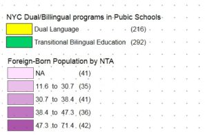
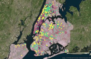
Finally in the Map Info software I created the thematic map as I wanted to show foreign-born population ranges and at the same time with the point data showing the two types of language programs. This contains 36 schools that have Spanish and Chinese as DL and TBE bilingual programs. There is a clear dominance of Spanish-language programs, notably with a presence in both NTAs with a foreign-born population exceeding 50 percent and those with around a third or fewer. However in parts of Queens and central and central Brooklyn which the darker shades of purple, there are large gaps without any programs. In the Jackson Heights, Elmhurst, North Corona areas of northern Queens, there is a notable cluster of both DL and TBE programs unlike most other areas where there is a dominating point color – like in western Brooklyn and western Manhattan where the NTAs with relatively lower immigrant populations have a sizable number of DL programs.
Comparing Bilingual Program Types and Foreign-Born Population by NTA
The map blog post refers to a project that was created by a four member team in Digital Humanities Methods and Practices last semester. It reached a satisfying level but the mapping section kept being built by me until recently.
After I completed my course in Digital Humanities Methods and Practices last Spring, I had the chance to work for a project that still has great potential to expand and inform anyone who is interested in immigration ,media history, or in European ancestry and of course every scholar of urban immigration and median history.
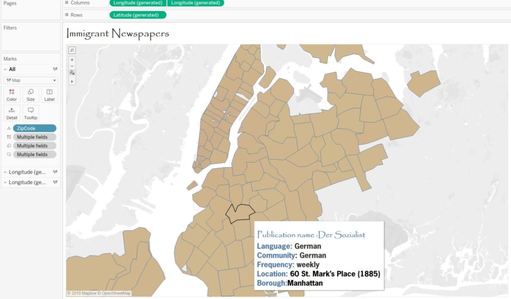
Immigrant Newspapers was a project that had multiple tasks as everybody had to get enrolled in a different demand in order to contribute to the completion of it’s initial scope. Our goal was to publish and distribute a digital collection of historical NYC immigrant newspapers by collecting them from hundreds of communities and various ethnic publications and displaying them in a public forum. The time span of those collections was between 1860-1890, mostly because of the increasing diversity of immigrants from southern and eastern Europe who arrived then, but also due to the limited time we had to complete it during our semester.
Because of big responsibilities that everybody had to take over for that project(coding, data aggregating and cleaning, digitizing hard copies data sources, designing, UX researching, logo designing, social media account and many others) we didn’t that the opportunity to finalize our initial goals. Though we managed to take it to a good level. One of my responsibilities was of course to geocode a map so that the user can navigate and be able to easily find the geographic coordinates of those newspapers in the city of New York.
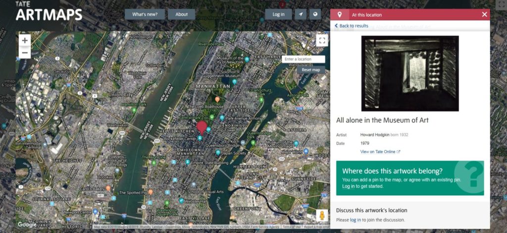
I started building an interactive map through Artmap software. I was inspired by the Tate Gallery in London since there was a similar way to geocode locations. Additionally the design was very appealing as the layout seemed to fit perfectly with the concept of our project.
As I was trying to intergrade my JavaScript
code into the WordPress platform, I faced some compatibility problems. I also noticed
the background of the map was from certain longitude and latitude coordinates
and it couldn’t fit to our demands, as the team and our instructor preferred to
implement a historic atlas of the city. Additionally, trying to change marker
pins with other icons depending on the origin country, I found additional
technical difficulties. So I decided not to use Artmap tool in the end.
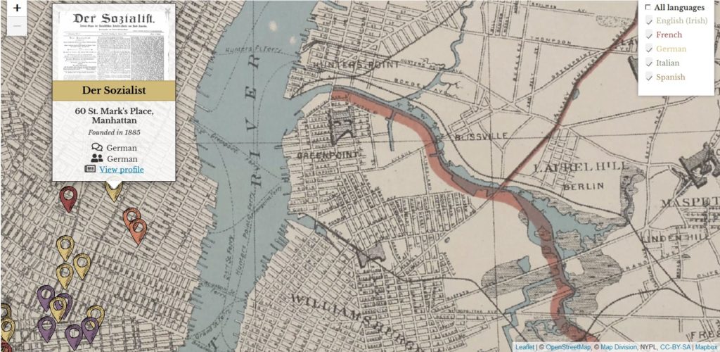
The next step was to find another tool that is more suitable for our project so I decided to use an open-source JavaScript library for mobile-friendly interactive maps called “Leaflet”. Mapbox was the software tool that I used to upload the code that was made through leaflet plugin to proceed with the implementation of the historical map up to the level it has been reached.
The map that was used to present our data was a georeferenced illustration from a New York City Atlas in 1893. The grid covers almost the entire city, and it is good enough to georeference every newspaper what we had in our database. The user can interact with the publications within the context of the New York City region and when he clicks on the pin marker he is able to see valuable information for it’s publication separately.
However, using a historical illustration scanned form New York City Atlas, I realized that it had additional difficulties. Unfortunately the user could see the edges of the page. That could restrict everyone from seeing beyond the boundaries of the page. Additionally using this kind of historical map,I couldn’t set a very high “zoomed out” level and resulted with the same conflict. One of the limited capabilities that I had with this option was that the publications points that were located outside those boundaries should be noted on a tool tip that it would be off the map and that was not looking so professional for such a project. Moreover that was not included among the main user experience principles and as a UX designer should have offered a better solution.
As the mapping project had reached a high level and it could give more efficiency, interaction and value to whom might be interested, I was persuaded that it could also improved ,so I started modify again the mapping code and in order to include more components and useful tools as to add more newspaper ethnicities for example.
What I did this week was to find a higher resolution historical map and to implement it as a background. Along the way I realized that the problem remained the same. My new pin markers I added to the map that were near the edge of the historical map (e.g. a Greek Publication pin near Nassau county , Long Island ) revealed that even that map wasn’t good enough to georeference it, as the user was able to see the edges of the page. So my goal was to try to find another way to create it using filters that could give the historical sense of the map.
Having completed the Datavis Methods class during the summer, I was trying to see if that problem could be resolved using my Tableau skills. I tried to create the map in the Tableau platform .The results were satisfying, the annotations and the pin markers were fantastic but I still couldn’t find a way to incorporate a historical map on it. This is still in process.
The interesting thing is that I managed to change the pin markers I found from shutterstock.com image library. Using different color codes that signifies every different language, I clustered them in a way so the user can recognize the publication newspapers that he is interested in and at the same time can eliminate whatever language the user dislikes to display on the map using the checking filter method.
By clicking on every pin marker the user can find a very detailed tooltip with a sample of the newspaper, any information that we aggregated (location, language etc.) and also a link that goes to the main profile of each publication.
What I have done within the last two weeks was to enrich the map with more newspapers from other languages(Greek, Russian Chezh, Yiddish, Turkish) based on the database that we have already completed .Because of the of time limitation, although we have gathered our data of newspaper titles from Chronicling America, NYPL Microfilm library and NYHS, a project that lasted many weeks, we were unable to prepare all those collections, upload and mapping them at the same time.
My future goal is also to try to geocode all the newspaper collections and also to try to expand their time span as the one that we have done so far was narrowed down to newspapers founded between 1860-1890.
Additionally tools like a search bar could also help the user navigate better. As the collection gets bigger and bigger, information gets gathered and the papers are scattered over the map area, the user could use an advanced search engine tool to seek, locate, define and filter information (text and images) in the searchable index of the platform.
If I should write about the importance to develop such a project I would highlight that this project is a perspective of new immigrant history of New York through the lens of news media. As New York city is a real home for hundreds of communities and ethnic publications, this map could potentially discover great findings in their respective language. Moreover this mapping project could be a reminder of how immigrants have been an integral part of US history and especially in New York City history whether they arrived in 1830 or 2015.
“The human
being is the answer, no matter the question”. With the risk of sounding too
Western I wish to begin my remarks quoting the surreal writer, poet and
anti-fascist Andre Breton (who, among other interesting things about his life,
opposed colonialism and traveled to Haiti for that matter). I am not indicating
nationality because I wish to put the accent on his words and not his
background. The reason why I chose to begin with these words is because I want
to lay emphasis on the generic aspect of
humanities.
After
reading Kim Gallon’s chapter on
black digital humanities, the following thoughts were generated in my mind:
Accentuating the element of
‘blackness’ in several of our social constructions and norms in life, instead
of underlining the common denominator behind them which is none other than our
human condition (the triptych reason/spirit/appetite) impedes a constructive
dialogue between technology and the service of human needs. I believe that
black studies have done very well to identify and criticize the fact that
digital services offered to black populations have been racialized, however,
black studies must avoid the peril of self-entrapment.
To the extent that ‘racialization’
is a fact and therefore it needs to be addressed, I can only think of
participation and inclusion to be two strong remedies. After all, humanities
revolve around humans. The more we reach out to them the better we understand
them and create a more spherical opinion. Participation should not only involve
the academia, as Gallon, more or less suggests. It can take up the form of
community engagement. When a digital project is born, an analyst uses not only
computational material, data and quantitative elements but asks for input in
terms of user experience. The analyst’s ultimate goal is to achieve usability,
satisfaction and sustainability. These objectives require thorough examination
of social traits, through interviews and immersion in local cultures.
The future challenge in digital services will
be the degree of customization. One size DOES NOT fit all. That is a given in
today’s digital humanities bibliography. With reference to black digital
humanities, the problem begins when “Type A” group of people attempt to create
a system for the “Type B” group. Discrepancies are bound to occur. However,
when we think how fast technology revolutionized the democratization in the use
of means of communication, pluralism in digital products design should be a
relatively widely accessible process, overcoming these discrepancies.
Talking about becoming the very producer
of the projects you will one day use yourself, I would like to mention a
successful example by the Greek immigration authorities: The introduced the “Home
New Home” program which aimed at training young refugees in digital filming.
The purpose was to enable them to become the creators of their own digital
projects. Instead of being the object of observation, the beneficiaries of the
program became the subject. That is a crucial dimension in digital humanities
because it diminishes the anxiety of being left out, or being dictated what to
do, or how to respond.
Kim Gallon is the founder and director of the BPRC (The Black Press
Research Collective). The Black Press
Research Collective (BPRC) is an interdisciplinary group of scholars
committed to generating digital scholarship about the historical and
contemporary role of black newspapers in Africa and the African Diasporas.For
those ones they want to have a look here is the link: http://blackpressresearchcollective.org/about/
Although it was hard to deep
understand some meanings of the text of D.Fox
Harrell story I ended up with some
personal questions that pointing out my thoughts :
How can you evaluate immaterial labor in the context of DH? Is it the
product of scholarship assessed by experts or the product of a cognitive
process assessed by its users? Can the users who are by no means experts serve
as the reviewers of an application? Is science so pure that anything which is
not theorized in writing can be disregarded as non-scientific? It seems to me
that this is a matter of “what comes first? The chicken or the egg”? “Theory or
action?”.
An interesting view on this comes from Bruno Latour who in 1993 wrote that western science has been subject to a process of purification; a process that dissembles the fact that modern science is characterized by a hybridization of artifacts. In this sense, it is interesting to ask why there is the need in contemporary academia to be able to compartmentalize knowledge in such a way that alienates its different parts from each other?
Especially since evaluation is
also something that should be tested for its scientific merits. If evaluation
that is also a product of intellectual labor stands unchallenged then it comes
down to configurations of power within academia which elevate evaluation as a
solid body of knowledge and reduce the evaluated labor in spare parts of human
intellect that need to be checked not in relation but in separation with the
process that created them. So it all comes down to who, why and how decides
what knowledge and its different manifestations is.
Roopika
Risen in her text “What passes for Human” is trying to express the way in which DH
should
approach different cases of technology such as the creation of robots with AI.
As long as the Digital Humanities centers produce and expand that kind of
technology, they do reproduce the same cultural and aesthetic models with those
of the western society.
Regarding to the question who is well-educated or uneducated, handsome or ugly
we will keep representing of a variety of races, nationalities and other human
attributes. Taken such analysis we realize that we can’t talk in any case about
technology that imitates the human being, as it is clear that this human being
is not exclusively the white Eurocentric model.
Language and Textuality, as said, are the core dimension of DH and they played an important role in the valuing of universalism. The huge textual producers of Europe, like Homer, Shakespeare or Cervantes are valued for their universality and their articulation of a “human condition”. Artificial Intelligence is supposed to mimic human cognition but instead of replicating the model of white Eurocentric male cognition, it should always consider another “human” areas such as humor, in order the natural language processing software to produce normative forms of the human. Humanoid text manages only to reinforce cultures and aesthetics of dominant culture paradigms .DH practitioners, therefore, should resist such types of universal human subjects in their scholarship as many times digital humanities projects that take up computational approaches, mostly at the level of textuality, often fail to address the cultural dynamics.
As per which data can be found in supporting research and scholarship in Digital Humanities, DH practitioners should broaden include and regenerate in their data as much Information as possible from culture, race, ethnicity, nation, gender and language resulting positively everybody globally based on the same principles that DH was created to serve. Advanced technologies, under the umbrella of data, could give the opportunity to the researchers of Digital Humanities to join the mainstream of the digital age with new challenges: accessing and reusing large volumes of diverse data and most importantly to bring the knowledge of the complex intricacies of human society to light. Challenges and opportunities co-exist, but it is certain that Data, having the ability to achieve big insights from trusted, contextualized, relevant, cognitive, and consumable data at any scale, will continue to have extraordinary value in digital humanities. In the digital era, it is common for people to only think of data in terms of digitally available formats. The connection between digital data and data analytics is correct, but we need to fully understand that the terms “data” and “digital data” are not equivalent.
By defining Digital Humanities I found a well-targeted way by borrowing a phrase form “A DH That Matters”. It’s an excerpt that highlights the fact that the website Torn Apart/Separados shows “how digital humanists, scholars and practitioners in an expanding set of allied fields can contribute in meaningful ways to improve different situations and clarify their commitments to public scholarship addressing not simply to public but also to specific communities and the needs that they identify as most pressing”.
While Torn Apart/Separados
visualizes in Vol 1 the transfer of funds within United States regarding the
actions of ICE and also the “zero tolerance policy”, in Vol2 tries to provide
with an answer in issues that came up during the investigation of additional
evidences.
Such efforts, that have to do with social –political and also economic issues contribute significantly towards to the main scope of Digital Humanities. As the intro of “A DH That Matters “ relates, DH, through visualization and mapping of its projects achieves to impress the audience and also to make them attractive and acceptable as much as possible by the public. This is the only way to spread the word through the dissemination and criticism so that public requires quick responses and respectful answers by the political authorities.The good thing is that, this is being transformed in a powerful leverage of public which includes not only scholars and humanists but also the average citizens.
In such cases of humanitarian crisis, in our modern era the role of Digital Humanities could help effectively towards the direction of what the science of humanities advocates. The use of data through digital humanities approves practically that all the humans who are engaged with different social or educational background and also the new digital technology (coding, mapping, social media etc) could give a significant added value to humanities. That said, both of them could raise awareness to scientific issues in a clear way and mobilize the humans in a different and more interactive way, if we compare it with traditional media especially in cases such as that one that Torn Apart/Separados deals with.
A similar way in which digital humanities could achieve unlimited effectiveness is the example of the humanitarian crisis that took place in 2015 in Greece and Italy due to the war in Syria That resulted a huge number of refugees immigrants and other asylum seekers who, under inhuman conditions have crossed the Mediterranean sea border using smuggler-provided (rubber inflatable) boats tried to find a shelter in northern EU countries. As a result we faced governments in panic without the experience to tolerate such issues, detention center along the borders with thousands of people and a European Union in front of a big dilemma of how to handle such a large number of people approaching each borders and the same time European countries trying to preserve basic values that were constructed upon Second World War based on solidarity and social state.
Non-governmental Organizations and volunteers from around the world were mobilized through traditional and social media to help on the spots. But Digital Humanities tools could guide through the use of data to the management of aid and transfer the people in a more effective way as well as to reactivate academics, scholars, students and European citizens towards a true solution to integrate smoothly and constructively those people in the European society. Years later it seems that the problem never existed as everybody stopped talking about it once the traditional media haven’t included it into their hot- topics agenda. Asylum seekers keep coming in European borders without a certain plan on behalf of the host European countries. In this case Digital Humanities projects could exert a powerful influence for a wide-European solution. As the data mapping project, Torn Apart/Separados, quickly captured the imagination of all humans and gained national media attention, similar DH tools could also gain potential insights providing an amazing example of how technology can be used to depict vividly a real story.
Need help with the Commons?
Email us at [email protected] so we can respond to your questions and requests. Please email from your CUNY email address if possible. Or visit our help site for more information:


 Comparing Bilingual Program Types and Foreign-Born Population by NTA