Author Archives: Christofer Gass

A Peace Through Understanding Viz

For the data visualization project, I wanted to put together a data set to create a visualization of the 1964-65 World’s Fair.

The audience of this visualization are individuals interested in the World’s Fair.

For this visualization, I started with locations depicted on the Official Souvenir map of the Fair. I created an excel for these pavilions and then added information from the Official Guide book of the Fair that I found online. This was the longest part of the project. I typed exhibit information for each of the pavilions and created a field for the page from where I found it. Initially, I was adding the page number of the Official Guide for each exhibit I added but decided to just create a column for references. Also, in addition to exhibit information, I added hours of operation, price of admission, restaurant, and snack bar info. Something I did in Excel but ended up being pointless was boldening the names of exhibits and restaurants for all the applicable pavilions. However, these formatting changes were not picked up in Tableau. Another major addition to my Excel was longitude and latitude dimensions for all the pavilions. I knew that I wanted to add much of the data I was creating to a point on the map where the pavilion was and the only way I knew to do that was by adding longitude and latitude. I have never done it before in Tableau but tried it out first with a few sample locations, to make sure I wasn’t wasting my time, and was happy to see it worked! I was able to do this by looking at my personal souvenir map I recently bought online and clicking that same exact spot on Google Maps. The points on my Tableau map could be positioned a little better, but it works for what I was trying to do. At this time I had been pulling my data into Tableau and playing around with it, but realized I wanted to add a couple more rows to my Excel for two small visuals in Tableau. These were focused on remaining pavilions from the Fair still at Flushing Meadows and traces of the pavilion that still remain in some way. With my data side of the project finished and there not being a pretty way to showcase it in Tableau, I created a repository for my data in GitHub that I have made accessible.

My first visual I made was my map. In my Excel I created a column for the area of where the pavilion was, so once my plots were where they were suppose to be I added the area dimension to the color field. This breaks the pavilions up by “Federal and State”, “Flushing Bay”, “Industrial”, “International”, “Lake Amusement” and “Transportation”. In the tooltip I added the exhibits, notes and reference page from the Official Guide. I wanted to have more, but I found it to be way too much. Information I took out I made sure to utilize in other visuals in the visualization. Lastly, I never edited the map layer, so I took some time to play with the background I wanted to use and how visible to make it. I decided to use a satellite image and washed it out 50%. The original background is not very informative, and I knew I wanted the viewer to be able to zoom in and see features of the map, but I wanted points to be the most visible. I then created visuals for price of admission and price of exhibit. The visitor to the Fair paid an entrance fee, which was able to get you into most of the pavilions and their exhibits, but not all of them. I wanted to showcase this in these two visuals. I had to format and clean my data a few times when playing with these due to inaccuracies in how it was being read. Also, most of the Fair’s pavilions were open from 10am-10pm, but not all of them. I wanted to showcase the hours of operation for pavilions and their exhibits and restaurants that ran before and after the ordinary hours of operation. The final data dashboard of my story includes restaurants, snack bars and traces from the Fair. Not all the pavilions had restaurants, so I wanted to show which ones had restaurants, how expensive they were and give a brief description. Even less of the pavilions had snack bars, so I added a visual to inform the viewer of the snacks available at a given pavilion. The Still Standing visual informs of the pavilions that are still in the park and Traces Remaining inform of the traces that can be found around the park of where that pavilion lived momentarily. These two visuals are the colors of the Fair and the Traces Remaining visual reminds me of the Column of Jerash with its sections slightly separated, so I decided to space the Still Standing visual the same way. The last visual I made was the cover page. I added images I took a few days ago, a title with a color scheme used on the Official Guide book, short description and simple text of three important bits of information.

This was a big first step for me. The data helped me visualize some things I never considered before. I hope to do more with this Fair and to create a data set and visualize it is very powerful and exciting. This visualization is looking at all the, what I consider, “nice things” about the Fair. However, there were a lot of negatives that surrounded the Fair, as well. I want to try to visualize the whitewashing that took place under the guidance of the Fair’s President, and NYC’s Master Builder, Robert Moses, as well as inform of the protests that took place and other issues people had.

VR Experience at a Columbia Colloquium

I attended Columbia’s Emerging Technologies Colloquium a few Saturdays ago and delved myself into the virtual reality world for the first time. Even though it was about a little over a month ago now, the experience is still resonant in my mind.

After listening to a talk by Columbia University’s State of AR/VR & the Computer Graphics and User Interfaces Lab, Steve K. Feiner, the colloquium broke for lunch and were invited to check out some of the Virtual Reality simulators that were set up around the room – I couldn’t wait to dive in! 

I have never engulfed myself into VR before, so I was very excited to experience it in an environment that was meant specifically for its exploration and play. There were eight devices set up around the room and the first VR experience I ‘dove’ into was an underwater one. From the computer screen, where you can see what the user is experiencing, it looked like the smoothest game play of all the other VR sets and I was looking forward to interacting with it. As soon as I went in, it was very immersive. I was at a single point a few meters below the water in what seemed like the ocean – what ocean it was though, I don’t have the slightest idea. There were different color coral and species of fish around me and I felt as if I could even touch them. I was trying to move to different spots at first with the controls but was unsuccessful, thinking I could swim around. The visuals were so beautiful though. Something I was able to do with the controls was slow down the scene around me, which was impactful. It made me notice smaller details like the sun’s rays on the shell of a sea turtle that swam by me. Also, the title for this specific underwater experience was “Sea Turtle” and thinking back at this moment reminds me of the Matrix when Neo notices the woman in the red dress – it looked and felt so real. Another title that I saw someone in was “Jelly Fish”. In that one a group of jelly fish pass by. Anyway, while I was immersed, a conversation was brought up about historical pedagogical uses for VR, such as being a witness to the Gettysburg address or some other significant place at a specific time. I was very much enjoying my VR underwater experience, but I couldn’t help but want to engage in the conversation, as well. Being plugged in though, I didn’t feel like I could converse with them about the topic, but when I came out, I discussed my interests in virtual tourism for pedagogical purposes. The handler of the machine was interested in this idea, as well, and told us that Google Earth is a good platform to play in, but while he was trying to change the platform to Google Earth, he informed us he wasn’t patched into an internet connection and was not able to show us at the time. 

Another Virtual Reality simulator I plugged into was a foreign language teaching tool. Once you had the gear on over your eyes and ears you were in a classroom. You are a student at a desk and there is a teacher at the front of the classroom. The teacher informs you about the language you are about to learn and then begins. The tutorial I was in was for Hebrew, but it malfunctioned and was not able to pick up my voice. The handler asked if it was working and I had to tell him it wasn’t and he, even more disappointed than me, took off my headset and told me he had to shut it down for the rest of the day. 

I am very intrigued by the direction VR can go in terms of pedagogical use and looking forward to watching this growth closely and hope to play in it more often, as well.

Along for the Ride: Mapping “Warwick Woodlands”

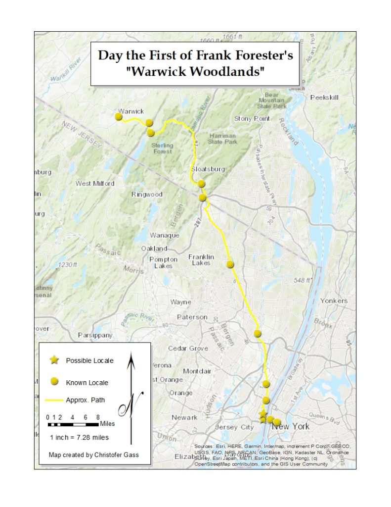
For our mapping project I created a digital story map and a static map for the first chapter of Warwick Woodlands by Frank Forester. I first created the story map with multiple maps within it and decided to make a map that contained all the locations with the addition of a legend.

The story map feature was something I wanted to utilize for this project because there are many template options and ways to showcase the data. I have used ArcGIS online, to plot points, lines and areas for research before, but never used the platform to house as a standalone site.

I still feel like the site needs major edits, it doesn’t seem complete. I, initially, wanted to geolocate for three to five chapters, but after closer analysis of the first chapter I decided to focus my attention on the initial text and how to best visualize. Something I feel this project is missing is black and white photography and paintings of the landscape, people and places written in the text from that time period. I have hyperlinked a map that covers a majority of the trip taken in the first chapter that was current to the time period, but was not able to find other imagery I was hoping to find, yet. One image, in particular, I was thinking of was a Jasper Cropsey painting, one of his Greenwood Lake landscapes, but for the slideshow effect I wanted to utilize a few images to look over near the end of the chapter. Regarding design, I used a historic map from 1840 for New York City as a base map for the earlier stops along the way, with a gray background to highlight the historic map, other ordinary base maps used were US Topography for the map of Hoboken to Warwick and Newspaper for the map of Warwick. For marks on the map I used simple imagery such as the circle and star and dotted line. The circle points are to describe known locates and the star points for possible locales. The dotted line is to inform the viewer of the approximate path. If there was a known path or known portion of a path, it would be on a straight line. The coloration is due to being the lowest color on the list of colors in the edit function. There is eight color groups for the symbology I was using, so I was thinking about using a different color for each day to designate a different chapter of the book. Something I am finding difficult after publishing the story map is the click-ability of the points – I have found it difficult. In a way it’s the most important aspect of the page, being able to click and read for a particular point. For most of the points, I have added descriptions from the text with the page number it derives from in the novel.

For the static map, I first edited one of the maps in ArcGIS online to encompass all the points created for the first chapter, along with the line to connect all the points and then opened in ArcMap to edit. After other little tweaks, I added a title, and legend with map labels, north arrow, distance, ratio, and a signature.

Approaching the Digital Humanities, Thinking the Caribbean

A quote that resonated with me in The Digital Humanities Moment was by Stephen Ramsay from his talk “Who’s In and Who’s Out” from the 2011 Modern Language Association Convention, “If you are not making anything, you are not . . . a Digital Humanist.” I feel like I am still new to the DH field, but if this statement is true, the sites presented for this weeks ‘sites to explore’ justify this sentiment. 

Torn Apart/ Separados is a site I was first introduced to at NYCDH ’19. The project was powerful to hear about then and is still remarkable to explore. Alex Gil spoke about the project at the conference, and its intent, and I immediately thought to myself “how can one person do all of this research by themself?” As I soon found out, and continue to realize, great work is usually a collaboration between many minds. The layout to the map is simple and straight to the point. The visitor to the site is prompted with a note of the sites purpose and then left to explore the thousands of plots on the map. A legend at the bottom showcases the three different sized and colored points. The top header allows the viewer to observe additional visualizations, change between the two versions created, read a description of the project, showcases allied organizations, bibliography, and the 100s of researchers and contributors to the site.

Caribbean Digital was another informative site to explore. During our first class I was thinking if there was already a DH presence in the Caribbean. This site confirmed to me that, yes, there is. One of the first aspects of the conference I searched for was the location. It was wonderful to see that the site of the conference was held within the Caribbean. One of the first links when brought to the site directs the viewer to a YouTube channel with videos of sections of the conference. Which I feel is important for allowing a greater audience to enjoy and feel included. Another exciting aspect was that you could go to older versions of the conference’s webpage.

Create Caribbean Projects and ECDA both confirmed my thoughts on DH in the Caribbean. They had numerous projects to showcase detailing the locations rich history with pedagogical tools to encourage the creation of more projects.