Category Archives: Posts

How to See Race Online – syllabus reflections

This was one of the hardest assignments I’ve ever done… I feel like I’ve spent hours and hours getting closer to the end, and mostly didn’t feel any closer. I showed it to someone on Sunday and she said, “wow, looks like you’re almost done!” And I said, “Yeah!” And then I put another 20+ hours of work into it and still feel like I could do 10 more if I had the time. But I found a stopping point that feels adequate enough, so I’ve stopped for now. I don’t want to post it online, but if anyone wants to check it out, I’m happy to email it or post it in the forum.

Here are some reflections about my choices, since I don’t get to defend them in the syllabus itself.

(And first of all, this syllabus has much more detail about in-class assignments/activities than other syllabi I saw, but when I started taking them out to make it look like a real syllabus, I felt the pedagogical loss too keenly. Can’t kill my darlings this time.)

I chose to include some feminist texts without having a “feminism unit” because I’m only now realizing how useful and universally applicable I find feminist theory to be. (@Lisa Rhody, thank you!) I did not take a Gender & Women’s Studies class as an undergraduate, and as such I got pretty much zero exposure to academic articles or materials that were labeled as explicitly feminist, despite engaging with recognizably feminist ideas and many feminist scholars. I didn’t know that some of the core ideas of feminism are about standpoint, bias, and objectivity, but it’s clear to me that these ideas are important for any researcher or critical thinker. I was hesitant at first to include the Koen Leurs piece, for example, but talked myself into it by imagining how helpful it might have been for me as an undergraduate to read feminist methods in action, and see how they can be applied to any question. It would have upset my misguided notion that “learning feminist theory” could only mean taking GWS 101.

I tried to include art and multimedia, and that too was difficult. It feels just right to me to include Yoko Ono’s Grapefruit in a discussion of giving instructions/writing algorithms. It’s easy for me to imagine it as an extension of Rafa’s physical explanation of for loops, using chairs, at the Python workshop in October, and I think it would make for a similarly memorable and intuitive understanding of how computers work through problems and how algorithms are structured. I’m a little less clear on the value of including thewrong.com, an online biennial that is more or less unstructured and aims to disrupt the deeply entrenched hierarchies of the art fair world. In theory, I think it fits well in a discussion of online values and shaking up entrenched value norms. In practice, it may be too much of a leap for students, or its context may be too obscure for those with minimal knowledge of the art world.

And that leads me to the next difficulty. I struggled to balance making a course that could answer the very basic questions and not scare off students for whom “algorithms” are a complete mystery. But I also want to challenge students, and not underestimate their abilities. My guess is that if anything, this class can and should delve deeper, with more theory and more academic articles to build a more robust epistemological base for thinking about the internet. But I also wanted to keep the focus on the everyday, so although including as many media sources as I did may feel less challenging to the students, I hope that it would pay off in terms of relevance and applicability. 

I included free-writing for a couple reasons. Firstly, I appreciated it in our class as an opportunity of time and space to think about the readings without having to share with the whole class (although let’s be real, I clearly don’t have a problem sharing with the whole class…). Additionally, early on in creating my syllabus, I found Kris Macomber and Sarah Nell Rusche’s “Using Students’ Racial Memories to Teach About Racial Inequality” to be an incredibly accessible and helpful resource in imagining a classroom environment in which students were having meaningful conversations about race and the internet. Free-writing, as Macomber and Rusche write, gives an opportunity for all students to consider their own experiences, and then to share/connect those experiences to course concepts with whatever degree of structure and guidance seems most beneficial. 

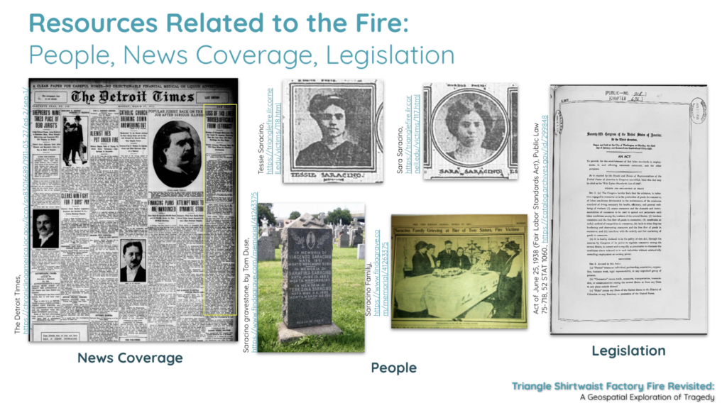
Some last grab bag things: I included an open day, and put it in the middle of the semester so that student input could potentially shape the second half of the course beyond that day. I chose to use QGIS because it’s free and open source, and it works on Macs or PCs. I found it difficult to get scholarly sources on the history of digital advertising— I’d fix this up in the next draft. 

“Priming” became a really important consideration for me — on almost every single day, I found myself wondering if I should switch the order of the lecture and the readings. This was usually a response I could trace to my own lack of confidence in my imaginary students, and therefore one I dealt with by reminding myself that I have countless times learned or thought about something for the first time in a reading and then had it further explained and contextualized in a lecture or class discussion. I cannot control what my students take away from the class anyway (nor should I), so as long as I avoid leaving large contextual gaps or assigning anything that is too jargon-heavy to make sense of, it is probably best to let students sit with the material on their own first and begin class by asking what they think of it.

And finally, a note on confronting my accumulated academic privileges. I tried to take up the challenge to envision this course as part of the CUNY system, and the best spot I could find for it was the American Studies Department at City College. (I’d be curious to know if there’s a better place, though!). Figuring this out helped me to reflect critically on a few things about my own undergraduate experience.

I knew in the abstract that I was privileged to be at Bowdoin College while I was there. But designing this course for a CUNY school helped me to realize a couple of specific privileges inherent to taking an Interdisciplinary Studies Course called Data Driven Societies at Bowdoin College (an amazing course that inspired my pursuit of DH). Privilege went beyond the thirty brand new MacBook Pro computers connected to thirty brand new chargers in a neat little locked cart that were stored at the back of our classroom for lab periods. It extended to the fact that Bowdoin College even had an Interdisciplinary Studies department. How much less career-skill-oriented can you get than an interdisciplinary department at a liberal arts college? And my own privilege extended to the fact that my parents, who paid for my education, didn’t blink an eyelash when I told them that I would be taking the class. 

Part of recognizing my own privilege is recognizing that I didn’t ask “where does this syllabus fit into an existing scheme of funding” until the very end. Which is why at 11:30pm on Tuesday and I was frantically looking to figure out how I’d get laptops, whether City College has a computer lab I could use for the lab sections, and trying to figure out how I could change my syllabus for a more minimal-computing approach if a computer lab wasn’t possible. But it was a bit late to change the syllabus that much, and in fact I believe there could be computer labs available for a class like this one at City College! 

I may have failed at making a CUNY-ready syllabus. It’s easier for me to imagine the course being successful at a small private college, which I guess makes sense because I’m much more familiar with the resources available, the academic culture, the student body, and the classroom dynamics in that setting. Luckily it’s a first draft, though, and since I’m submitting it into the CUNY world, there’s more than a little hope for its improvement in this regard and others!

Finally, I’d like to acknowledge Professors Jack Gieseking and Kristen Mapes, whose pedagogical approaches and syllabi were invaluable to me in attempting this project.

The Triangle Shirtwaist Factory Fire Revisited: A Geospatial Exploration of Tragedy

Can we use geospatial tools to explore the human condition and tragedy? The Triangle Shirtwaist Factory Fire Revisited: A Geospatial Exploration of Tragedy aims to do just that, by introducing the viewer to a historical event, the Triangle Shirtwaist Factory Fire of 1911, through the use of interactive geospatial technology. The project presents the viewer with the home addresses of all 146 victims of the Triangle Shirtwaist Factory Fire, their burial places, and major geographic points related to the fire, identified by points on a map. The project uncovers siloed documents and information, bringing them together in a singular context for a more intimate understanding of an event and the primary sources that document it. This project intends to create a single access point via a digital portal for interaction by the user. Creating this portal offers the user the freedom to interact with the information contained within the map at their own pace, and explore the information that most appeals to the user. The Triangle Shirtwaist Factory Fire Revisited project is built on a dataset complied from archive photographs, letters, journalism, artwork, home, work, and gravesite addresses all relating to the fire victims.

Resources related to the fire including images of people news coverage and legislation
Project Resources

Modeling historic events with geospatial data has been shown to be an impactful way to explore history in digital humanities projects such as Torn Apart / Separados http://xpmethod.plaintext.in/torn-apart/volume/1/, Slave Revolt in Jamaica, 1760-1761: A Cartographic Narrative http://revolt.axismaps.com/, and American Panorama: An Atlas of United States History http://dsl.richmond.edu/panorama/

The Triangle Shirtwaist Factory Fire Revisited continues the expansion of geospatial exploration in the digital humanities by presenting the user with the ability to explore the horrific event of the Triangle Shirtwaist Factory Fire through the lives of the victims. By creating an interface that will allow the user to explore an event through their own direction, the user can take ownership over learning about a historical event through their own research. This project encourages the user to examine underrepresented histories and also provides a way for them to engage with primary sources and digital tools. This project is committed to grounding geospatial concepts in the humanities for thinking critically about the relationships between events, people, movements, laws and regulations, and journalism.

prototype of map project dark mode
Prototype #1

The Triangle Shirtwaist Factory Fire Revisited project will be built in three phases: 1) research and data collection, 2) prototype design and review 3) digital portal creation, followed by user testing. Phase 1) research and data collection— Information about the 146 victims was gathered from David Von Drehle’s book Triangle: The Fire that Changed America, the Cornell University Kheel Center website Remembering the Triangle Shirtwaist Factory Fire of 1911 (https://trianglefire.ilr.cornell.edu/) which includes Michael Hirsch’s research on the six previously unidentified victims and also from the Find A Grave website (https://www.findagrave.com/). Additionally, the information and letters included in Anthony Giacchino’s 2011 Triangle Fire Letter Project (http://open-archive.rememberthetrianglefire.org/triangle-fire-letter-project/) was included to add another dimension to the information landscape of these 146 victims. This information was compiled and reviewed for accuracy, then a dataset was built. Relevant primary and secondary sources were then identified and incorporated into the dataset. Addresses were geocoded (latitude and longitude locations added to the addresses). Phase one is complete. Phase 2) prototype design and review — The dataset built in phase one was then used to create several digital geospatial prototypes (see Appendix). Further review will need to be done to complete Phase 2 and move forward with the project. Phase 3) digital portal development, creation & user testing— For this phase, the project team will continue to review prototypes created in phase 2, determine the mapping software to be used, features and information to be included, and then begin building the final map. Once the digital map and interactive portal is complete, user testing will be begin and adjustments will be made based on comments and recommendations made by the user testing group, pending final approval by the project team.

prototype of map project grayscale
Prototype #2

The final product, a digital, interactive geospatial (map) interface documenting the Triangle Shirtwaist Factory Fire of 1911, that will allow the user to explore this historical event, and those connected to it, at their own direction will be published openly on the internet under a Creative Commons license that would allow others to freely use the code and dataset to build their own geospatial project. Once the project is publicly available, a Github repository for the tools used, data gathered, and dataset created will be established and populated, allowing further research to be done using the tools and data collected by the project team. In addition, a detailed account of the building of the project, including lessons learned, will be added to the Github repository with the hope of providing future researchers a formula for success and review of best practices for a digital mapping project. We will also use social media, blog posts on digital humanities and geospatial websites, conference talks and presentations with relevant academic associations to further publicize the project.

The Wax Workshop

A few weeks ago I went to DH Wax workshop hosted by Alex Gil at Columbia University.         Our task was to develop our own projects based on Wax technology.

Wax is a minimal computing project. Through that project we were able to produce our personal digital exhibition and archives focused on longevity, low cost and flexibility. Its technology is simple enough to learn, as you don’t need to have any advanced programming skills. Through Wax project we will able to produce in the future beautifully rendered, high-quality image collections,  scholarly exhibits and digital libraries.

The template that was given at the beginning had a collection from The Museum of Islamic Art, Qatar and The Qatar National Library. We had to browse the collection and at the same time to replace it with a collection that we would like for our own project.

The workshop was a three part series.The first week started by learning general things minimal definitions and perspectives so as  to start experiencing fundamental principles of minimal computing.

Minimal design is to modify the structure of the project in order to focus more on the content production. Our goal in MC is to reduce the use of what you see is what you get interfaces and try to increase awareness of programming and markup processes. Maintain a minimal computing project is to try decrease the labor of updating, moderating and stewarding a project over time. Our priority is to avoid the usage of natural technologies like hardware and other peripherals or use implementation of advance technologies computer vision and other tracking mechanisms. In terms of minimal surveillance, it is needed to increase privacy and security so we can reduce hacks and harassment. Moreover one of our tasks is to reduce the use of specialized language and try to increase participation and engagement with shared techno cultural problems.

During the first week we tried  to install the theme through Jekyll. All the technological stuff was used it through Command Line and the terminal of our laptop. To be honest I had the experience to learn some basics from last semester in Patrick Smyth’s class and this really helped me to catch up with the progress of installation.

So what we have initially done was to create a new Jekyll website with a default gem-based theme scaffold. Using a mac I started using Xcode command line tool for my OSX. Using the terminal’s command line  I switched to the directory/folder ready to download and start using Ed theme .With all the materials  that were uploaded in Git hub, I was able to execute the commands  and run Jekyll server locally in my computer: After we run the following commands :

$ git clone https://github.com/minicomp/ed.git
$ cd ed
$ gem install bundler
$ bundle install
$ jekyll serve

we were almost there! We had installed Jekyll (which is a Ruby gem package).Now the only thing left was to install ED theme. We managed to install a localhost server in my computer by using the url http://127.0.0.1:4000/ed  This way I was able to view my project.The Jekyll theme designed for textual editors it was based on minimal computing principles, and focused on legibility, durability, ease and flexibility.

The second week we  focused more to the project we have decided to develop. We actually should resize images and prepare a csv file for our dataset that we had to work on. Working with csv file we  normalized and validated our metadata records based on certain fields with special characters and values. After we wrote our fields and cleaned our data we exported  them in a certain format (csv , .json, .yml) so that, would make our progress easier later. Most of the students used pictures and data that were only for practice purposes, as we haven’t really decided about our main project we wanted to create in the future. I started preparing some of the images to test during the class and also some dummy content. My final goal would be to create my personal portfolio and categorize my work and assignments that I have done so far in Graduate Center. In summary what we have done in class was to create a file of metadata records for our collection (csv file), to organize our collection images and put them both into the Jekyll site folder. After that ,we run a few command lines tasks in order to prepare the data for use by the Jekyll site and convert them with special components as static pages.Basically a basic diagram that shows the steps we have done was the following:

wax

A very important advice that Alex suggested, was to try to clone our demo website and try to swap in our image collection data and exhibition content. That way we would keep our main site unused so we can use it from scratch in case  our code didn’t work during the whole process of development.

The third week was more to the practice of what we have learnt so far. Alex gave us some of the new layouts (page like exhibit.html or page. Html etc.) of the theme and we tried to add them in the front page of our website. Moreover, he gave us a folder full of new html pages that had to do with quick, reusable blocks (like shortcodes in WordPress) and he insisted how we should use them, in case we need to implement some of them in our project .

Finally he guided us on how we could host our website in a server  as soon as  we complete the project.  He also provided us with other Wax interesting projects  that had very successful results .

Personally I found this three part workshop a very well training course, although the student should study a lot prior to class in order to catch up Tutor’s directions. I think this was a great opportunity for those ones that are interested in building static pages through wax. Especially useful also for those who have collections of cultural artifacts and they would like to present them online or even offline, once they  learn in the workshop how to build even a local server on their own computer. It was also a great opportunity for students to be introduced in computing fundamentals. Even if someone doesn’t have advanced skills in CMS platforms or HTML and CSS, it is a great chance for everyone start building static websites, learning about data curation, basic principles about Github and web architecture. It could also  benefit users who want to expose their work in building digital exhibits, collections at libraries and archives. I highly encourage everyone to attend to this workshop as soon as the class hours will be announced next year.

Workshop: DH Playshop

DH Playshop
Wednesday, November 13, 2019

A few weeks ago I went to the DH Playshop hosted by Micki Kaufman, the program student advisor. When we went, we were able to discuss topics that we thought would be interesting. This was our chance to be able to ask someone who has been in the DH world about their experiences.

We started with talking about Micki’s experience over the years that led to her dissertation topic. She showed us a bit more of what she showed us in class and was able to show us her VR project. She also showed us the website that she made.

She described the website as containing data visualizations that did not directly connect to her dissertation but were created based on the data she collected. Although she did not have any use for these visualizations, she said that it felt like a waste to discard them, and what may not have meaning to her could be meaningful to someone else. This is what really stuck with me and is part of my reasoning for my proposal.

There were other topics that we discussed but it was just great to be able to have an open discussion about the DH field and I cannot wait for the next DH Playshop!

Disability, Universal Design, and the Digital Humanist/Librarian

In the chapter, Disability, Universal Design, and the Digital Humanities, George Williams argues that while scholars have developed standards on how to best create, organize, present and preserve digital information, the needs of people with disabilities are largely neglected during development. It is assumed that everyone has the same abilities to access these ‘digital knowledge tools’ but it is more often the case that these tools actually further disable people with disabilities by preventing them from using digital resources altogether. In order to rectify this oversight, Williams believes that digital humanists should adopt a universal design approach when creating their digital projects, offers reasons why they should, and gives project ideas.
Universal design is defined as “the concept of designing all products and the built environment to be aesthetic and usable to the greatest extent possible by everyone, regardless of their age, ability, or status in life” (“Ronald L. Mace”). For designers, it is making a conscious decision about accessibility for all, not just focusing on people with disabilities. Four reasons why digital humanists should adopt universal design principles are:

  • In many countries, it is against the law for federally funded digital resources to not be accessible. And while U.S. federal agencies do not yet require proof of accessibility, this may not be the case in the future. Section 508 of the U.S. Federal Rehabilitation Act requires that all federal agencies “developing, procuring, maintaining, or using electronic and information technology” ensure that disabled people “have access to and use of information and data that is comparable to the access to and use of the information and data” by people who are not disabled. Projects seeking government funding could be turned down in the future if they cannot show proof of complying with Section 508.
  • Universal design is efficient. In order to comply with Section 508, web developers would create an alternate accessible version. Creating two versions is expensive and time-consuming, so it would make sense to just create one version.
  • Applying universal design principles to digital resources will make those resources more likely to be compatible with multiple devices including smartphones and tablets, which disabled people often use. Studies also show that an increasing number of people who access the web use mobile devices, among those minorities and people from low-income households.
  • Most importantly, is that it is the right thing to do. As digital humanists, we recognize the importance of open access to materials, and we should extend the concept of open access to include access to disabled people. We do not often think about people with disabilities while developing digital resources, and that can lead to barring this group from the information entirely. If the goal for our resources is to share with as wide and diverse an audience as possible, we should already be using universal design principles.

Williams then shares project ideas, including accessibility tools for the more popular content management systems (WordPress and Omeka), format translation tools that convert RSS feeds into XML formats for digital talking book devices, and tools for crowdsourced captions and subtitles. He concludes with the reciprocal benefits of adopting universal design principles and the significance of digital resources being not only useful but usable to all.

While reading this article, I couldn’t help but think about the ALA’s Library Services for People with Disabilities Policy (found here ) Without going into too much detail, the policy was approved in 2001 and recognizes that people with disabilities are often a neglected minority and that libraries play a crucial role in promoting their engagement with their community. And that libraries should use “strategies based upon the principles of universal design to ensure that library policy, resources, and services meet the needs of all people.” The policy then goes on to make recommendations on how libraries should improve services, facilities, and opportunities for people with disabilities. The policy is a big point in library school, it’s often hammered into students’ brains, and is a central point when creating access to the library and its collections (for legal and ethical reasons). I am not sure why it took until the chapter and seeing the similarities to the ALA Policy to consider people with disabilities in regards to digital resources-possibly because I haven’t created a ‘complete’ digital project yet-but I can say that it is something I will definitely consider going forward. Maybe because it’s my first semester in the program, or because I still see myself as a librarian first and digital humanist second, instead of just being both. Either way, this was a good reminder to truly think about accessibility for all.

Sounds, Signals, and Glitches: A Monday Morning Commute

Having appreciated our reading from Digital Sound Studies, I wanted to first vouch for the keen way in which the book’s editors introduce readers to this rising field of multimodal inquiry, often striking a balance between the ethical and intellectual currents of sound-centric inquiry. As difficult as it is to initiate readers to new types of criticism, the act of presenting a radical new mode of scholarship altogether is truly another beast, not least because the academy is known for clinging to its standards in communication and praxis. Lingold, Mueller, and Trettien problematize this matter when discussing the disciplinary origins of the digital humanities, in particular, writing that the “answer lies in the text-centricity of the field, a bias that is baked into its institutional history,” borne out by text-based journals like Literary and Linguistic Computing and social media platforms like Twitter (10). Given that text-centricity permeates academic knowledge production and thus shapes the disciplinary ethos of DH, I suspect the field cannot afford to overlook multimodal initiatives without continuing to suffer from the tacit biases of text-centric thinking. With that said, I’m immediately inclined to point out the elephant in the room by noting that the text-centered format of my blogpost is an irony not lost on me. It is actually in light of acknowledging this irony that I’ve decided to use this post as a space to not only think about but also try out some of the critical methods outline in the introduction to Digital Sound Studies.

Accordingly, one train of thought and practice that I’m interested in pursuing here relates to “what counts as “sound” or “signal” and what gets dismissed as “noise”… across listening practices,” focusing perhaps on how certain sounds inscribe meaning into our unselfconscious experience of digital tools and social spaces (5). Broadly speaking, the myriad sounds of digital technology run the gamut in how they signify meaning to users. For instance, on one end of the digital spectrum, we have the bubbly sound effect that Facebook emits when aggregating user feeds, all but patching its simulation of our “real-time” social community. Meanwhile, on the other end, we have the IBM beep codes of a power-on self-test (POST), configured so that computer systems will self-assess for internal hardware failures and communicate their results to users (who in return seldom think twice). Fascinating as cybernetics can be, I’ve found myself even more drawn to analyzing how this hypercritical approach to digital sounds can shed light our experience of the relation between sound and noise in daily routines.

Take, for example, my daily commute. Inauspiciously swiping my MetroCard yesterday, I came across the dreaded beeping sound of a turnstile failing to register my magnetic strip, joyously accompanied by that monochromatic error message which politely requests tepid MTA riders to Please swipe again or Please swipe again at this turnstile. As residents of NYC, it’s a sound effect we know too well — and yet I decided to record and embed it below, along with the next 90 or so seconds of this Monday morning commute to Manhattan.

The recording then teeters about for a moment until the rattling hum of the train grows more and more apparent. After grinding to a stop, its doors hiss open, the MTA voiceover plays, and I enter the subway car to find the next available seat.

Though straightforward at a glance, many of these sounds work not unlike commas in a CSV file, similarly but more loosely enacting delimiters for one of the key duties of the NYC subway system: to safely prompt passengers onto and out of subway cars. Together with verbally recorded cues, in other words, MTA voiceovers appear to serve as markers of not only spatial but also temporal cues. By way of example, consider the following series of sound signals: the turnstile’s beep effect marks a transition into the self-enclosed space of the station; the M-train arrives and emits its door-opening voiceover, which at once marks the line progression and the onset of when riders may enter the train, framed off by the (in)famous MTA line, Stand clear of the closing of the closing doors please. Exiting the train, I was struck by the fact that I had only twice acknowledged the sound of the voiceover (getting on at Hewes Street and getting off at Herald Square station), despite there being several other stops between. It follows that these sound effects contain locally assigned meaning, produced in accordance with the intentionality or focus of the subject — or, in this case, the individual passenger. Herein lies the difference between sound and noise. We inscribe symbolic value to sound on the basis of perceived relevance, of functional utility, but have no immediate use for noise, which in turn blends into white noise, accounting for why sound is specific and noise nonspecific. Put differently, we choose to hear certain sounds because they are unsurprisingly meaningful to us and our purposes — e.g. hearing your name in a crowd — while we neglect the indiscrete stuff of noise because it is peripheral, useless. While sound resembles our impressions of order, noise veers closer to our impressions of disorder.

Exiting the train, I was struck by the fact that I had only twice acknowledged the sound of the voiceover (getting on at Hewes Street and getting off at Herald Square station), despite there being several other stops between. It follows that these sound effects contain locally assigned meaning, produced in accordance with the intentionality or focus of the subject — or, in this case, the individual passenger. Herein lies the difference between sound and noise. We inscribe symbolic value to sound on the basis of perceived relevance, of functional utility, but have no immediate use for noise, which in turn blends into white noise, accounting for why sound is specific and noise nonspecific. Put differently, we choose to hear certain sounds because they are unsurprisingly meaningful to us and our purposes — e.g. hearing your name in a crowd — while we neglect the indiscrete stuff of noise because it is peripheral, useless. While sound resembles our impressions of order, noise veers closer to our impressions of disorder.

To further ground my thoughts in the context of DH and digital sound studies, also consider the interrogative voice at the end of the recording from above. As some might guess, once the MTA voiceover begins to fade out, the recording very clearly catches a homeless man’s appeal for food from passengers on the train. Intending initially to catch clearly recorded sounds of the MTA subway system, my knee-jerk reaction here was to either edit the file (the one embedded above), or to simply cut my losses and rerecord when returning home later that day. Since it felt heavy-handed to run through the whole process again and convolute the integrity of my data-collection process, I elected to edit the video at first. But it was only shortly after that I started to think more honestly about why I wanted to record my commute in the first place. In turn, I determined that this interruption did not misrepresent my commute so much as it merely deviated from what I anticipated — and thus intended — to record out of my commute, if only to realize the extent to which these these interrogative sounds were crucially embedded in my experience of the ride and its sounds. No amount of edit will change that fact, so here below I’ve included the full recording:

Needless to say, sudden appeals for food or money on these tight subway cars can have an awkward or troubling effect on passengers, who in return may go quiet, look down or away, resort to headphones, or read absently until it’s over. As is common, the man in this recording recognizes this particular social reality, evident in how he prefaces his appeal by saying “I’m really sorry to disturb you.” Similar to the many for whom this experience is semi-normalized, I’m inclined to likewise ignore these interruptions for the same reason that I rushed to edit my recording in pursuit of an uninterrupted soundbite — that is, because I’m regulated to perceive these appeals as just another unavoidable case of NYC noise, brushed off as an uncomfortable glitch in the matrix of urban American society.

Like “the cats batting at Eugene Smith’s microphone” and refocusing listeners to “the technology itself,” it’s clear that such disturbances enable us to reinspect our use of digital technology, often in ways that reveal the naturalized conditions of daily social life and more (3). I cannot help but think back to the part of Race After Technology when Ruha Benjamin speaks to the illuminating potential of digging deeper into glitches; and how these anomalies can act as key resources in the fight to reveal hidden insights about the invisible infrastructures of modern technology. With that in mind, I’ll end with an excerpt of hers, one whose words to me ring a little louder today than they did in days prior.

Glitches are generally considered a fleeting interruption of an otherwise benign system, not an enduring and constitutive feature of social life. But what if we understand glitches to be a slippery place (with reference to the possible Yiddish origin of the word) between fleeting and durable, micro-interactions and macro-structures, individual hate and institutional indifference? Perhaps in that case glitches are not spurious, but rather a kind of signal of how the system operates. Not an aberration but a form of evidence, illuminating underlying flaws in a corrupted system (80).


A Manifold Syllabus – Prospectus

In the DH spirit of openness — and to offer you all a more complete idea of the syllabus I intend to design for our final project — I thought it might be worthwhile to post my one-page prospectus on our blog. Please do let me know your thoughts and suggestions!

A Manifold Syllabus

Open Educational Resources, Readings, and Textuality in the First-Year Writing Classroom

In preparing to serve as a writing instructor for Baruch College in Fall 2020, I hope to deploy this project as a chance to envision a syllabus whose pedagogy encourages students to unite their reading, writing, and digital literacies toward a generative, multimodal learning experience. Aiming to promote a more intuitive and transactional relationship between reader and text, I plan to collate each of my assigned readings into a single .epub file formatted according to Manifold’s publication interface, with each “chapter” delimited by individual class readings drawn solely from the public domain. With each chapter sequenced in tandem with the linear flow of my syllabus, I intend for this remixed digital publication to afford students a more streamlined, yet cohesive interaction with the course’s assigned readings. In addition, I plan to incorporate Manifold’s annotative toolkit into the “Participation” component of my syllabus, requesting that students post 2-3 public comments on one of the two assigned readings for a given class. Each set of annotations will not only help precondition a space for class discussion, but they will also structure the course’s three critical self-reflections, which will prompt students to choose an assigned reading for informal analysis by situating their comments in conversation with those of their classmates. These critical self-reflections will work up to a six-page academic research paper, thematized according to argumentative topics chosen by students in a participatory poll on the matter. Adopting a process-based model of pedagogy, I plan to offer students constructive feedback on their first draft of this writing assignment, in conjunction with a preliminary grade to be overridden by the grade I later assign to their final drafts. In order to unpack my syllabus into a more substantial pedagogical framework, moreover, my proposal will utilize academic scholarship on topics ranging from critical writing studies, to multimodal theories of literacy, to a student-centered pedagogy of praxis.

Text Analysis Praxis: A look into the world of Harry Potter

The idea for the Text Analysis praxis assignment came after trying to do the Data Visualization praxis assignment a few weeks ago. I had originally planned to do the Data Viz praxis, but I was having trouble finding a dataset or even something that I was interested in using. Unlike the Mapping praxis, I did not have an immediate topic in mind that would allow me to understand my dataset enough to create visualizations in the way I wanted to. Thus, I decided to forego the Data Viz praxis and focus on this week’s Text Analysis praxis.

The first thing I had to think about was what large text I was interested in enough to analyze. Not only would I have to be interested in the topic, it had to be easy enough to get access to the text itself. The first thing that came to mind that I was interested in that would also be easy to access the text was the Harry Potter book series. With the popularity of the text, I knew that I would be able to find the text somewhere online and I know the text enough to be able to spot some interesting patterns.

The tool that I used was Voyant because, from sampling a few of the different tools, I realized that it was, not only easy to use, but had many ways of looking at the text. This was also, unfortunately, determined by the fact that I knew I would not have much time over the past few weeks due to work to mess with other techniques using coding (such as Python), though I was very tempted.

I found each book in the form of a text file and saved them separately. The first thing that I did when I downloaded the text files was to make sure that some items were consistent across all the files. This includes the following:

  • Making sure all chapter numbers were spelled out instead of numerical (i.e. Chapter 4 would be changed to “Chapter Four”)
  • Making sure that there was no other text except that of the book.
    • For example, the top of some of the text files included the title and author of the book and the publisher information.

Once that was done, I uploaded each text file into Voyant and just tried out as many of the tools as I could. One of my favorites has always been the Word Clouds, or Cirrus as Voyant calls it. I created a 155 word cloud for each book separately as well as the corpus as a whole.

Harry Potter and the Deathly Hallows 155 Word Cloud

One item that stood out to me right away, which is obvious from knowing the content of the books but was still interesting to see, was how Voldemort’s name was used the most in the last book, “Harry Potter and the Deathly Hallows”, compared to all of the other books. This makes sense when understanding that the last book is when Voldemort is the most present and where people are more willing to say or think his name compared to the other books.

After this I wanted to see the trend of Voldemort’s name across the corpus.

Trend of Voldemort across the series.

Then, after seeing this, I wanted to see the comparison between his name and the other main characters in the series. I didn’t realize that I could add labels at first but, when comparing to the other characters, it was necessary in order to tell them apart.

Trend of main characters across the series.

There were a few things that I noticed when I was first experimenting with the word cloud. One thing was that the largest or second largest word originally was “said”. This was obvious as the book is set in third person. However, I did not want to include “said” in the findings, so I was able to use Voyant’s edit feature to exclude “said” from the corpus. There were many other words that I wish I could have excluded as well but it would have taken a lot of time to go through it all. One other thing that I noticed in a few of the word clouds (such as the corpus one) is that there must have been typos in a few of the text files because “harry’s” and “harry’ s” showed up twice (there is a space between the apostrophe and the “s” which is making them count as two separate words. Of course, it was bound to happen when relying on text files put together by others.

Corpus 155 Word Cloud

I took some time to mess around with other tools and I have included screen shots below. One of which looked at the location that a word(s) show up in each text file. When looking at the use of “Harry”, what jumped out at me was the gaps that can be seen at the beginning of the Sorcerer’s Stone, Goblet of Fire, Half Blood Prince and Deathly Hallows.

Location of “Harry” throughout the series.

Of course, with knowing the story, the start of each of these books begins with a chapter or two that do not focus solely on Harry.


Below are other items that I pulled from Voyant in case you are interested. There is so much that can be done with this information, I am sure.

Statistics across the series.
Mandala comparing the frequency of use across the series and amongst some of the most used words.
Harry Potter and the Sorcerer’s Stone 155 Word Cloud
Harry Potter and the Chamber of Secrets 155 Word Cloud
Harry Potter and the Prisoner of Azkaban 155 Word Cloud
Harry Potter and the Goblet of Fire 155 Word Cloud
Harry Potter and the Order of the Phoenix 155 Word Cloud
Harry Potter and the Half Blood Prince 155 Word Cloud

Text Analysis: Distant reading of British parliamentary debates

For the text analysis assignment, I initially attempted topic modeling using Mallet, but after many failed attempts, error messages and hair-pulling, I decided to switch gears. I chose to work with Voyant, especially after trying Mallet, because I felt it was the easiest to maneuver and offered a variety of tools for analyzing the data.

My dataset consisted of transcripts from three parliamentary debates that occurred in Britain during the year of 1944. These debates, which took place in March, June and November of that year, discussed three white papers that outlined the government’s policy plans for the creation of a welfare state in Britain. In these debates, Members of Parliament (MPs) discussed the creation of a national health service, employment policy, as well as the establishment of a scheme of social insurance and a system of family allowances.

I chose this dataset because it made up a large portion of the primary source material I used to write my history honors thesis that explored the origins of the British welfare state. For my thesis, I read and analyzed these debates to understand how MPs discussed the establishment of a welfare state and their motivations for its creation. I found the miseries experienced in the aftermath of WWI, the desire to maintain superiority within the world order, and anxieties surrounding the future of the ‘British race’ spurred the call for a welfare state that benefited all Britons. Only through close reading did I discover these motivations and causations.

For this assignment, I thought it would be interesting to use Voyant to conduct a distant reading of these debates to see what appeared significant. I started by inserting each debate as a separate document. From the initial output, I saw I needed to add some addition stop words to the automate list. Words like hon, mr and member related to MPs addressing each other in the discussions. The words, white, scheme, paper referred back to the physical documents being discussed. I decided to add these words to the stop-word list because I believed they skewed the results.

Initial word cloud

After adding to the stop-word list I reran Voyant to update my results.

Voyant dashboard after second iteration
second word cloud after addition to stop-word list

The five words that occurred the most in theses debates were, in order, government, people, country, war and right. These words, to me, were not surprising; they corresponded to the content of the debates. MPs discussed the government’s role in providing welfare to the people, how the country would benefit from its creation and believed it was the right thing to do for the entire population. The word link images below further illustrate word connections within the corpus.

Government links
Country links

People links

These three images show how the top words government, country and people correspond to other words found within the documents. For someone who has not close read the debates it might be difficult to pull meaning from these connections. From my close reading, these links reflect main points from the corpus: there was great hope in the government’s ability to make policies that addressed the people’s needs and a strong belief that from these policies the country’s future and health would benefit.

When looking at the summary of the corpus below, the distinctive words within each documents reflect the themes of each. Without knowing the title or topics of each debate, I believe an individual could make an educated guess of what each document details. I think this tool could be useful when trying to determine the contents of a large number of documents within a corpus. Because there are only three documents with rather distinct topics, it is easy to determine the overall contents.

Summary of corpus

I spent some time exploring the other tools offered through Voyant that aren’t initially displayed on the dashboard. While going through the additional offerings, I found some to be useful toward my data and others that were not. One tool that I found interesting was Veliza. According to the Voyant Help page, “Veliza is a (very) experimental tool for having a (limited) natural language exchange (in English) based on your corpus”. It is inspired by the Eliza computer program that mimics the responses of a Rogerian psychotherapist. I didn’t know the context of either, so after googling I found the basic premise was that the computer program would respond to your text in a way a psychologist typically would.

To start, you can choose between entering your own text, or text from you corpus you wish to discuss, into the text bubble at the bottom to start a conversation. Or you can import text from your corpus by random using the ‘from text’ button. I chose to use the button to randomly enter text to see how the tool would respond. I clicked the ‘from text’ button multiple times to see the variety of responses. Below is a example of a conversation with text from my corpus. Even though this tool is not specifically useful for analyzing data, it was fun to play around and test how Veliza would answer.

Veliza text conversation

Final Thoughts

It is always important to remember the parameters of analysis are set by the researcher when doing any type of text analysis. With my analysis, I chose the documents as well as additional stop-words added to the list. This created a specific environment for exploration. Another individual could do an analysis of these documents and come to very different conclusions based on how they framed the data. I believe my close reading of the documents influenced my distant reading of them. My knowledge of the context gave me a better understanding of the distant reading results. Or one could also say, influenced my understanding of them because I already had preconceived notions. In general, I think distant reading is usually better with a large corpus, allowing for patterns to be discerned over time, but I was excited to see how the data I had spent so much time examining up close would look from afar, so to speak.

Overall, I think Voyant is a good way to get a broad analysis of a corpus or document. With the variety of features available, this tool is helpful when an individual wants to look at the data from multiple directions. Not being limited to only word links or topic modeling allows for wider exploration of a corpus and a higher likelihood that some type of insight will be gleaned from the first iteration of analysis.

In the future, I think it would be an interesting project to look more broadly at British parliamentary debates over time to see if any interesting patterns appear. The website Hansard has the official reports of parliamentary debates dating back 200 years and gives users the option to download debates into a plain text file, making the analysis of these debates with computational tools quite easy.