I had quite the journey with my project, initially titled: Exploring Diversity in Newbery and Caldecott Medal and Honor Books. I had the idea for my proposal after we explored data and visualization and was excited to explore this topic. Lack of diversity in children’s literature is an ongoing problem, but what about the books that are awarded these distinguished medals, and then constantly promoted to children?
My plan was to analyze the Newbery and Caldecott books and see if historically underrepresented groups are actually represented and if there are any trends among the honorees. I would divide all pertinent bibliographic data into eight categories, and then use Tableau Public-very excited to use-to display my results. When I started counting all of the Medal and Honor Books I started to panic. There are a total of 733 Honorees. My immediate question was, can this project be completed in a semester? No. Of course not. So how can I break up the project? How much can I cut before I can’t accurately answer my research questions? I was thinking about only analyzing the Medal Winners, or maybe winners in a certain time range, but it didn’t feel right. Discussing my problem in class was helpful, and I was close to making a decision. I then went to the Data Visualization presentations last week for inspiration and was blown away by the projects. Congrats to everyone in the class! All of the presentations I saw used Tableau Public, and I got to chat with other students about their experiences with it. It’s one thing to look at recommended projects on the site, but another to play around with it while the creator is standing next to you.
It was during the after-party when I was speaking with some of my classmates and Michelle McSweeney, that I solved my dilemma. Michelle, who didn’t know much about the Medals, asked which one is more important? I answered Newbery and gave my reasoning (Caldecott focuses on the illustrations, not the story, not about the theme, etc). I think it takes having an outsider asking a question that put everything into focus for me. It was a simple solution and I should have come to it sooner, but I think I was too stubborn to let go of my original plan. I still think the Caldecott Books are important and will figure out a future project for them, but I will focus entirely on Newbery Books for the proposal. My book count is now 415, and while it is still a lot and gathering the data will take some time, I will be proud of my finished product. I collected some data already, and it looks promising. I can’t wait to present my proposal next semester.
In the chapter, Disability, Universal Design, and the Digital Humanities, George Williams argues that while scholars have developed standards on how to best create, organize, present and preserve digital information, the needs of people with disabilities are largely neglected during development. It is assumed that everyone has the same abilities to access these ‘digital knowledge tools’ but it is more often the case that these tools actually further disable people with disabilities by preventing them from using digital resources altogether. In order to rectify this oversight, Williams believes that digital humanists should adopt a universal design approach when creating their digital projects, offers reasons why they should, and gives project ideas. Universal design is defined as “the concept of designing all products and the built environment to be aesthetic and usable to the greatest extent possible by everyone, regardless of their age, ability, or status in life” (“Ronald L. Mace”). For designers, it is making a conscious decision about accessibility for all, not just focusing on people with disabilities. Four reasons why digital humanists should adopt universal design principles are:
In many countries, it is against the law for federally funded digital resources to not be accessible. And while U.S. federal agencies do not yet require proof of accessibility, this may not be the case in the future. Section 508 of the U.S. Federal Rehabilitation Act requires that all federal agencies “developing, procuring, maintaining, or using electronic and information technology” ensure that disabled people “have access to and use of information and data that is comparable to the access to and use of the information and data” by people who are not disabled. Projects seeking government funding could be turned down in the future if they cannot show proof of complying with Section 508.
Universal design is efficient. In order to comply with Section 508, web developers would create an alternate accessible version. Creating two versions is expensive and time-consuming, so it would make sense to just create one version.
Applying universal design principles to digital resources will make those resources more likely to be compatible with multiple devices including smartphones and tablets, which disabled people often use. Studies also show that an increasing number of people who access the web use mobile devices, among those minorities and people from low-income households.
Most importantly, is that it is the right thing to do. As digital humanists, we recognize the importance of open access to materials, and we should extend the concept of open access to include access to disabled people. We do not often think about people with disabilities while developing digital resources, and that can lead to barring this group from the information entirely. If the goal for our resources is to share with as wide and diverse an audience as possible, we should already be using universal design principles.
Williams then shares project ideas, including accessibility tools for the more popular content management systems (WordPress and Omeka), format translation tools that convert RSS feeds into XML formats for digital talking book devices, and tools for crowdsourced captions and subtitles. He concludes with the reciprocal benefits of adopting universal design principles and the significance of digital resources being not only useful but usable to all.
While reading this article, I couldn’t help but think about the ALA’s Library Services for People with Disabilities Policy (found here ) Without going into too much detail, the policy was approved in 2001 and recognizes that people with disabilities are often a neglected minority and that libraries play a crucial role in promoting their engagement with their community. And that libraries should use “strategies based upon the principles of universal design to ensure that library policy, resources, and services meet the needs of all people.” The policy then goes on to make recommendations on how libraries should improve services, facilities, and opportunities for people with disabilities. The policy is a big point in library school, it’s often hammered into students’ brains, and is a central point when creating access to the library and its collections (for legal and ethical reasons). I am not sure why it took until the chapter and seeing the similarities to the ALA Policy to consider people with disabilities in regards to digital resources-possibly because I haven’t created a ‘complete’ digital project yet-but I can say that it is something I will definitely consider going forward. Maybe because it’s my first semester in the program, or because I still see myself as a librarian first and digital humanist second, instead of just being both. Either way, this was a good reminder to truly think about accessibility for all.
Like many people around this time of year, I am faced with the decision of what to make for Thanksgiving. Recipes, traditional and modern, fill my brain as I decide what my guests will accept in their holiday meal. Recent conversations about my recipes have made me think about the history of American cooking, so I thought for this assignment I would look at American Cookbooks to see what were popular ingredients and cooking methods during our nation’s early history.
I used Michigan State University’s Feeding America Digital Project (https://d.lib.msu.edu/fa) to find cookbooks published in America and written by American authors. The site has 76 cookbooks from the late 18th century to the early 20th century and offers multiple formats to download. I used seven cookbooks from 1798-1909:
American cookery by Amelia Simmons (1798)
The frugal housewife by Susannah Carter (1803)
The Virginia housewife: or, Methodical cook by Mary Randolph (1838)
The American economical housekeeper, and family receipt book by E. A. Howland (1845)
The great western cook book: or, Table receipts, adapted to western housewifery by Anna Maria Collins (1857)
The Boston cooking-school cook book by Fannie Merritt Farmer (1896)
The good housekeeping woman’s home cook book by Good Housekeeping Magazine (1909)
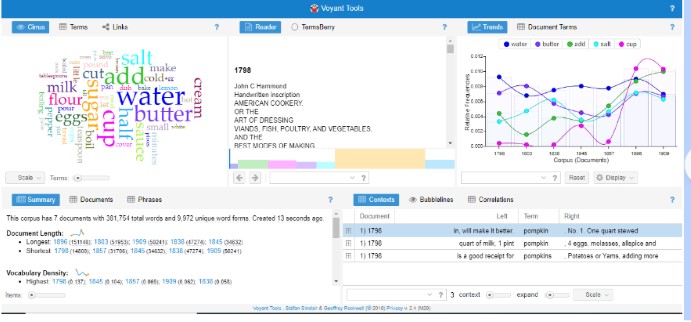
The Summary tab gives an overview of the corpus: 7 documents with 381,754 total words and 9,972 unique word forms. The longest document is the 1896 cookbook at 151,148 words and the shortest is the 1798 cookbook at 14,800 words. The 1798 cookbook has the highest vocabulary density and the lowest density is the 1896 cookbook. The five most frequent words in the corpus are ‘water’ (3,074); ‘butter’ (2,481); ‘add’ (2,439); ‘salt’ (2,250); and ‘cup’ (2,224). I wanted to see more results, so I moved the ‘Items’ slide bar on the bottom and it gave me the top 25 most frequent words in the corpus. The above chart shows the Relative Frequency of the top five words. I found it interesting how often the word ‘cup’ was used throughout the corpus. In 1798 ‘cup’ was counted 6 times and ‘cups’ 8 times. In the 1909 cookbook, ‘cup’ was counted 516 times and ‘cups’ 158 times. Granted the 1909 text is much longer than the 1798 text (approximately 35,000 words more), but I wondered what measurement terms were used in 1798. I entered common terms, and saw that ‘pint’ was used 68 times, ‘quart’ 94 times ‘spoonful’ 9 times and ‘ounce’ 12 times in the 1798 cookbook. Interestingly enough, neither ‘teaspoon/s’ nor ‘tablespoon/s’ were used in the 1798 or 1803 cookbooks.
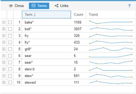
I then looked at common cooking terms and ran into my first issue. I know modern cooking terms, but what were common terms used in the 18th and 19th centuries? Looking at the word cloud Voyant produced helped, as well as the most frequent terms for each cookbook. After creating my initial list, I had to decide how I wanted to input the terms. Do I only include ‘sear’ or all words beginning with sear (‘sear*’) so I don’t miss terms in different tenses? When I just used ‘sear’ I had 5 counts, but ‘sear*’ is 15. I looked them up, and 18 ‘sear’ terms were cooking related (one was ‘sear’d’) and the other 2 instances were the word ‘search’. I’m sure that using all terms with an ‘*’ has skewed the results a bit, but as of right now I would rather be inclusive.
Cooking Methods
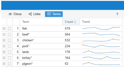
Next, I wanted to focus on food items, so I added measurements and related words to the list of stopwords. Added were: add, cup, tea/tablespoon, half, make, bake, pour, hot and dish. What showed up was slightly different, but I still saw some measurement terms and realized that I had to add the plural forms of words like tablespoon, cup, etc. I was thinking about removing ‘pound’ but there are recipes for pound cake and pear was called ‘Pound Pear’ (1798 cookbook) so I decided to keep it. After the words were added, the most common words in the corpus were: ‘water’ ‘flour’ ‘butter’ ‘sugar’ ‘milk’ and ‘eggs.’ I then looked at what meats were used and when. ‘Fish’ was the most popular, with ‘turkey’ and ‘pigeon’ at the bottom.
Meat terms in the corpus.
A side part of this project is to see when American cookbooks included what we think of as traditional Thanksgiving fare. I decided to look up pumpkin (pie), cranberry sauce and sweet potato. I also wanted to look up cocoa/chocolate. Looking up pumpkin was interesting. ‘Pumpkin’ was in every cookbook except in 1798. Through an internet search, I found out that pumpkin was spelled ‘pompkin’ at that time and once I searched the word, ‘pompkin’ is mentioned in the 1798 book 3 times. And it is for two variations of a pompkin pudding. By 1803, ‘pompkin’ was changed to ‘pumpkin’ and there was a recipe for a pie. Pumpkin came up the most in 1857. For cranberry, cranberries were first mentioned in 1803 for tarts. But over time cranberry sauce recipes were included. Sweet potatoes were first mentioned in 1838. Cocoa/ chocolate was first included in the 1838 cookbook.
Thoughts
I really enjoyed looking through the cookbooks, but I know that if I were to expand on this project, I would need to do more research about traditional cooking terms and recipes so I could get more accurate results. My current knowledge about this topic is not enough to make the decisions about what terms to focus on or what I can safely add to the list of stopwords. I would also need to find a larger collection of cookbooks. Feeding America was a great site for an introduction to text analysis, but there are only 76 cookbooks available, and some of them were more of a guide for women and the home than cookbooks. I need to look into how many cookbooks were actually published during this time. There were also books that focused on Swedish, German or Jewish-American cuisine, but they were published in the late 19th/early 20th centuries. I would like to investigate that topic further-when did ‘immigrant cookbooks’ first get published? Voyant was a good fit for this project, and I would recommend using it for those who are dipping their toes into text analysis. It was easy to upload the .txt files and fun to play around with the different Tools in each section (Scatter Plot, Mandala, etc). If I wanted to expand this project, I would have to investigate if Voyant would be as easy to use with a much larger corpus.
I, like Amanda, had a goal of finding a mapping platform to use for projects at my job. Being the only librarian/archivist on staff, project design (and ensuing work) is all done by me. So I keep an eye out for any free or low cost program with easily accessible tutorials. One project I thought would work well for this assignment was chronicling the history of early 20th century Irish America’s involvement in Irish Independence through a collection in my archive, the Friends of Irish Freedom (F.O.I.F.). And although it is not completely free, I decided to use ArcGIS Online.
Last year, my archive had the exciting opportunity to work on a project about Eamon de Valera’s 1919-1920 trip to the United States. The documentary relied heavily on the F.O.I.F. Collection, an Irish American organization that was formed shortly before the Easter Rising and whose main goal was to assist in any movement that would bring about the national independence of Ireland. De Valera’s tour seemed like a success, with national attention helping him collect $5,000,000 through a bond drive. What actually happened was a clash of politics and personalities that led to the dissolution of the F.O.I.F., a deep division in Irish America, and a decade of court battles for control of the funds raised.
From my research for the documentary, I had some questions that I wanted to begin to answer during the project:
Where exactly did de Valera visit during his 1919-1920 trip?
Did he go to predominantly Irish American states? Is there a correlation between his stops and the Irish American population?
Were Friends of Irish Freedom Branches near each of his stops? Did branches open after his visit?
Where/when was the $5,000,000 collected?
I knew that I was not going to be able to answer all of my questions in the time frame, but I would at least start with his visits and the branches. I initially thought that inputting the data would be the easiest part of this assignment. I had de Valera’s itinerary from the collection, and was going to use ArcGIS Online to create the map. I was also going to add links to photos and newspaper articles that I found online or from the collection. I soon realized that the itinerary I had was not accurate (whether on purpose or changed after he came to New York), so I had to search through the finding aid at UCD of de Valera’s personal papers for dates and then the corresponding newspapers to authenticate it. And to make the search just a little harder, the national newspapers did not fully cover de Valera’s trip. It was mostly covered by local papers (a problem organizers mentioned in both collections). Also, some of the dates that I found in local newspapers or F.O.I.F. circulars were not mentioned in the UCD finding aid. I decided to include all dates with newspaper sources. With time limitations, his tour is only until November 1919 and not until December 1920. Just another reason to always double check your sources!
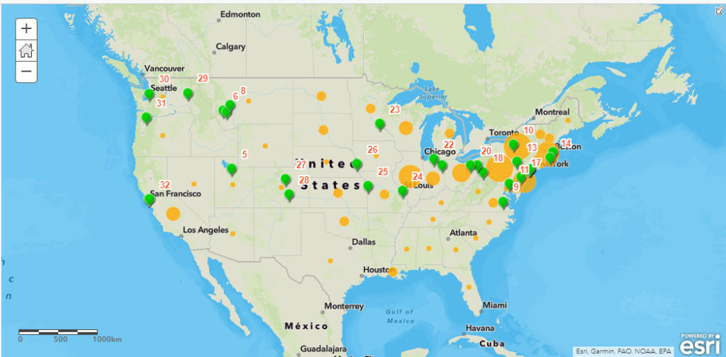
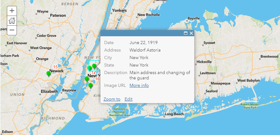
Once I had a good block of data, I created a comma separated value (csv) file from a spreadsheet of the 32 stops. In the file, I included date, city, state, description and image link. Not all stops have all of the fields filled in, but it is something I could go back and add. The csv file was added to my basemap as a layer, and I changed the symbols to green points with orange numbered labels in order of his tour stops. I then configured the pop ups to show the rest of the data from the file. The first stop at the Waldorf Astoria has some text as well as a link to an image of de Valera and Irish American leaders on the hotel’s roof.
The next layer I created was of F.O.I.F. Branches as of September 1920. This information was taken from multiple branch lists in the collection, and put into another spreadsheet later downloaded as a csv file. I used the ‘Counts and Amounts’ option for the data, and the circles in the states increase in size in correlation to the number of branches. I did not put in exact addresses, since there were about 700 of them nationally. I also did not include when the branches were formed since there were so many spread out over several documents. I think in the future I would try to shade the entire state, with the color deepening in relation to the amount of branches, instead of using circles.
Overview of map. From first stop on tour. Image URL is a link to rooftop photo de Valera and leading Irish Americans.
I didn’t want to create a StoryMap since I did not have all of the information I wanted to include, but I did create a slide presentation on ArcGIS Online. Each slide has a title, and I zoomed in and captured an area to show on the slide. The pop ups will appear if you click on the symbol, which is something I had to apply before saving. I also wanted the legend visible on the slides, but you have to click on the legend on the upper right hand corner for it to open up. The presentation is not as nice as StoryMaps, but it did work for the first stage of my project. It is a little clunky and it takes a few seconds for the map to refocus when you move to the next slide.
I really did enjoy using ArcGIS Online, and I think I would use it in the future. I know that it is limited and if I would have used the desktop version or QGIS, I could have added more features to my map before uploading it to ArcGIS Online as mentioned in Finding the Right Tools for Mapping article. What really helped me were the tutorials and videos I found online explaining the way to add layers and special features. For someone who is not technically inclined, they were much needed. I think that if I would have had all of my data (full itinerary, branch information, and population breakdown in 1920), then maybe I would have used the desktop versions first. This is definitely a project I will continue working on, and hopefully I will have a wonderful StoryMap to share in the future.
As a librarian working in special collections and a relative newcomer to the digital humanities field, I really enjoyed this week’s readings and posted sites. I think it took looking through the sites, in particular, the Early Caribbean Digital Archive (ECDA) to understand what the field of digital humanities is and how I can approach projects not only as a librarian/archivist but as a digital humanist.
A simple definition of the traditional role of an archivist is one who acquires a collection, processes it with respect to ‘original order,’ and provides access to the public (usually through finding aids). In recent years, archivists have taken a more active role by collaborating with scholars across the disciplines to digitally “re-archive” (ECDA) existing collections and reassemble them to highlight alternate views of history from often underrepresented subjects/groups. The ECDA calls it “decolonizing the archive.”
An example of decolonizing the archive is in the ECDA’s Embedded Slave Narrative Collection. The team took works that were created by the European colonials in power and examined the text to find stories from the slaves themselves. These stories were extracted and authorial credit given to the slaves, like in “Clara’s Narrative.” While the team kept Bryan Edwards as an author for his work History, Civil and Commercial, of the British Colonies in the West Indies (1793), they also assigned Clara as an author for her narrative that appears in Edwards’ book. This digital archive has essentially given Clara and many of the slaves and indigenous people of the Caribbean a voice in the archive and Caribbean history.
The concept of decolonizing the traditional archive is such an interesting way for archivists to get involved in digital humanities projects. I don’t think this is something we could/should do by ourselves, so collaboration is key. While we believe that the original collection is of value and should be preserved, we understand that it may not create an authentic account of what happened. Therefore, we should be looking at what critical voices and experiences are missing and partner with digital humanists to recover those once silenced voices for a new digital archive.
Need help with the Commons?
Email us at [email protected] so we can respond to your questions and requests. Please email from your CUNY email address if possible. Or visit our help site for more information: