
The links to my map and slide presentation made in ArcGIS Online.
I, like Amanda, had a goal of finding a mapping platform to use for projects at my job. Being the only librarian/archivist on staff, project design (and ensuing work) is all done by me. So I keep an eye out for any free or low cost program with easily accessible tutorials. One project I thought would work well for this assignment was chronicling the history of early 20th century Irish America’s involvement in Irish Independence through a collection in my archive, the Friends of Irish Freedom (F.O.I.F.). And although it is not completely free, I decided to use ArcGIS Online.
Last year, my archive had the exciting opportunity to work on a project about Eamon de Valera’s 1919-1920 trip to the United States. The documentary relied heavily on the F.O.I.F. Collection, an Irish American organization that was formed shortly before the Easter Rising and whose main goal was to assist in any movement that would bring about the national independence of Ireland. De Valera’s tour seemed like a success, with national attention helping him collect $5,000,000 through a bond drive. What actually happened was a clash of politics and personalities that led to the dissolution of the F.O.I.F., a deep division in Irish America, and a decade of court battles for control of the funds raised.
From my research for the documentary, I had some questions that I wanted to begin to answer during the project:
- Where exactly did de Valera visit during his 1919-1920 trip?
- Did he go to predominantly Irish American states? Is there a correlation between his stops and the Irish American population?
- Were Friends of Irish Freedom Branches near each of his stops? Did branches open after his visit?
- Where/when was the $5,000,000 collected?
I knew that I was not going to be able to answer all of my questions in the time frame, but I would at least start with his visits and the branches. I initially thought that inputting the data would be the easiest part of this assignment. I had de Valera’s itinerary from the collection, and was going to use ArcGIS Online to create the map. I was also going to add links to photos and newspaper articles that I found online or from the collection. I soon realized that the itinerary I had was not accurate (whether on purpose or changed after he came to New York), so I had to search through the finding aid at UCD of de Valera’s personal papers for dates and then the corresponding newspapers to authenticate it. And to make the search just a little harder, the national newspapers did not fully cover de Valera’s trip. It was mostly covered by local papers (a problem organizers mentioned in both collections). Also, some of the dates that I found in local newspapers or F.O.I.F. circulars were not mentioned in the UCD finding aid. I decided to include all dates with newspaper sources. With time limitations, his tour is only until November 1919 and not until December 1920. Just another reason to always double check your sources!
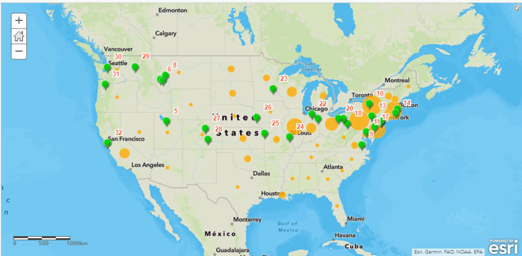
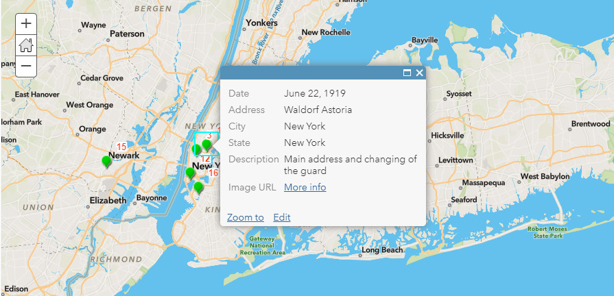
Once I had a good block of data, I created a comma separated value (csv) file from a spreadsheet of the 32 stops. In the file, I included date, city, state, description and image link. Not all stops have all of the fields filled in, but it is something I could go back and add. The csv file was added to my basemap as a layer, and I changed the symbols to green points with orange numbered labels in order of his tour stops. I then configured the pop ups to show the rest of the data from the file. The first stop at the Waldorf Astoria has some text as well as a link to an image of de Valera and Irish American leaders on the hotel’s roof.
The next layer I created was of F.O.I.F. Branches as of September 1920. This information was taken from multiple branch lists in the collection, and put into another spreadsheet later downloaded as a csv file. I used the ‘Counts and Amounts’ option for the data, and the circles in the states increase in size in correlation to the number of branches. I did not put in exact addresses, since there were about 700 of them nationally. I also did not include when the branches were formed since there were so many spread out over several documents. I think in the future I would try to shade the entire state, with the color deepening in relation to the amount of branches, instead of using circles.
I didn’t want to create a StoryMap since I did not have all of the information I wanted to include, but I did create a slide presentation on ArcGIS Online. Each slide has a title, and I zoomed in and captured an area to show on the slide. The pop ups will appear if you click on the symbol, which is something I had to apply before saving. I also wanted the legend visible on the slides, but you have to click on the legend on the upper right hand corner for it to open up. The presentation is not as nice as StoryMaps, but it did work for the first stage of my project. It is a little clunky and it takes a few seconds for the map to refocus when you move to the next slide.
I really did enjoy using ArcGIS Online, and I think I would use it in the future. I know that it is limited and if I would have used the desktop version or QGIS, I could have added more features to my map before uploading it to ArcGIS Online as mentioned in Finding the Right Tools for Mapping article. What really helped me were the tutorials and videos I found online explaining the way to add layers and special features. For someone who is not technically inclined, they were much needed. I think that if I would have had all of my data (full itinerary, branch information, and population breakdown in 1920), then maybe I would have used the desktop versions first. This is definitely a project I will continue working on, and hopefully I will have a wonderful StoryMap to share in the future.