Holding Fast: Mapping American Indigenous Sovereignty

My Hybrid Tableau/QGIS Project
https://public.tableau.com/shared/PJ2QF4BXS?:display_count=yes&:origin=viz_share_link

My Process
While exploring Yarimar Bonilla and Max Hantel’s “Visualizing Sovereignty,” I was struck by the power of untethering the Caribbean islands from the too-familiar lands and waters that otherwise dwarfed or laid cultural claim to them by virtue of a colonial past. I was also struck by the “Invasion of America” video referenced therein, depicting the loss of native North American lands as Europeans arrived, colonized, and expanded. I’d seen the “Invasion of America” before, but I didn’t realize until now how much that visualization reinforces the Manifest Destiny mindset, almost confirming Andrew Jackson’s belief that Indigenous people “must necessarily yield to the force of circumstances and ere long disappear.”[1] That video, as helpful as it is in depicting colonial greed also focuses the story on indigenous loss rather than indigenous resilience.

So, for this project, I wanted to mimic Bonilla and Hantal’s process to map the sovereignty of Native American nations in hopes of challenging the popular defeatist tale.

I started in Tableau, familiar to me after this summer’s Intro to Data Visualization intensive. I discovered a shapefile from the US Census Bureau demarcating the 2017 “Current American Indian/Alaska Native/Native Hawaiian Areas.” I had never worked with shapefiles, but found this one fairly intuitive to map in the program. I distinguished each officially recognized “area” (as the Bureau calls it) by color and added the indigenous nation’s name to the tooltip to make each area visually distinct. As does nearly every step of a mapping exercise, this alone yielded some insights. Oklahoma is nearly all designated land. The Navajo nation has a land allotment larger than some US states. Two of the largest land parcels in Alaska belong to tribes I hadn’t heard of: the Knik and the Chickaloon.

This first view also presented two significant problems, predicted by our readings both from Monmonier as well as Guiliano and Heitman. First, Tableau’s map projection is grossly distorted, with Greenland larger than the contiguous states, instead of 1/5 the size of them. Second, the limits of the data set—collected by and in service of the US government—cut out the indigenous people of Canada and Mexico, whose connections with the represented people are severed. What a visual reminder of a political and historical truth!

Census Bureau Areas 2017

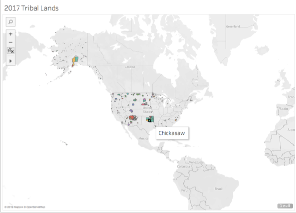
Screenshot of the Census Bureau’s mapped shapefile, with tooltip visible.

I did find a shapefile of Canadian aboriginal lands also from 2017, but couldn’t find a way to merge the geometries in one map. Mapping those Canadian reserves separately, I noted immediately how easy it is for political entities to be generous with lands they don’t value. (Of course, the map’s polar distortion may be enlarging that seeming, albeit self-serving, largesse.)

Canadian Aboriginal Reserves

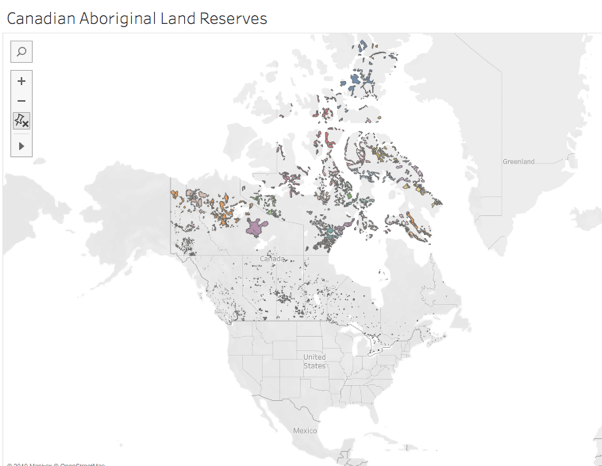
Screenshot of the Canadian government’s shapefile mapped.

I returned to the US visualization to see if similar land prioritization was made, changing the base map to a satellite rendering.

Census Bureau areas on a satellite map

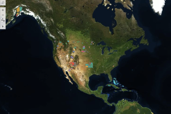
Screenshot of the Census Bureau’s shapefile on a satellite map.

Again, the new view offered some insights. The effect of the Indian Removal Act of 1830 is clear, as the wooded lands east of the Mississippi seem (from this height) nearly native-free. Reservations are carved in less desirable spots and are pushed toward the interior as, in addition to the westward push from the east, states began to be carved from the West Coast after the Gold Rush.

Next, eager to mirror Visualizing Sovereignty in turning the power tables, I removed the base map altogether. De Gaulle’s “specks of dust” quote sprang to mind, as I saw, in full view, this:

Census areas without a base map

Screenshot of the Census Bureau’s shapefile mapped, with the base map washed out.

Just this one act changed the scene for me entirely. Suddenly, Hawaii came into the picture, calling to mind its colonization in the name of strategic desirability. The whole scene reminded me of what Bonilla and Hantal (borrowing from Rodriquez) called “a nonsovereign archipelago, where patterns of constrained and challenged sovereignty can be said to repeat themselves.” I longed for the inclusion of the Canadian lands to flesh out the archipelago, though the missing data points to one such constraint and challenge.

Revealing just a surface level of the shifting sands of sovereignty, this data set includes ten distinct “classes” of recognized lands, so I included those in the ToolTips and offered an interactive component to allow users to isolate each class, foregrounding spaces that were connected by the US government’s classification of them. For example, choosing the D9 class (which the Census defines denoting a “statistical American Indian area defined for a state-recognized tribe that does not have a reservation or off-reservation trust land, specifically a state-designated tribal statistical area”) reduces the archipelago to a small southeastern corner—strongholds resistant, perhaps, to Jackson’s plans or perhaps more probably ones who went underground until the mid 20th century when the Civil Rights Movement empowered indigenous communities and gave birth to Native American studies.

Census Bureau's D9 class areas

The D9 class of recognized indigenous “areas.”

This divide-and-conquer, 10-class variety of sovereignty was underscored by the significant contrast in tone in the definitions of tribal sovereignty between the National Congress of American Indians (NCAI) and the US Bureau of Indian Affairs (BIA). The NCAI contextualizes and defines sovereignty with active, empowering language: “Currently, 573 sovereign tribal nations…have a formal nation-to-nation relationship with the US government. … Sovereignty is a legal word for an ordinary concept—the authority to self-govern. Hundreds of treaties, along with the Supreme Court, the President, and Congress, have repeatedly affirmed that tribal nations retain their inherent powers of self-government.”

In sharp contrast, the BIA contextualizes and defines sovereignty with passive, anemic language, explaining that, historically, indigenous tribes’ “strength in numbers, the control they exerted over the natural resources within and between their territories, and the European practice of establishing relations with countries other than themselves and the recognition of tribal property rights led to tribes being seen by exploring foreign powers as sovereign nations, who treatied with them accordingly. However, as the foreign powers’ presence expanded and with the establishment and growth of the United States, tribal populations dropped dramatically and tribal sovereignty gradually eroded. While tribal sovereignty is limited today by the United States under treaties, acts of Congress, Executive Orders, federal administrative agreements and court decisions, what remains is nevertheless protected and maintained by the federally recognized tribes against further encroachment by other sovereigns, such as the states. Tribal sovereignty ensures that any decisions about the tribes with regard to their property and citizens are made with their participation and consent.” “Participation and consent” are a far cry from “the authority to self-govern,” and even though the NCAI boasts of the Constitutional language assuring that tribes are politically on par with states, they make no mention of lack of representation in Congress or other such evident inequalities.

Shocked by the juxtaposition of these interpretations of sovereignty (and in a slightly less academically rigorous side jaunt), I pulled population data from Wikipedia into an Excel spreadsheet which I joined to my Tableau data. Using the World Atlas to compare population density of these reservations to the least densely populated states, I created an interactive view to show which reservations are more densely populated than the least densely populated states. Not surprisingly, many beat Alaska. But, other surprises emerged, such as the Omaha reservation’s greater population density than South Dakota, their neighbor to the north.

Area by population density

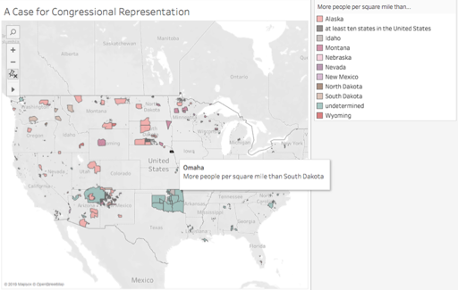
Screenshot of comparative population density.

I next wanted to recreate, in some way, the equalizing effect of the Visualizing Sovereignty project’s decision to same-size all of the Caribbean islands. But, with 573 federally recognized tribes, that seemed too ambitious for this assignment. So, I turned to video to record an exploration in zooming, giving some spots greater consideration than others, and starting in an oft-neglected place.

With Hawaii now foregrounded, the distortion of Tableau closer to the North Pole seemed too significant to neglect, so I learned a little QGIS in order to utilize its more size-righted mapping. Playing around with the new program, I found a powerful tool for foregrounding identity: labels. Merely including them turned the nonsovereign archipelago into a menacing swarm of equalized names. At all the same font size, they seemed like the Immortals of Xerxes’ Persian army, ever replenishing (as demonstrated in the linked, very rough video), regardless of how far away or close up I zoomed. They took over my RAM, slowing the display down with each change in scale, asserting themselves in greater detail the closer to the land I got and at their own pace. This view seemed to better represent the truth that contradicts Jackson’s prediction: the Indigenous have resisted and persisted despite all attempts to eradicate them. Further, this view points to the potential of collective action—a potential that may be best developed through DH, which can cut across geographic space.

QGIS view

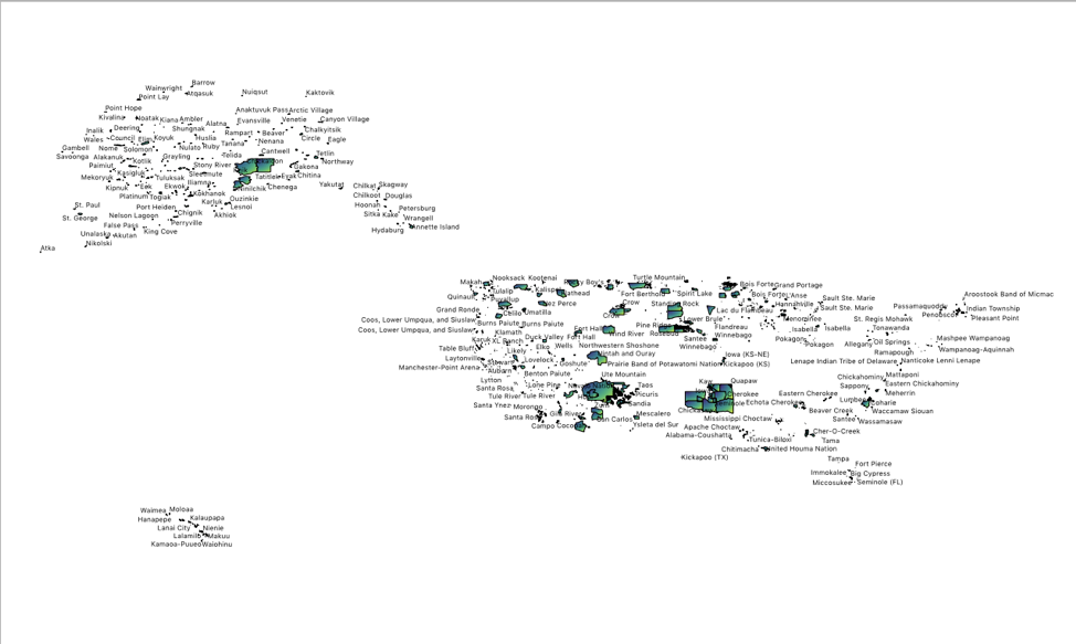
A screenshot of the labels in QGIS

This project has raised for me a host of questions. What about the nearly 300 unrecognized tribes not included by the Census Bureau? What might be revealed if data from Canada and Central America were included, restoring indigenous domains to their geographic boundaries rather than their political ones? What happens if we introduce the element of time, as Visualizing Sovereignty did, to this visualization? (And, thinking of the Sioux Winter Coat, what if that temporal consideration were made through an indigenous representation of time keeping?) What happens if we look at this data as capta, including in it profiles of those reduced to geographic entities and statistics or map views that begin from each region (for example, the Hopi are surrounded by Navajo—a very different experience from the Quinault)? And how might digital humanities provide a platform or opportunities for sharing culture and resources across these spaces and histories?


[1]For the fully appalling context, read the paragraph twelfth from the bottom of his address to Congress on December 3, 1833.  https://millercenter.org/the-presidency/presidential-speeches/december-3-1833-fifth-annual-message-congress


Praxis Mapping Assignment

My goal when approaching this assignment was to find a mapping platform that I could apply to projects at work. I work at a small history archive in Long Island City that focuses on New York City political and Queens local history. I’ve seen some archives that have developed geotagged photos to show what a specific building or street looked like at a different point in history, or some have developed “walking tours” where users can follow a predetermined path to see historic sites and have relevant photos or material displayed when they get there. While reviewing the options in “Finding the Right Tools for Mapping,” I wanted to choose something that was free and accessible for someone with limited technical skills (ahem, me). I also wanted something that had at least some interactivity instead of a static map. I first skipped over the section on ArcGIS Desktop because it’s listed as proprietary and not very beginner friendly, however, one of the strengths lists ESRI’s Story Maps which I thought would create a neat linear display that would be great for creating a historic walking tour using archival materials.

Since we only had two weeks to put together a map, I didn’t have time to do the necessary research to put together an actual walking tour using my archive’s materials – so I created a map based on various places relevant to my life i.e. where I attended school, a semester abroad, honeymoon, etc. At first, I followed the link directly to the ArcGIS Story Maps page and quickly found the classic StoryMap page and found that one to be more accessible. I created a free account and created a map with nine data points.

Original Story Map

I plotted the points but quickly realized that the map was more static than I would have liked and didn’t have the easiest navigation between the data points. It did provide more information once you clicked on one of the data points, but I felt that this would be a better option if it were embedded into a webpage or online exhibit. I looked up a few tutorials and found Story Map Tour. By this time, I had latched on to the “walking tour” idea and was looking specifically for a map that could move through the data points in a more linear fashion. The StoryMap Tour seemed to be catered for that design.

This is the map I created: http://arcg.is/1DD9m8

Creating the map: the interface for creating a story map is very user-friendly and offers a lot of options for getting your data points on the map. Images and video and can be attached to the data points of which can be imported via Flickr, Youtube or CSV file. I didn’t have enough data to attempt a CSV import, but I have reservations about the level of detail needed to capture the information and plot it on the map automatically. I also wasn’t thrilled about having to use proprietary sites to import media content, but I used so Creative Commons images to add a visual element. When importing via Flickr – I had to manually plot the points which became very time consuming. Points could also be added using a URL to media and the latitude/longitude coordinates, however, that is also only able to be done one by one and could become time consuming.

Customizing the map: there a few features that allow you to customize from predetermined choices. The data pointers come in four different colors, there are 24 options for the base map, there are 3 layout options, and a title and header section that can be customized to include a custom logo or link to a specific web page. While this may be limiting to someone who’s technical knowledge with mapping/GIS software – it worked for my needs. I was also impressed with the how close the view would zoom in onto the map which would make manually plotting points much easier. After I plotted my nine points, I went through and give each data point a title and short description. For the 9th point, I filled the description box with lorem ipsum text to get a sense of how much content could be included.

Overall, I was trying to experiment and test the features of Story Maps Tour – with the idea of a archival-based walking tour in the back of my mind – and feel comfortable that I would be able to put something together. My next step would be to attempt importing a larger data set from a CSV file in order to really test the limits. However, for smaller, more localized projects I think Story Maps is a perfectly adequate tool for beginners with limited skills and limited budget.

10/2: Mapping Praxis Assignment

When starting my project, I knew that I wanted to explore topics within archaeology. One dream of mine had always been mapping out places that had sites, monuments, or artifacts in common. For myself, this was going to be a way to try and find connections between cultures or other data points that stand out. This map that I had imagined spanned across time as well as geographic locations, a kind of combination of a timeline and global map. Since my undergraduate career, however, I quickly realized that it was difficult to accumulate that sort of data without knowing the content intimately or being shown the resources. This is since much of the data is either not published yet or down so many scholarly rabbit holes that it is difficult to track down. I also encountered this when trying to design my mapping project.

When searching for open data sets, I was also looking for something that was intriguing to me. After some time, I ended up coming across a list of archeoastronomy sites that were listed by country on a Wikipedia page. Archaeoastronomy is the study of archaeological sites that may have been used to study astronomy. The idea then popped into my head, not only to see the sites marked on a map, but to see a sort of time lapse (either during the time period of the site, if possible, or present day) of the stars from the point of view of whatever site you click on. Although I felt like the sky-gazing part of the project would not be feasible with the programs we were starting out with, I was still curious to see where these sites were located and if there were any sort of pattern. I only resided on using Wikipedia due to the topic and the fact that much of the data I was finding was not something I could map.


When starting, I decided to create an excel sheet with the columns listed as follows: Country, Site, Location, and Coordinates (later separated to Latitude and Longitude). In order to get the coordinates for each site, I searched for the sites on Google Maps. Of course, this means that I was relying on the accuracy of Google Maps, but since there was no other way I could get the coordinates without physically being on site, it worked.

This process was interesting for many reasons. First, I noticed that there were some sites where their exact locations were not published, such as the Puyang tomb located in China. When trying to search for this site, on both Google Maps and through the search engine, there was no mention that I could find that clearly stated the location; not even an area that it was near besides Puyang. Thus, this coordinate was left blank. Some other locations that were like this one, I just used the coordinates for the nearest town. What stood out to me about this was that I did not have this trouble with any of the Western countries. Many of the Western locations were either more well-known or better mapped than those in Non-Western locations. This, however, also lead me to think that maybe the exact location for some of these sites were kept secret for a reason. When I was on a dig (one that had not been published yet) we were always told to not tell any of the locals that we were digging at an archaeological site. This was to keep away any potential looters.

In addition to this, there were topics on the Wikipedia page such as Nuraghi in Italy. A Nuraghe is a type of archaeological structure that is located all over Italy. Since this is something that appears many times in many different locations, it was not something that I could use as data points. The others that showed up like this were the temples on Malta and the Funnel-Beaker culture that appeared in Finland and ended up spreading throughout the Mediterranean.

On the opposite end to this, the listing for India was so extensive that many names were left off the list and the reader was referred to a book that discussed archaeoastronomy at sites located in India.

Being able to go through the names one by one on Google maps, although time consuming, was also fun for me because I was able to see sites that I have never seen or heard of. It was so interesting and made me even want to visit some of these sites one day.

When going to use a program, I checked out a few from the article we read but I eventually settled on QGIS. I am not sure what I was expecting (having never used a mapping program before) but this was not it. There was nothing to show me how to get started or where to go for even the simplest of things. Thus, I went to Google.

The first thing I knew I wanted to do was have a world map background to be able to map my coordinates. Eventually I came across a YouTube video that showed me how to set up three different types of map backgrounds, a regular map, a terrain map, and a satellite map. I decided that I would just use the regular and terrain maps.


Once I got the map background, I needed to figure out how to set up the coordinates. I ended up finding a tutorial page on how to import spreadsheets. This is when I had to separate my Coordinates column to Latitude and Longitude so that the information could import properly. Once imported, the items only showed as dots to mark the coordinate spots. After some searching and exploring the program some more, I was able to figure out how to add site labels to the dots. Once the labels were up, I noticed that there were some letters with accents and from other alphabets that did not transfer over well from my spreadsheet. I took some time to see if I could edit the labels within the program itself or, if I were to edit the labels within my CSV file, if I could overwrite the information I previously imported for more up-to-date information. I was not able to figure it out or find it online, so I just edited my CSV file and imported a new layer, deleting the previous one.

The next step that I tried doing was to see if the labels could only show if you were to either hover over the dot or clicked on it. I saw a few pages that were talking about how to set up the map for the web where you could use HTML and have the labels activated on hover. The problem with those pages, however, was that there were plugins that had to be installed in order to do this. The different plugins that I was told to search for never ended up showing up on QGIS for me. I am not sure if this was due to the fact that the plugins I was showed were out of date or if they were renamed. Whatever the case might be, I was not able to figure out how to do the pop-up labels.

If I had more time and a place I could go to look up different things that could be done in QGIS (a documentation file that is updated?) I think I would enjoy using QGIS. I am not sure, though, if QGIS would be able to support my original idea of being able to show a time lapse of the sky (though if it could be in the form of a video maybe that could work?). I have attached a PDF of the map I made down below.

Reconciling with the Archive

I’ve been looking forward to this week’s readings since the intersection of DH and the Archives is what I’m most interested in. However, in an effort to be totally transparent, I found myself reflexively being defensive when reading through Daut’s article the first time – there’s a history of archivists struggling to be recognized as professionals in their own right – and had to reread with a conscious effort to keep an open mind in case my own bias was keeping me in an old pattern of thinking.

In terms of access, I think Daut framed her discussion of decolonizing archives and repatriating Haitian documents in a way that exemplified discussions that archivists are having. I think in most disciplines there is a push back against the white/straight/male version of history that is commonly reflected in archival holdings and there has been a real effort in recent years to include materials that more accurately reflect a realistic historic record. I’m also glad she included Revue de la Société Haïtienne d’Histoire, de Géographie et de Géologie in her discussion about digitization. It echoes the same sentiments that was expressed in “Difficult Heritage…” from last week’s readings. Just because there are documents that can be digitized and available universally, it doesn’t mean that ethically they should.

I couldn’t overcome my bias during Daut’s discussion in the “Content” section as she advocates avoiding the “citizen historian” or crowdsourcing model in regards to digital scholarship and working with the materials. She says “Without a doubt, neither trained archivists nor traditional historians can be replaced in digital historical scholarship.” However, she continues on to discuss the contributions of “historian archivists” which itself diminishes the expertise and training of professional archivists. I think there is a clear difference in being trained to recognize and describe meta/data from documents and being a subject expert (historians) on the content, but both are needed in order to to fully engage with the data presented. This is a discussion that comes up from time to time in the archives profession and something I wanted to mention, but I do not want to devote too much space in this post to it.

Daut’s discussion on curation and context is a mixed bag for me, and I believe its because the term “archive” means something different to me. When Daut mentions that “Digital archiving projects…teach the reader/user the significance and importance of a defined set of documents…” that seems more like a digital project than an archive. By having a creator limit the documents that are used, it might restrict information that could potentially contribute to scholarship. The large amount of materials available in an archive (hopefully) means that no matter what question a researcher is trying to answer they have the resources to do so. That being said, I think that deeper evaluation of archival sources can contribute meaningfully to scholarship. In the case of Digital Aponte, a space was created for the absence of archival material. I thought the Digital Aponte project was a great way to carve out space for a gap in the archival record and to compile secondhand accounts in an effort to recreate some of what was lost. I particularly liked the interdisciplinary nature of the website and how there were sections devoted to genealogy and mapping, all while allowing annotations to encourage collaboration across multiple disciplines. Trying to center and create an environment that resembled Aponte’s Havana also adds necessary contextualization. I’m excited to hear Ada Ferrer’s description of the project during class.


No Visualization Without Representation!

Searching for new forms of representation through visualization generates an entire new discussion in the digital humanities about how standard representational tools through visualization are insufficient and even harmful to the complexities present in analytical studies. We needed to ask ourselves, what is data? How are we representing it? And what effect does what we choose to represent and what we neglect to represent have on the processes of knowledge creation and consumption?

We first start by unpacking data. Johanna Drucker leads us through a reconceptualization of data as capta. As a humanist, this notion might be intuitive, perhaps, never articulated in this way before but you have a sense that you always knew this to be true. The fact is; data collection is a selective process, taken not given. Under this premise, historians are trained to be initially skeptical of all data and to investigate all possible factors that surround a dataset (documents, artifacts, human remains). Through this methodological approach, data collection becomes a multi-layered selective process – natural selection of surviving material objects, artificial selection by historical preservation, and the final selection made by the historian for further analysis.

Once we have our data as capta, how do we represent it visually? Therein lies the question at the heart of this conversation. There are many representational concerns that arise. What features of the data do we represent? When we centralize a feature, does it have a trivializing effect on other features?  How are western epistemological frameworks unsuitable for the representation of indigenous cultures? And how do we make visualization more dynamic to represent temporality and spatiality?

Joseph Stalin is often credited with the statement “A single death is a tragedy; a million death is statistics”. This quote really puts into focus the value of holistic representation. Stalin who is arguably the most murderous political leader of the 20th century with an estimate of 14-20 million people killed as a result of his policies, understood how visualization decontextualized from representation was a useful scheme for the implementation of bolshevism in the Soviet Union. Lev Manovich has an argument to make on the practices of information visualization (infovis), a field which has continuously relied on graphical primitive substitutions (dots, dashes, lines,  curves, geometric shapes) for data objects (people, animals, places, material objects, complex ideas) divorced from any substantive representation. For example, replacing a firefighter with a dot on a scatter plot, eliminates all elements but the singularity of his/her/their person. It does not distinguish him/her/them from the 1st grader on the same scatter plot. Graphical primitives gives us nothing of value to contextualize quantitative information other than visual add-ons such as color or size. Graphical primitives are the tip of the iceberg, an optical fallacy that leads us to make incorrect or incomplete assumptions about the data object which is harmful when it has a direct hand in policy making. Direct visualization uses techniques such as miniaturization, tag, cloud, and indexing, which reduce but also preserve the original form of the data object by presenting small or shorthand versions of the original object.

Standard visualization practices are harmful when one epistemology assumes authority over knowledge processes that belong to other epistemologies. Indigenous data and artifacts removed to and created within the traditional western epistemological framework are intractably situated in what Amy LoneTree calls a ‘Difficult Heritage’—meaningful but interpretively problematic. Non-indigenous processes are by design problematic for the study of Indigenous people. They are rooted in the same historical paradigms that legitimizes the ideal of manifest destiny (indigenous land grab) as American exceptionalism and lionizes Andrew Jackson the architect of the Trail of Tears as Old Hickory. The right system for approaching studies of indigenous communities is substantively irreconcilable with the former. Digital humanists today must reconceptualize their entire methodological and theoretical approach to studying indigenous communities. Firstly, it is imperative that indigenous voices are framing the ‘what’ how’ and ‘why’ of knowledge creation as well as curating access to material around their sensitivities and not that of the West.

Visualization is also confronting the representation of temporality and spatiality. The primacy and immediacy of space as the favored medium of graphical and textual representation is a challenge for digital humanists who want to err from that path. Space is a useful medium for arranging objects and ideas in a way that declares certainty, rationality, and finality, a false premise to begin with once we understand data as capta. Moreover, spatial delineation is harmful especially when it forces analysis into binary categories of representation such as gender.  

Reflection on the Python Workshop

I attended the Python workshop on Wednesday night. Although I have spent probably about 200 hours coding in the last 5 years, this was the first time since 2013 that I have received in-person instruction in a coding language. I had never reflected on how self-directed and self-taught my coding experience has been thus far, and I find that one of my biggest takeaways from the Python workshop is a sense of empowerment about my own ability to teach myself to use code. (Not “code,” but “use code,” probably a similar distinction to Micki’s “I am a hacker, not a coder.”) I’d say I was already comfortable with about 90% of the material covered, but dang, has that 10% filled my brain for the last 28 hours.

I was first exposed to coding in my first year of college, when I took a course called “Data Driven Societies” to fulfill a math requirement. We learned Excel and some basic R to perform statistical analysis and make charts in ggplot2. Since then, I have learned R on and off exclusively through applied projects: an independent study (with a non-coding History professor), a summer internship (for a non-coding boss), an honors project (with a non-coding English professor), and a couple personal projects. It’s not until right now that I recognize that 1. I have done a lot on my own and am proud to feel the results of that work, and 2. It feels SO good to learn from a real person and to know that the troubleshooting sessions in my near future can involve more than just me searching in Stack Exchange. I am excited to reach out, and to embrace this physical, interpersonal aspect of coding that I haven’t connected with in years. Hooray for analog help on digital questions!

On that note, everyone in the workshop was given a pink and a green post-it to signal “I’ve completed the latest task” or “wait, I need help.” This not only gave an easy, non-verbal way to ask for help or more time, but also made it physically clear that each and every person in the workshop had the right and the means to do so. I like that this expectation was set so concretely, and think it helped make for a workshop with a pace and style that would feel accessible even to someone who considers themselves an absolute beginner. 

Re: Shani’s allusion to my analog solution — Rafa wanted to use the blackboard behind the projector screen, but without turning off the projector there was no apparent way to turn off/down the projected image. So I got up and put my pink post-it over the projector lens, and cut the image off at the analog level, rather than the digital. Which, along with the unexpected joy of being taught Python in a human voice, has now gotten me thinking about how I love analog and digital best when they work together. I love reading about coding projects on printed pages, and also experiencing those projects online. And I love iterating between the two myself: my hand and my consciousness feel resonant when I underline and annotate with a pen, and then again when I turn my fingers to my keyboard to compose new thoughts on a screen. I learn best when I have both. I’m very grateful for this workshop’s simple but profound reminder that and code help, along with code, comes from humans, and it takes only a little bit of effort for me to get myself into the same room as those humans and talk in more than ones and zeros. 

Python Workshop

The Python workshop Wednesday evening stepped us through the command line in terminal, and some basic Python in an editor of our choice– i took the opportunity to try out VS Code which is what was recommended for the workshop.
Even though the workshop was officially full, people from the waitlist were able to join, and I think some walk-ins as well. There were laptops on hand for people to sign for and use if necessary.

The main instructor, Rafa, stepped us through the instructions using GitHub, and I found it helpful to have some passive exposure to GitHub, together with his supportive assurances not to be put off by the busy interface. He also had sent us very easy-to-follow (though also, somewhat intimidating-seeming to me) instructions in advance about what we needed to download to get our machines ready for the workshop, and how to do this.

The general material covered was the usual basic intro to Python– data types (integers, floats, strings, booleans, and lists), and some basic concepts and functions– the “type” function, arithmetic operations, variables, and the “for” loop. Although the material was already familiar to me, I found it really helpful to have a systematic, generously- and thoughtfully- paced, step-through of these fundamentals. Rafa was very clear and very attentive to the group and individuals; there was also individual support by Filipa.

I found this to be a great opportunity to meet a couple of the digital fellows:
https://digitalfellows.commons.gc.cuny.edu/about/people/ . I know that the CUNY Digital programs offer so much great support, but it can be hard to take a first step in reaching out. I now feel i would be more comfortable about contacting Rafa or Filipa for support.

A highlight of the evening was Eva suggesting an “analog” solution to a tech problem that arose. When Rafa wanted to use the blackboard without having to turn and re-start the projector…. maybe somebody else will want to tell about that…

Difficult Readings: Data Visualization

I struggled a lot with this week’s readings.

Some of my difficulty is simple and individual– I’ve no experience producing data visualization, and little experience thinking about it. And also some suspicion about how “the sheer power of the graphical display of ‘information visualization’ (and its novelty within a humanities community newly enthralled with the toys of data mining and display)” can lead to sloppy use of data visualization. Although I recognize the potential of Data Visualization, I feel that the limited examples I have seen in my field have been superficial use of “the Shiny” intended to impress rather than to inform or provoke thought.

Some of my difficulty might be trivial, or maybe a sign of my outdated sensibilities: i noticed many more small errors in this week’s readings than in previous weeks– imperfections that heighten my sense that there is too much info being transmitted too quickly, without time or need for careful copy-editing, sacrificing precision and clarity; a sense that the authors may somehow feel that all since human communication is reductionist and transient, they just need to get their texts to be comprehensible-enough, and that any effort to achieve greater accuracy would be past some point of diminishing returns. One example that struck me in Drucker:

A bar chart could compare daylight hours at different longitudes, or the average size of men and women in different countries…

when what was meant was something like:

the average size of *the population of* men and women…“.

(This not only makes more sense, but is clear from the description of the bar chart beginning two paragraphs down: “As an example, we can use that bar chart mentioned above, one that compares the percentage of men and women in various national populations at the present time”).

Manovich has many small syntactic errors, and I find that the effort it takes for me to correct for these (whether more or less consciously) comes at the expense of the energy i have for grasping and analyzing the arguments.

But the real motivation for my writing this post is: I am finding this week’s readings confronting as far as the limitations of DH.

Partly in a good way— i have been nodding along vigorously with our earlier readings, and suddenly my moral commitment to full open access is challenged by Guiliano’s and Heitman’s arguments in favor of considering restrictions to accord with the needs, rights, preferences of indigenous people. I am feeling some resistance to having my views challenged, with no appealing solution being offered as an alternative. I have become so accustomed to seeing multiplicity and customization as a solution to conflict– but it is not possible to make sensitive data selectively available in ways that will resolve the tension between, for example, a gender-restrictive tribal tradition and a woman within that traditional community who wants access to her family’s records, and my feminist values…. This is probably an important discomfort.
(note: when i say “not possible”, i do not just mean technically– the issues that Ashley addressed; i mean the ethical clashes between the right-to-know value of transparency and the right-not-to-be-exposed value of privacy and confidentiality).
More difficult: although I love Drucker’s insistence upon “capta”, which accords with some of our earlier readings about all texts being interpretation, and pushes these ideas further…. I find parts of her advocacy of more subjective representation to be somewhat inconsistent, incoherent, or maybe just beyond my capacity.

And, the reading that brought me here: the framing of Manovich’s attempt to advocate for “Direct Visualization” by presenting three examples. I am once again resistant as I read this, in part because he is trying to make a case that these are “direct” rather than “reductive”. Because I’ve already been convinced by our other readings, and life experience, that all representation is reductive. So I’m intolerant of his binary advocacy of “direct” visualization as an ideal alternative. I’d be much more open to hearing how and to what extent the different projects bring mediated, curated, or direct engagement with the user instead of feeling subjected to a defense of his pre-determined verdict that they are direct. This makes me think of Matt’s statements about the Digital Debates series– that it was important to insist upon contributions with “an argument” rather than simply descriptive case studies….

EDIT: I wrote this on monday, and let it sit. After a Text Analysis class last night, I am less troubled by Manovich. Now I would say instead that I reject his binary approach and his advocacy. I think that there are ways that Data Visualization can allow users’ more direct engagement with data and interpretation than other modes of presentation, and that such immediacy can have benefits, but that there are times when a more curated presentation might have greater benefits– and that the most important value, as we discussed last week, is for researchers to be as reflective and clear as possible about their aims, perspectives, data selection, limitations, and other aspects of their research and how they share it.

I am still feeling challenged by this week’s readings, but less grumpy about it because of the gift of Drucker’s formulation about all “data” being Capta.