
Author Archives: Shani Tzoref
Towards a Text Analysis of Gender in the Psalms of Solomon
My initial intention for the Text Analysis praxis was to try to follow the procedure recommended by Lisa Rhody in the Text Analysis course I am taking this semester, as outlined in the article “How We Do Things With words: Analyzing Text as Social and Cultural Data,” by Dong Nguyen, Maria Liakata, Simon DeDeo, Jacob Eisenstein, David Mimno, Rebekah Tromble, and Jane Winters. https://arxiv.org/pdf/1907.01468.pdf. They identify five project phases (1) identification of research questions; (2) data selection; (3) conceptualization; (4) operationalization; (5) analysis and the interpretation of results.
1. Identification of Research Questions: I realized that my research aim was not really a question, but something more like: play around with text analysis.
2. Data Selection: To select my data, I decided to work with texts that I have worked on in my biblical research. I had initially thought to work with a legal term that appears in talmudic texts. I found an open access digitized corpus of the Talmud online (at https://www.sefaria.org/), but I lacked the programming skills to access the full corpus, scrape, and search it.
So I decided to work instead with the Psalms of Solomon– a collection of 18 psalms that is dated to the 2nd century B.C.E. I am currently writing an article based on a conference paper that I presented on gender stereotypes in the Psalms of Solomon. My delivered paper was highly impressionistic, and quite basic: introducing simple premises of gender-sensitive hermeneutics to the mostly-male group of conference participants. In selecting The Psalms of Solomon for this praxis, I can pull together my prior “close reading” research on this text, with the coursework for the 3 CUNY courses I am taking this semester: our Intro course; the “Text Analysis” course, in which the focus is “feminist text analysis”; and Computational Linguistics Methods 1.
Since the Psalms of Solomon is just a single document, with 7165 words (as I learned from Voyant, below), it does not lend itself to “distant reading”. I simply hoped it could serve as a manageable test-case for playing with methods.
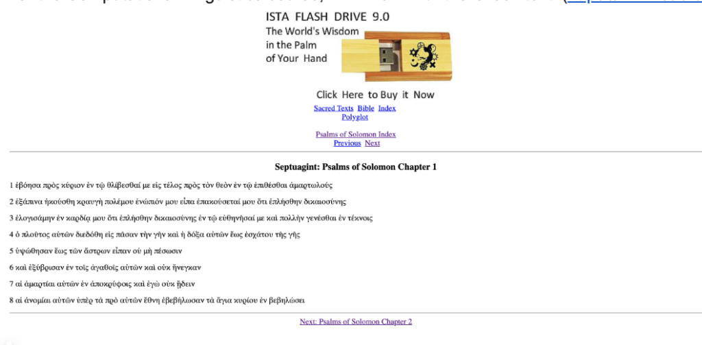
For the Computational Linguistics course, I will work with the Greek text. (https://www.sacred-texts.com/bib/sep/pss001.htm
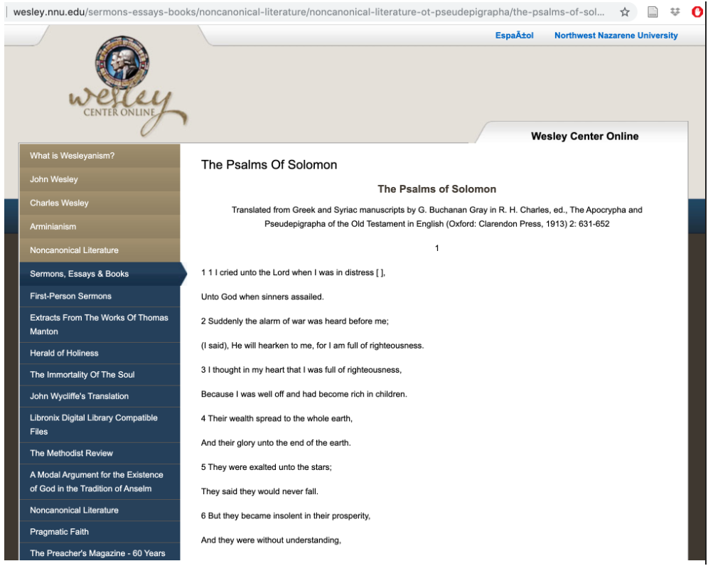
For our praxis, I thought it more appropriate to work with the English translation:
http://wesley.nnu.edu/sermons-essays-books/noncanonical-literature/noncanonical-literature-ot-pseudepigrapha/the-psalms-of-solomon/
(3) Conceptualization: since my main aim was to experiment with tech tools, my starter “concept” was quite simple: to choose a tool and see what I could do with the Psalms of Solomon with this tool.
(4) operationalization: After reading Amanda’s blog post about the Iliad, (https://dhintro19.commons.gc.cuny.edu/text-analysis-lessons-and-failures/) I mustered the courage to create a word cloud of PssSol with Voyant.
https://voyant-tools.org/?corpus=a748e4c58fbb317b36e0617bf8b61404

(5) analysis and the interpretation of results.
The most frequent words make sense for a collection of prayers with a national concern, and aligns with accepted descriptions of the psalms: “lord (112); god (108); shall (73); righteous (38); israel (33)”. The word “shall” is introduced in the English translation, since Greek verbal tenses are built in to the morphology of the verbs. I was pleasantly surprised to see that the word cloud reflects more than I would have expected. Specifically, it represents the dualism that is central to this work: the psalms ask for and assert the salvation of the righteous and the punishment of the wicked. I reduced the number of terms to be shown in the word cloud, and saw the prominence of “righteous”/”righteousness”, and “mercy”, as well as “pious”, and also “sinners”, though less prominently. In an earlier publication, I wrote about “theodicy” in the Psalms of Solomon– the question of the justness of God as reflected in divine responses to righteousness and evil.
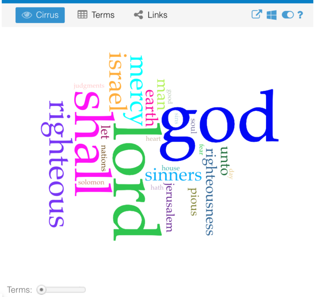
Viewing this visualization of the content of Psalms of Solomon with my prior publication in mind made me feel more comfortable about Voyant, even though it just displays the obvious.
Setting the terms bar to the top 95 words further strengthened some of my warm fuzzies for Voyant. Feeling ready to step up my game, I tried to return to Step 3, “Conceptualization.” I know I want to look at words pertaining to gender. But I find myself stuck as far as I can get with Voyant.
In the meantime, I’ve met with my Comp. Linguistics prof., and my current plan for that assignment is to seek co-occurrences for some some gendered terms: possibly, “man/men” (but this can be complicated, because sometimes “man” means male, and sometimes it means “person”, and, as is well-known, sometimes “person” sort of presumes a male person to some exgent); “women“, “sons” (again, gender-ambiguous), “daughters“; maybe verbs in feminine form.
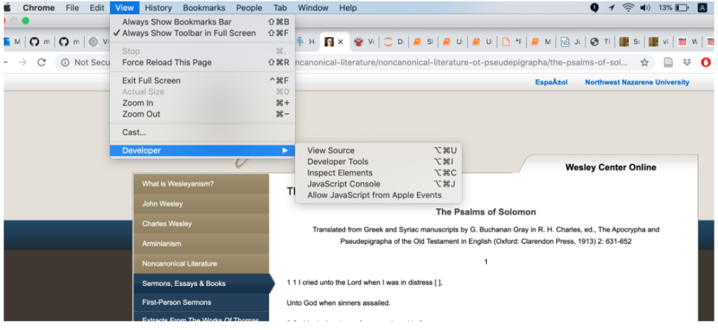
At this point, I only reached the stage of accessing the source code, which, on my machine, I do as follows:
This yields:
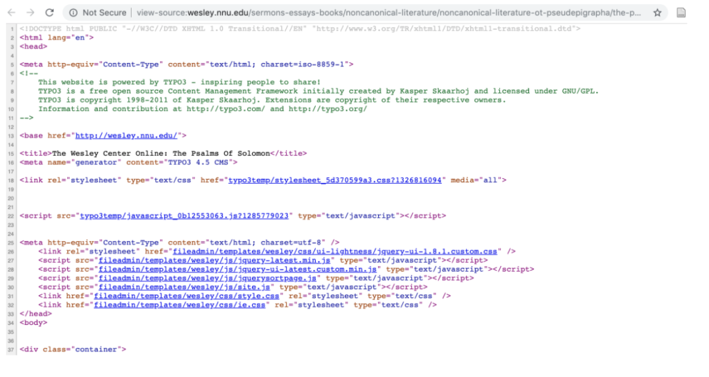
I find this very exciting, especially the part that contains the text:

As it turns out, the code for the Greek is actually simpler than the code for the English:

I’m looking forward to working with this text, but this is as far as I’ve been able to get up to this point. My first task is to collect all of the 18 Psalms into a single file, by iterating over the URL, since the website for the Greek text has a separate page for each psalm. Then, I will think about what to search for, and how….
Infrastructure in the news
Our readings for yesterday illuminated these news items for me:
https://www.huffpost.com/entry/alexandria-ocasio-cortez-mark-zuckerberg-political-ads_n_5db0afa6e4b0d5b789454272 , esp. from 1:30, and the response, “Congresswoman, I would say that we’re not the one assessing…” (resonating esp. with Posner’s “See no Evil”).
and https://www.technologyreview.com/s/614487/meet-americas-newest-military-giant-amazon/?utm_campaign=site_visitor.paid.acquisition&utm_source=facebook&utm_medium=tr_social&utm_content=keywee_paywall_retarget&kwp_0=1416678&fbclid=IwAR0Q6y3B6ZG100sBJS5QytU4SLBi-D09P3psgeWTa3WjWCQsXaqeUbmJ-6s
Last August, I was among a group of people arrested with an organization called JFREJ, at an event calling attention to Amazon’s role, with Palantir, in supplying surveillance tech to ICE. At a follow-up meeting, the question arose of whether to boycott Amazon. Reading this article led me to think about the likely demographic overlap of Americans who boycott Amazon (on policy grounds like these, rather than the consumption ones we discussed in class yesterday) and those who subscribe to the Washington Post. Bezos and Trump seem so similar and aligned in many ways, even as they perpetuate their public images as political and personal rivals. And as Bezos’ newspaper tries to profess and promote an ethics of care. The invisibility of tech makes it hard to figure out infrastructures, as I think was implied in Star’s article. And makes it harder to identify, and align with, the good guys.
first steps to mapping “State-Enforced Family Separation in the 20th century: Towards a Global Conversation”
Since I have no experience with mapping, or other graphing or visualization tools, I felt at a loss to begin working on this assignment. I tried to consider a number of topic options, but one kept recurring. The phenomenon of state-enforced family separation in the 20th century is a topic I have wanted to explore since February 2018 when I attended a conference in Moscow and heard a paper entitled “Desired Children – Transnational adoption of Jewish child survivors in the immediate aftermath of Second World War.”
Much of the information that is accessible about the phenomenon of forced adoptions in the 20th century is brought to light by scholars and activists working in a particular region, often with significant personal investment in the history that they study and expose. I believe that a global conversation could help specialists working with these histories, particularly through: the validating process of being heard by sympathetic listeners outsides one’s own “bubbles”; comparison of research methods; comparison of experiences–biographies, healing, justice. Our mapping assignment struck me as an opportunity to think again about how I could facilitate such a conversation.
With trepidation, I turned to Olivia Ildefonso’s, “Finding the Right Tools for Mapping“, hoping I would find something that would feel accessible.I arranged time to work at the library so I could plunge right into the powerful ArcGIS on one of the library’s desktops. But the machine felt foreign, and I decided to try QGIS instead–it’s open source, and would work on my MacBook, so I might feel more comfortable. All I managed to do was to open an account and download the software and become re-intimidated. Since I had arranged to meet with Micki, I hoped she might be able to give me some magic key. In our meeting, Micki focused on the importance of choosing a realistic and appropriate question and data set.
Whereas I saw the assignment as primarily an exercise in using the digital resources, I understood Micki’s perspective to prioritize thinking in map form, and then afterwards finding appropriate digital tools, preferably as simple as possible.
My notes from the meeting read:
- a question worth asking
- a data set we can ask it of
- a way of measuring that data that makes sense
I also have a few hand-drawn maps and diagrams that Micki created at our meeting, trying to help me think of other topics I could work on that would be more manageable than the highly-sensitive and complicated one I had suggested. Something that would not need an extensive investment of time in research and collection of data, but could still involve some creative conceptualization.
But I still felt stuck. I tried looking at Tableau and still could not find a way in to this world of mapping…. After our last class session, when Matt said our map topic could be as simple as something like “the last 5 places we’ve visited”, I decided that I would stick to the general topic I had chosen, but without asking any of the complicated questions that are on my wish-list to open up.
I adopted the simple aim of plotting out 5 of the locations that I would want to include in a conversation that would bring together experts who research the topic of family separation in their home countries: The “Stolen Generations” in Australia, which I learned about when I lived in Sydney; the “Yemenite, Mizrahi, and Balkan Children Affair” which I learned about while living in Israel; the “Kinder der Landstrasse” and “Verdingkinder“ in Switzerland; the “Lost Children” of Francoist Spain, and the “Sixties Scoop” in Canada.
And I decided to try Story Maps, since Robin had been very encouraging about its accessibility. At first, I found myself in a loop of Story Maps options, signed up (again?) for a trial of ARCGIS to gain access, and tried to check out “learning options”, before finally stumbling upon a template that seemed useable.
I typed in my title– and saw that I could not control spacing or placement of the words. I adjusted the title, using the subtitle option, and once I became prepared to relinquish control, I did find the software to be quite user-friendly. It helped me to finally achieve my starting-point goal of a map that showed 5 places that were relevant for the topic of 20th century state-enforced family separation.
I could see how uninformative it was, but also felt I had a framework into which I could begin inserting information. So I added some data for each of the numbered locations, which would appear with hover feature:
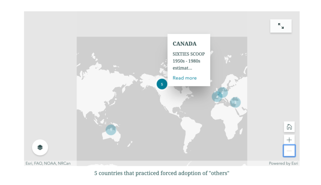
I then re-numbered the countries to try to reflect some chronological order of when the policies of family separation were in place. Because of overlaps, I did not see how to make this order apparent to a user, though it did help me with my own visualizations, from Australia (#1) where policies began already in the 19th century, through Canada (#5) where they began in the 1960s and seem to have continued later than in the other countries.
This very basic map, which managed to communicate at least something, at least to me, emboldened me to revise my minimal goal and try to produce a map that communicated the factors underlying the family-separation policies in some of the different locations. Twentieth-century western governments removed children from their families when they perceived the birth families as being of some “inferior” ethnicity/race, political affiliation, and socio-economic class. Racial/ethnic factors were relevant in four of the five countries I had chosen to mark on the map: Australia, Canada, Israel, Switzerland (Kinder der Landstrasse). Politics was the factor in Francoist Spain.
Australia and Switzerland also had socio-economically-based policies/practices of family separation: Australia’s policy is sometimes called the “stolen white generations”, and in Switzerland, the Verdingkinder, “the contract children”, or “indentured child laborers”. This would mean figuring out how to include 2 factors in one location.If I managed to show the Verdingkinder factor in Switzerland, then I would add Ireland as an additional location that forced adoption on a socio-economic basis…. And maybe add Argentina as another location for political theft of children… And maybe figure out how to add data about the widespread policies and practices of removing children born to unwed mothers….
But… I was unable to figure out how to color-code in the Express Map, and still cannot think of a way to mark the factors by category using the tools that I see in the template.
Since it is nearly time for class I am submitting this blog post with a link to the sad-looking product of my efforts, but with some guarded optimism about having embarked on a process, and maybe beginning to at least be able to formulate questions about how to move further.
https://storymaps.arcgis.com/stories/cd582eb6436d47a88aae29724750c78c
Python Workshop
The Python workshop Wednesday evening stepped us through the command line in terminal, and some basic Python in an editor of our choice– i took the opportunity to try out VS Code which is what was recommended for the workshop.
Even though the workshop was officially full, people from the waitlist were able to join, and I think some walk-ins as well. There were laptops on hand for people to sign for and use if necessary.
The main instructor, Rafa, stepped us through the instructions using GitHub, and I found it helpful to have some passive exposure to GitHub, together with his supportive assurances not to be put off by the busy interface. He also had sent us very easy-to-follow (though also, somewhat intimidating-seeming to me) instructions in advance about what we needed to download to get our machines ready for the workshop, and how to do this.
The general material covered was the usual basic intro to Python– data types (integers, floats, strings, booleans, and lists), and some basic concepts and functions– the “type” function, arithmetic operations, variables, and the “for” loop. Although the material was already familiar to me, I found it really helpful to have a systematic, generously- and thoughtfully- paced, step-through of these fundamentals. Rafa was very clear and very attentive to the group and individuals; there was also individual support by Filipa.
I found this to be a great opportunity to meet a couple of the digital fellows:
https://digitalfellows.commons.gc.cuny.edu/about/people/ . I know that the CUNY Digital programs offer so much great support, but it can be hard to take a first step in reaching out. I now feel i would be more comfortable about contacting Rafa or Filipa for support.
A highlight of the evening was Eva suggesting an “analog” solution to a tech problem that arose. When Rafa wanted to use the blackboard without having to turn and re-start the projector…. maybe somebody else will want to tell about that…
Difficult Readings: Data Visualization
I struggled a lot with this week’s readings.
Some of my difficulty is simple and individual– I’ve no experience producing data visualization, and little experience thinking about it. And also some suspicion about how “the sheer power of the graphical display of ‘information visualization’ (and its novelty within a humanities community newly enthralled with the toys of data mining and display)” can lead to sloppy use of data visualization. Although I recognize the potential of Data Visualization, I feel that the limited examples I have seen in my field have been superficial use of “the Shiny” intended to impress rather than to inform or provoke thought.
Some of my difficulty might be trivial, or maybe a sign of my outdated sensibilities: i noticed many more small errors in this week’s readings than in previous weeks– imperfections that heighten my sense that there is too much info being transmitted too quickly, without time or need for careful copy-editing, sacrificing precision and clarity; a sense that the authors may somehow feel that all since human communication is reductionist and transient, they just need to get their texts to be comprehensible-enough, and that any effort to achieve greater accuracy would be past some point of diminishing returns. One example that struck me in Drucker:
“A bar chart could compare daylight hours at different longitudes, or the average size of men and women in different countries…“
when what was meant was something like:
“the average size of *the population of* men and women…“.
(This not only makes more sense, but is clear from the description of the bar chart beginning two paragraphs down: “As an example, we can use that bar chart mentioned above, one that compares the percentage of men and women in various national populations at the present time”).
Manovich has many small syntactic errors, and I find that the effort it takes for me to correct for these (whether more or less consciously) comes at the expense of the energy i have for grasping and analyzing the arguments.
But the real motivation for my writing this post is: I am finding this week’s readings confronting as far as the limitations of DH.
Partly in a good way— i have been nodding along vigorously with our earlier readings, and suddenly my moral commitment to full open access is challenged by Guiliano’s and Heitman’s arguments in favor of considering restrictions to accord with the needs, rights, preferences of indigenous people. I am feeling some resistance to having my views challenged, with no appealing solution being offered as an alternative. I have become so accustomed to seeing multiplicity and customization as a solution to conflict– but it is not possible to make sensitive data selectively available in ways that will resolve the tension between, for example, a gender-restrictive tribal tradition and a woman within that traditional community who wants access to her family’s records, and my feminist values…. This is probably an important discomfort.
(note: when i say “not possible”, i do not just mean technically– the issues that Ashley addressed; i mean the ethical clashes between the right-to-know value of transparency and the right-not-to-be-exposed value of privacy and confidentiality).
More difficult: although I love Drucker’s insistence upon “capta”, which accords with some of our earlier readings about all texts being interpretation, and pushes these ideas further…. I find parts of her advocacy of more subjective representation to be somewhat inconsistent, incoherent, or maybe just beyond my capacity.
And, the reading that brought me here: the framing of Manovich’s attempt to advocate for “Direct Visualization” by presenting three examples. I am once again resistant as I read this, in part because he is trying to make a case that these are “direct” rather than “reductive”. Because I’ve already been convinced by our other readings, and life experience, that all representation is reductive. So I’m intolerant of his binary advocacy of “direct” visualization as an ideal alternative. I’d be much more open to hearing how and to what extent the different projects bring mediated, curated, or direct engagement with the user instead of feeling subjected to a defense of his pre-determined verdict that they are direct. This makes me think of Matt’s statements about the Digital Debates series– that it was important to insist upon contributions with “an argument” rather than simply descriptive case studies….
EDIT: I wrote this on monday, and let it sit. After a Text Analysis class last night, I am less troubled by Manovich. Now I would say instead that I reject his binary approach and his advocacy. I think that there are ways that Data Visualization can allow users’ more direct engagement with data and interpretation than other modes of presentation, and that such immediacy can have benefits, but that there are times when a more curated presentation might have greater benefits– and that the most important value, as we discussed last week, is for researchers to be as reflective and clear as possible about their aims, perspectives, data selection, limitations, and other aspects of their research and how they share it.
I am still feeling challenged by this week’s readings, but less grumpy about it because of the gift of Drucker’s formulation about all “data” being Capta.
Blog Post for Week 2: Readings & Websites
*Note: please excuse the amateur and possibly excessive use of links in this post. It’s about the only “extra” thing i know to do on a blog post besides enter text, and I might have gotten carried away.
What jumps out at me most about the websites is that the ECDA and Caribbean Digital sites reflect more traditional humanities endeavors of pedagogy and research—with a high degree of political consciousness, aims, and praxis—while the Create Caribbean and Separados sites strike me as something more like an “application” of digital humanities in the service of socio-political transformation and activism. The former sites are driven by scholarly disciplinary interests while the latter ones arose as responses to “real-life” needs.
All of the sites reflect an awareness of the political power of digital humanities and a commitment to using that power for social transformation, as well as a commitment to maximizing the opportunities afforded by the multidisciplinary nature of DH.
ECDA states its aims:
Produced in 2011, the website emerged as an archiving project, which understood its potential for use in decolonization, from within its own disciplinary perspective, while adopting a critical approach to the status quo of the discipline, and also looking outward. This resonates with the intro to the 2012 Debates volume, The Digital Humanities Moment:
ECDA aimed to accomplish both. It is primarily a Caribbean Studies project website, but it recognizes DH as a way to “disrupt… the academic practice” of the discipline.
I see the relationship between Caribbean Studies and Digital Humanities in the SX/Caribbean Digital conference websites as being more integrative. I might be over-reading the chronology as indicative of development, but I see this site (or is it a collection of sites?) as incorporating the stage described in the intro to the 2016 volume, Digital Humanities: The Expanded Field. The content, descriptions, and documentation of the conferences reflect an expansion of the “Big Tent”, in practice (scope and scale) and in the expanded metacognitive discourse about the definition, scope, and scale of DH. (Thanks to Zach Muhlbauer, who brought up the “metacognitive” aspect of DH, and the term, in our breakout group in class in Week 1).
Although it was launched at roughly the same time as the Caribbean Digital site, in 2014, the Create Caribbean website strikes me as embodying the motivations and mentalities outlined in the intro to the 2019 Debates volume, A DH that Matters.
Both Caribbean Digital and Create Caribbean reflect the multidimensionality and “openness” described in the (draft) intro to “Digital Black Atlantic,” and the conscious effort of creating a language that is true to the realities experienced and perceived by those whose identities place them “inside” the spatial, temporal, and cultural categories encompassed in the term “the Caribbean” and its diasporas, and also comprehensible to those viewing and analyzing the data through the lenses of various academic disciplines.
In their expansiveness (or, “capaciousness”– a word I heard a lot of in our first week of classes), I see both websites as accomplishing an integration that David Scott associates with Brathwaite: “a conceptual framework of Caribbean studies that combined the ‘social arts’ with the ‘social sciences.’” I understand Scott’s description of Brathwaite as a form of supplementation: adding humanities to the social scientific approaches he inherited (Smith’s pluralism, and Best’s and Beckford’s plantation society theory). But Scott also calls for a radical questioning and revision of the social scientific framework. I see Create Caribbean as such a corrective transformation. In some ways, it strikes me as an inversion of the initial colonialist project of instrumentalization and weaponization of scholarly inquiry. But, as a humanist, I am relieved to see the prominence of the social arts in its projects and methods.
In this respect, Torn Apart / Separados – xpmethod forces me to stretch my conception of digital humanities. I opened the site in its version 2, and the graphics struck me as much more commercial than scholarly:
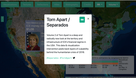
But the description of the tools, collaboration, and methods easily convinced me that this too is DH. The need for this project underscores what I see as the core of DH– understanding and implementing responsibility in the gathering and processing of information.