
Since I have no experience with mapping, or other graphing or visualization tools, I felt at a loss to begin working on this assignment. I tried to consider a number of topic options, but one kept recurring. The phenomenon of state-enforced family separation in the 20th century is a topic I have wanted to explore since February 2018 when I attended a conference in Moscow and heard a paper entitled “Desired Children – Transnational adoption of Jewish child survivors in the immediate aftermath of Second World War.”
Much of the information that is accessible about the phenomenon of forced adoptions in the 20th century is brought to light by scholars and activists working in a particular region, often with significant personal investment in the history that they study and expose. I believe that a global conversation could help specialists working with these histories, particularly through: the validating process of being heard by sympathetic listeners outsides one’s own “bubbles”; comparison of research methods; comparison of experiences–biographies, healing, justice. Our mapping assignment struck me as an opportunity to think again about how I could facilitate such a conversation.
With trepidation, I turned to Olivia Ildefonso’s, “Finding the Right Tools for Mapping“, hoping I would find something that would feel accessible.I arranged time to work at the library so I could plunge right into the powerful ArcGIS on one of the library’s desktops. But the machine felt foreign, and I decided to try QGIS instead–it’s open source, and would work on my MacBook, so I might feel more comfortable. All I managed to do was to open an account and download the software and become re-intimidated. Since I had arranged to meet with Micki, I hoped she might be able to give me some magic key. In our meeting, Micki focused on the importance of choosing a realistic and appropriate question and data set.
Whereas I saw the assignment as primarily an exercise in using the digital resources, I understood Micki’s perspective to prioritize thinking in map form, and then afterwards finding appropriate digital tools, preferably as simple as possible.
My notes from the meeting read:
- a question worth asking
- a data set we can ask it of
- a way of measuring that data that makes sense
I also have a few hand-drawn maps and diagrams that Micki created at our meeting, trying to help me think of other topics I could work on that would be more manageable than the highly-sensitive and complicated one I had suggested. Something that would not need an extensive investment of time in research and collection of data, but could still involve some creative conceptualization.
But I still felt stuck. I tried looking at Tableau and still could not find a way in to this world of mapping…. After our last class session, when Matt said our map topic could be as simple as something like “the last 5 places we’ve visited”, I decided that I would stick to the general topic I had chosen, but without asking any of the complicated questions that are on my wish-list to open up.
I adopted the simple aim of plotting out 5 of the locations that I would want to include in a conversation that would bring together experts who research the topic of family separation in their home countries: The “Stolen Generations” in Australia, which I learned about when I lived in Sydney; the “Yemenite, Mizrahi, and Balkan Children Affair” which I learned about while living in Israel; the “Kinder der Landstrasse” and “Verdingkinder“ in Switzerland; the “Lost Children” of Francoist Spain, and the “Sixties Scoop” in Canada.
And I decided to try Story Maps, since Robin had been very encouraging about its accessibility. At first, I found myself in a loop of Story Maps options, signed up (again?) for a trial of ARCGIS to gain access, and tried to check out “learning options”, before finally stumbling upon a template that seemed useable.
I typed in my title– and saw that I could not control spacing or placement of the words. I adjusted the title, using the subtitle option, and once I became prepared to relinquish control, I did find the software to be quite user-friendly. It helped me to finally achieve my starting-point goal of a map that showed 5 places that were relevant for the topic of 20th century state-enforced family separation.
I could see how uninformative it was, but also felt I had a framework into which I could begin inserting information. So I added some data for each of the numbered locations, which would appear with hover feature:
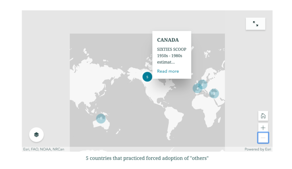
I then re-numbered the countries to try to reflect some chronological order of when the policies of family separation were in place. Because of overlaps, I did not see how to make this order apparent to a user, though it did help me with my own visualizations, from Australia (#1) where policies began already in the 19th century, through Canada (#5) where they began in the 1960s and seem to have continued later than in the other countries.
This very basic map, which managed to communicate at least something, at least to me, emboldened me to revise my minimal goal and try to produce a map that communicated the factors underlying the family-separation policies in some of the different locations. Twentieth-century western governments removed children from their families when they perceived the birth families as being of some “inferior” ethnicity/race, political affiliation, and socio-economic class. Racial/ethnic factors were relevant in four of the five countries I had chosen to mark on the map: Australia, Canada, Israel, Switzerland (Kinder der Landstrasse). Politics was the factor in Francoist Spain.
Australia and Switzerland also had socio-economically-based policies/practices of family separation: Australia’s policy is sometimes called the “stolen white generations”, and in Switzerland, the Verdingkinder, “the contract children”, or “indentured child laborers”. This would mean figuring out how to include 2 factors in one location.If I managed to show the Verdingkinder factor in Switzerland, then I would add Ireland as an additional location that forced adoption on a socio-economic basis…. And maybe add Argentina as another location for political theft of children… And maybe figure out how to add data about the widespread policies and practices of removing children born to unwed mothers….
But… I was unable to figure out how to color-code in the Express Map, and still cannot think of a way to mark the factors by category using the tools that I see in the template.
Since it is nearly time for class I am submitting this blog post with a link to the sad-looking product of my efforts, but with some guarded optimism about having embarked on a process, and maybe beginning to at least be able to formulate questions about how to move further.
https://storymaps.arcgis.com/stories/cd582eb6436d47a88aae29724750c78c