
For my mapping assignment, I wanted to create a digital map of a ‘big problem, big solution’ topic. I set the widest parameters for my topic option while limiting my visualization options. I wanted my visualization to cover the globe or as much of it as possible and re-examine mapping from the standpoint of geospatial representation of place, identifiable by a coordinate pair of longitude and latitude. In my map, I sought to explore how global positioning is correlated to attainment in global development, how each country’s national development is always under the sphere of influence of local and global powers, why the notions of global north and global south exist, and how those representations can be harmful or helpful to developing nations.
I landed on the ‘big problem, big solution’ issue of sustainable energy development where in the developing world measurable steps have been taken toward success in contrast to the developed world. I created a map of the inventory of global wind masts and solar stations from which there is access to measurement data. I gathered this data from 4 World Bank studies from 2012-2018. My interest in looking at this issue was very different from the organization who published these studies and the project funders attached to them.
The World Bank states that their interests in conducting these studies. “…aims to help improve developing countries’ knowledge and awareness of solar and wind resources.” The World Bank’s framing fails to point out that although these resources exist within the local borders of developing countries, the manufacturing of solar and wind energy is often controlled by global financial entities therefore making sustainable energy development in the global south interconnected with the policymaking and financial intervention of the global north. The reverse is also true. environmental pollution in the global north is interconnected with human development indices in the global south.
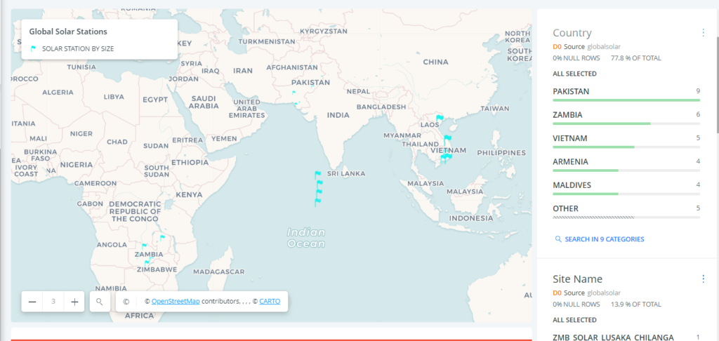
In terms of visualization, I developed my map through 4 layers of data. I decided to represent each inventory through a different color and symbol. The wind masts global inventory is represented in pink in the shape of a meteorological tower. The representation of each symbol is also determined by the size of each local inventory. For the solar global inventory, I assigned a blue flag in the size of each local inventory.

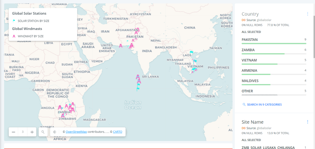
The third map aggregated both solar and wind inventories. There is clear evidence that project funders such as ESMAP who principally work to implement the UN Sustainable Development Goal 7 decided to focus on the same geographical spheres of influence with the exception of Armenia getting added to the solar inventory.
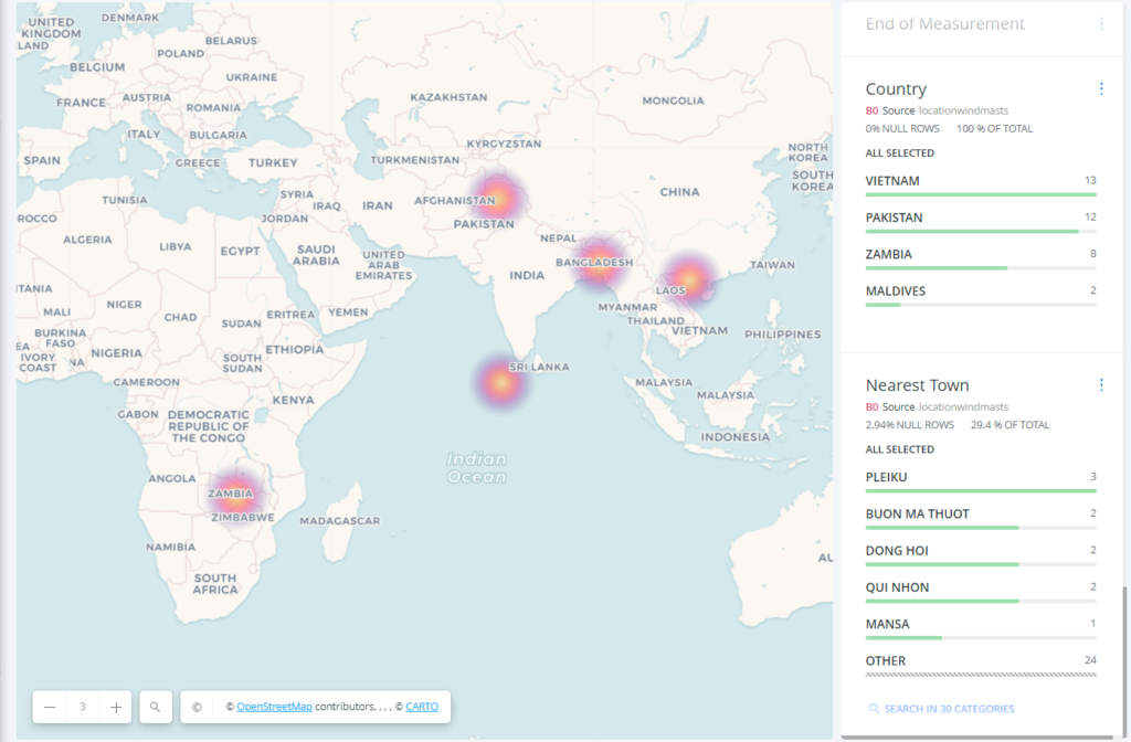
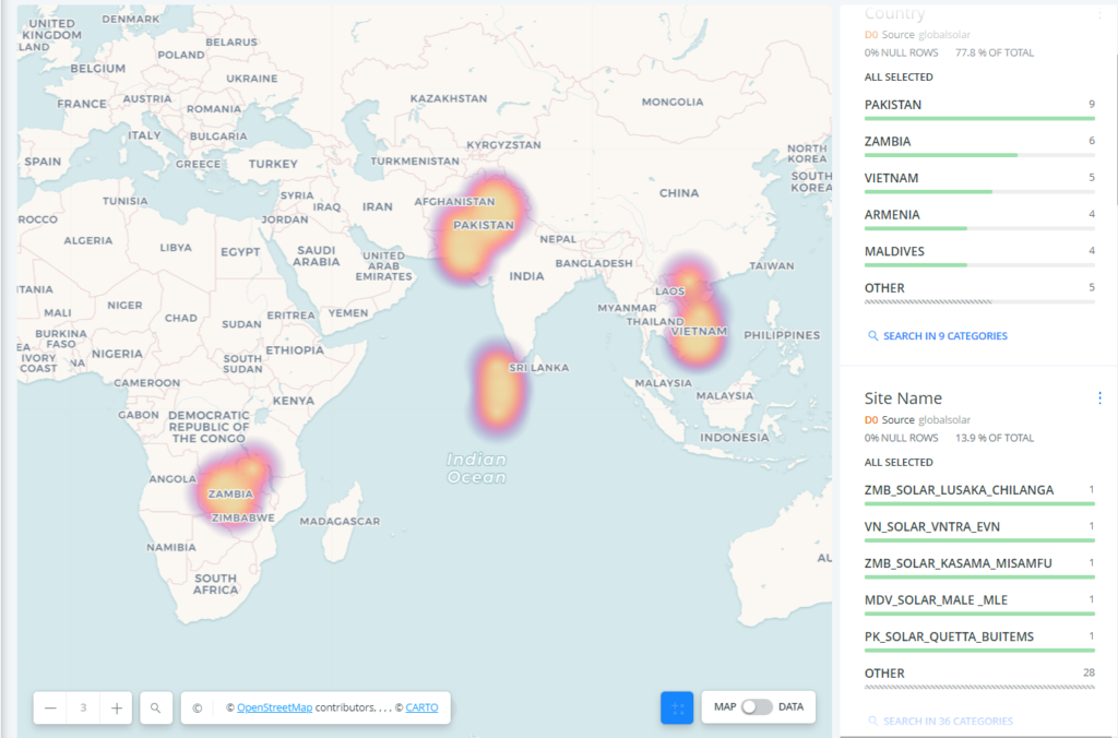
I also created a visualization option for the map to display pools of sustainable energy projects as opposed to individual projects.
The map also has a dynamic function which can display individual local inventory acquisition over time from the first inventory acquired to the last. This feature can only be accessed through the map page.
This map represents many things that I haven’t fully examined but in the most basic ways it answers our question about global positioning and its correlation to indices of human development. Sometimes global positioning means an absolute advantage in a natural resource such as solar energy development because a country is located near the equator. And mobilizing that particular resource whether for trade or other national interest is always interconnected to the influence of other powers which is why the same countries are the duplicate focus of both solar and wind energy development by global financial interests.