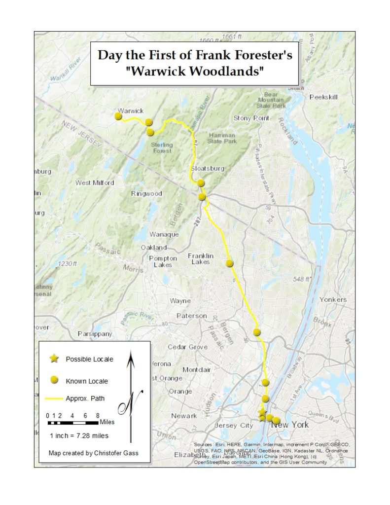
For our mapping project I created a digital story map and a static map for the first chapter of Warwick Woodlands by Frank Forester. I first created the story map with multiple maps within it and decided to make a map that contained all the locations with the addition of a legend.
The story map feature was something I wanted to utilize for this project because there are many template options and ways to showcase the data. I have used ArcGIS online, to plot points, lines and areas for research before, but never used the platform to house as a standalone site.
I still feel like the site needs major edits, it doesn’t seem complete. I, initially, wanted to geolocate for three to five chapters, but after closer analysis of the first chapter I decided to focus my attention on the initial text and how to best visualize. Something I feel this project is missing is black and white photography and paintings of the landscape, people and places written in the text from that time period. I have hyperlinked a map that covers a majority of the trip taken in the first chapter that was current to the time period, but was not able to find other imagery I was hoping to find, yet. One image, in particular, I was thinking of was a Jasper Cropsey painting, one of his Greenwood Lake landscapes, but for the slideshow effect I wanted to utilize a few images to look over near the end of the chapter. Regarding design, I used a historic map from 1840 for New York City as a base map for the earlier stops along the way, with a gray background to highlight the historic map, other ordinary base maps used were US Topography for the map of Hoboken to Warwick and Newspaper for the map of Warwick. For marks on the map I used simple imagery such as the circle and star and dotted line. The circle points are to describe known locates and the star points for possible locales. The dotted line is to inform the viewer of the approximate path. If there was a known path or known portion of a path, it would be on a straight line. The coloration is due to being the lowest color on the list of colors in the edit function. There is eight color groups for the symbology I was using, so I was thinking about using a different color for each day to designate a different chapter of the book. Something I am finding difficult after publishing the story map is the click-ability of the points – I have found it difficult. In a way it’s the most important aspect of the page, being able to click and read for a particular point. For most of the points, I have added descriptions from the text with the page number it derives from in the novel.
For the static map, I first edited one of the maps in ArcGIS online to encompass all the points created for the first chapter, along with the line to connect all the points and then opened in ArcMap to edit. After other little tweaks, I added a title, and legend with map labels, north arrow, distance, ratio, and a signature.


