
The map blog post refers to a project that was created by a four member team in Digital Humanities Methods and Practices last semester. It reached a satisfying level but the mapping section kept being built by me until recently.
After I completed my course in Digital Humanities Methods and Practices last Spring, I had the chance to work for a project that still has great potential to expand and inform anyone who is interested in immigration ,media history, or in European ancestry and of course every scholar of urban immigration and median history.
Immigrant Newspapers was a project that had multiple tasks as everybody had to get enrolled in a different demand in order to contribute to the completion of it’s initial scope. Our goal was to publish and distribute a digital collection of historical NYC immigrant newspapers by collecting them from hundreds of communities and various ethnic publications and displaying them in a public forum. The time span of those collections was between 1860-1890, mostly because of the increasing diversity of immigrants from southern and eastern Europe who arrived then, but also due to the limited time we had to complete it during our semester.
Because of big responsibilities that everybody had to take over for that project(coding, data aggregating and cleaning, digitizing hard copies data sources, designing, UX researching, logo designing, social media account and many others) we didn’t that the opportunity to finalize our initial goals. Though we managed to take it to a good level. One of my responsibilities was of course to geocode a map so that the user can navigate and be able to easily find the geographic coordinates of those newspapers in the city of New York.
I started building an interactive map through Artmap software. I was inspired by the Tate Gallery in London since there was a similar way to geocode locations. Additionally the design was very appealing as the layout seemed to fit perfectly with the concept of our project.
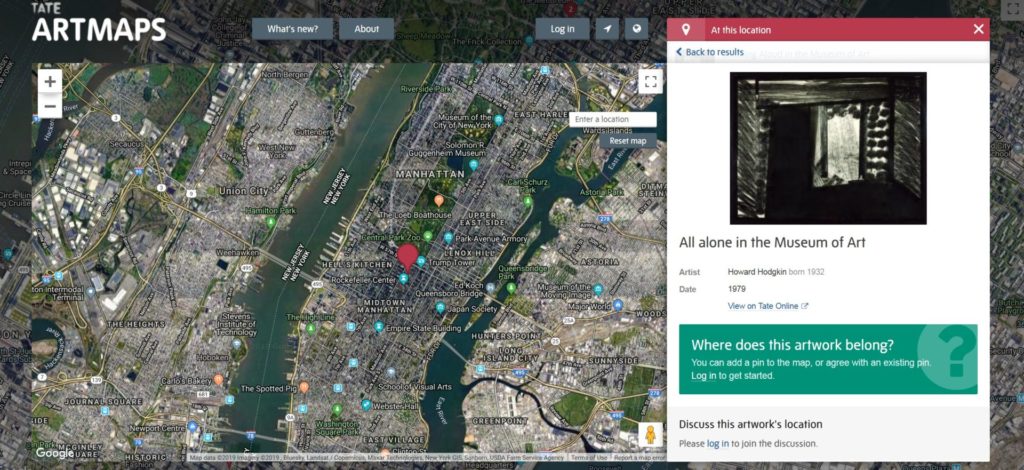
As I was trying to intergrade my JavaScript code into the WordPress platform, I faced some compatibility problems. I also noticed the background of the map was from certain longitude and latitude coordinates and it couldn’t fit to our demands, as the team and our instructor preferred to implement a historic atlas of the city. Additionally, trying to change marker pins with other icons depending on the origin country, I found additional technical difficulties. So I decided not to use Artmap tool in the end.
The next step was to find another tool that is more suitable for our project so I decided to use an open-source JavaScript library for mobile-friendly interactive maps called “Leaflet”. Mapbox was the software tool that I used to upload the code that was made through leaflet plugin to proceed with the implementation of the historical map up to the level it has been reached.

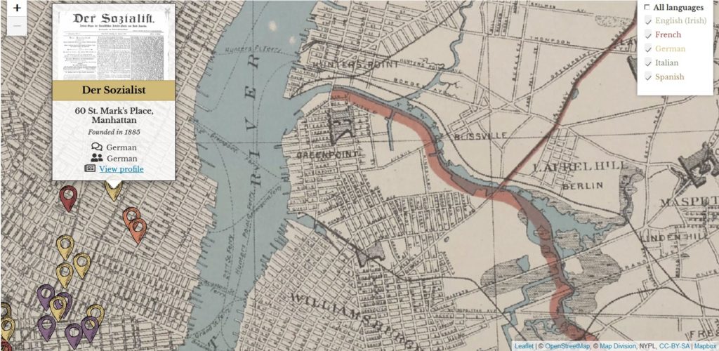
The map that was used to present our data was a georeferenced illustration from a New York City Atlas in 1893. The grid covers almost the entire city, and it is good enough to georeference every newspaper what we had in our database. The user can interact with the publications within the context of the New York City region and when he clicks on the pin marker he is able to see valuable information for it’s publication separately.
However, using a historical illustration scanned form New York City Atlas, I realized that it had additional difficulties. Unfortunately the user could see the edges of the page. That could restrict everyone from seeing beyond the boundaries of the page. Additionally using this kind of historical map,I couldn’t set a very high “zoomed out” level and resulted with the same conflict. One of the limited capabilities that I had with this option was that the publications points that were located outside those boundaries should be noted on a tool tip that it would be off the map and that was not looking so professional for such a project. Moreover that was not included among the main user experience principles and as a UX designer should have offered a better solution.
As the mapping project had reached a high level and it could give more efficiency, interaction and value to whom might be interested, I was persuaded that it could also improved ,so I started modify again the mapping code and in order to include more components and useful tools as to add more newspaper ethnicities for example.
What I did this week was to find a higher resolution historical map and to implement it as a background. Along the way I realized that the problem remained the same. My new pin markers I added to the map that were near the edge of the historical map (e.g. a Greek Publication pin near Nassau county , Long Island ) revealed that even that map wasn’t good enough to georeference it, as the user was able to see the edges of the page. So my goal was to try to find another way to create it using filters that could give the historical sense of the map.
Having completed the Datavis Methods class during the summer, I was trying to see if that problem could be resolved using my Tableau skills. I tried to create the map in the Tableau platform .The results were satisfying, the annotations and the pin markers were fantastic but I still couldn’t find a way to incorporate a historical map on it. This is still in process.
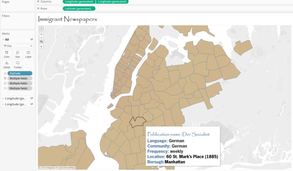
The interesting thing is that I managed to change the pin markers I found from shutterstock.com image library. Using different color codes that signifies every different language, I clustered them in a way so the user can recognize the publication newspapers that he is interested in and at the same time can eliminate whatever language the user dislikes to display on the map using the checking filter method.
By clicking on every pin marker the user can find a very detailed tooltip with a sample of the newspaper, any information that we aggregated (location, language etc.) and also a link that goes to the main profile of each publication.
What I have done within the last two weeks was to enrich the map with more newspapers from other languages(Greek, Russian Chezh, Yiddish, Turkish) based on the database that we have already completed .Because of the of time limitation, although we have gathered our data of newspaper titles from Chronicling America, NYPL Microfilm library and NYHS, a project that lasted many weeks, we were unable to prepare all those collections, upload and mapping them at the same time.

My future goal is also to try to geocode all the newspaper collections and also to try to expand their time span as the one that we have done so far was narrowed down to newspapers founded between 1860-1890.
Additionally tools like a search bar could also help the user navigate better. As the collection gets bigger and bigger, information gets gathered and the papers are scattered over the map area, the user could use an advanced search engine tool to seek, locate, define and filter information (text and images) in the searchable index of the platform.
If I should write about the importance to develop such a project I would highlight that this project is a perspective of new immigrant history of New York through the lens of news media. As New York city is a real home for hundreds of communities and ethnic publications, this map could potentially discover great findings in their respective language. Moreover this mapping project could be a reminder of how immigrants have been an integral part of US history and especially in New York City history whether they arrived in 1830 or 2015.