
I. Project background, map images, conclusions
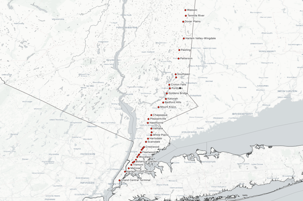
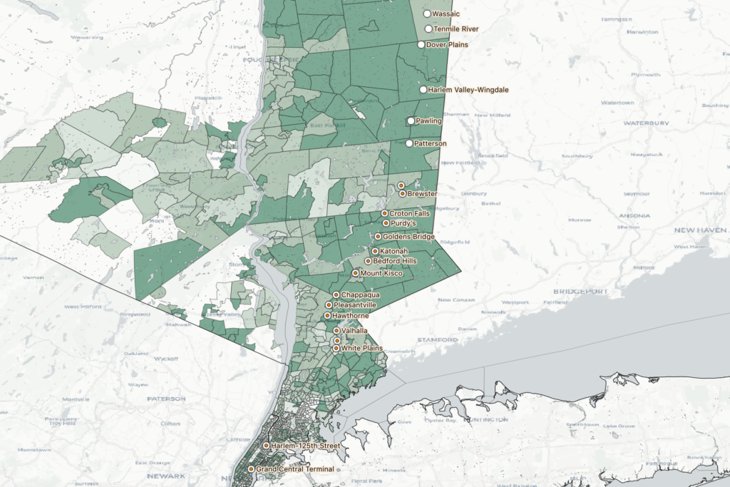
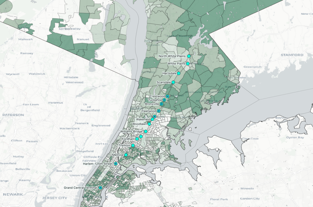
I grew up mostly in Westchester, and viewed MetroNorth Railroad (MNR) as an escape route from the suburbs. I lived along the Harlem Line, which makes stops between Grand Central Terminal and the ambiguously-named Southeast. Less than 10% of trains each day also connect to a transfer at Southeast that runs further north, an 30 additional miles up to Wassaic in Dutchess County. My most-traveled path is from the town where my parents live to Grand Central, off peak. However, the more I’ve taken the train in recent years (particularly when I take a new combinations of stops to reach my students via public transport, or when I ride at an unusual time), the more I observe that the Harlem Line train serves, obviously, many more purposes than just my own. I guess it’s what I already had words for from Kevin Lynch’s mental maps, but each person’s map of the same geography will be different.
This particular project was motivated by a phrase I had heard used a couple times in reference to this train line: “the nanny train.” This is a blunt shorthand for the observed phenomenon of women of color riding from stations in affluent, majority-white towns in Northern Westchester (where they work) to stations further south that generally serve communities of color in the Bronx and Southern Westchester (where they live). The question that motivated this map was “Is there actually a ‘nanny train,’ and can I visualize its existence?”
By and large, what I gleaned from scrutinizing the train schedule and counting up trips (not exhaustively, but carefully) is that Harlem Line trains make stops either south of White Plains and terminate at North White Plains (24 miles north of GCT), or begin making stops at White Plains and terminate at Southeast (53 miles north) or Wassaic (82 miles north). Out of 109 total trips per day to Grand Central (I did not include reverse trips in this map), 96 trips fell into one of these four patterns:
- Group 1: begin at North White Plains, make at least 5 stops (i.e. make local stops in the Bronx)
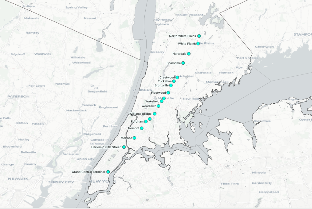
- Group 2: begin at Crestwood in Southern Westchester, make either 5 stops (express in peak hour) or 12 (all stops in the Bronx)
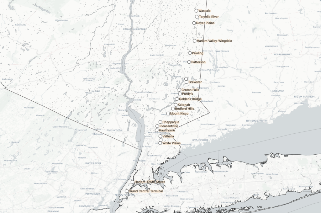
- Group 3: Start at Southeast, making all or most stops until either Chappaqua or White Plains, then run express through the Bronx
- Group 4: Start at Wassaic, and run express before reaching Southern Westchester

The remaining 13 trains of the day generally make very specific, peak-hour stops. Sometimes they stop at only 3 or 4 stations total, and seem to be oriented towards moving people quickly into the city from specific high density areas along the whole line. I was surprised to see that there is actually no single train that makes every single stop — the closest is the 1:56am train from Grand Central to Southeast, which skips 2 stations in the Bronx (these areas are also served by MTA subway stations), and the 6 stops after Southeast (which are generally considered sort of an extension of the “regular” line).
So, most trains make stops north of White Plains or south of it, but not both. Indeed, there are only two southbound trains to “bridge the gap” by making at least 4 stops in northern Westchester AND at least 4 stops in southern Westchester/the Bronx: the 8:14pm from Mt. Kisco, and the 11:21 from Wassaic, which makes many local stops and doesn’t arrive in Grand Central until 1:53am the next day. If there is such a thing as “the nanny train,” as the term seems to have been intended, it’s the 8:14 from Mt. Kisco. Otherwise, anyone commuting from Chappaqua to Woodlawn, for example, has to switch at White Plains from the “Northern Westchester Harlem Line” to the “Southern Westchester/Bronx Harlem Line.”

In the end, I’m not very satisfied with my map. To say something meaningful about how train scheduling aligns or is at odds with the demographics of this train line would require a more nuanced visualization of race than just “percentage of white people per census tract,” which is what I have in the background now (see below). To a large degree, it only says what is already widely known: census tracts in northern Westchester generally have a higher percentage of white people than those in southern Westchester and the Bronx. On the train front, likewise, it’s already obvious that White Plains is a change-over station. This makes sense, since it’s about half the distance from GCT to Southeast and is the biggest municipality on the line outside of NYC. I guess I’m a little surprised at just how few trains stop in Northern AND Southern Westchester, but that’s about it in terms of breakthroughs on this map (and I got it mostly from the train schedule, rather than the map).
The process of making it was extremely enlightening, though. To have spent this many hours only to arrive at a lackluster conclusion and lackluster map is humbling, and helps me understand the pressure to produce results or give in to the temptation to say that our visualizations say what we desperately want them to say. I’m glad to be able to look at this project critically, without any need to make statements (or seek funding…) based on its conclusions.
II. Method
I downloaded American Community Survey 2017 data from the American FactFinder website. I took data for New York, Bronx, Westchester, Putnam, and Dutchess counties, covering every county the Harlem Line MNR services. I took a pre-packaged “Race” dataset that gives a raw count breakdown of race in the generic [super limited] government categories: white, black or African American, American Indian and Alaska Native, Asian, Native Hawaiian and Other Pacific Islander. The raw counts are per census tract.
To display population counts with space factored in, I made the raw counts into percentages. I did this only for the white population, so the map shows the percentages of white and non-white people, with no option for a more specific racial breakdown. This would absolutely be possible based on my dataset, but added too much complexity for me on this project.
I also downloaded a TIGER shapefile package for all census tracts in New York State. I joined this geographical file to my race data file from America FactFInder using the Join function in QGIS. This is done by linking two spreadsheets using a common column that puts the same, unique datapoint in each spreadsheet. This part of the process gave me the most trouble, as QGIS consistently read the same 11-digit number, the GEOid for each census tract, as a string of text in one file and an integer in the other. This seems like a fairly common problem, based on the information available on Stack Exchange and other forums. However, despite numerous attempts to troubleshoot this problem, I wasn’t able to fix it using any of the suggested methods. Instead, I eventually gave up on fixing the problem in QGIS and used Excel’s Text-to-Columns feature to modify my dataset and create a different, common, unique value. This was easily read as a string in QGIS and I was able to join my geography file to my data file.
My favorite part of the data-creation process was using latlong.net to record the point coordinates of all 36 stations on the Harlem Line of MNR. I literally just followed the train line up a digital map and clicked on each station to get its coordinates, then put these into a third spreadsheet. After spending so much time troubleshooting data types in QGIS (and with the problem still unresolved at this point), I took great pleasure in such a straightforward task that also allowed me to explore a bird’s-eye map I am very familiar with from a lived-experience standpoint. I eventually loaded this file into QGIS and was delighted to see every station appear on the map.
Then came the data-creation that felt least scientific and most subject to my own bias and lived experience of this question. I spent many minutes examining the Harlem Line train schedule, trying alternately to pull patterns out and to just allow myself to absorb the schedule without consciously looking for patterns. Once I had counted up and figured out some parameters that seemed reasonable (very much capta, not data), I made each of these groups a layer on my map.
I added labels, fussed endlessly with all the colors and was never satisfied, read about color theory and looked up pre-made ColorBrewer packages, still hated my map and finally called it a day and wrote this blog post. Then I went back and fussed some more after dinner, adding hydrology shapefiles from the state of New York to make my coastline cover the dangling edges of census tracts, and color matching the new water to the underlying knock-off ESRI basemap. And now I’m grudgingly saying goodbye (for now??) to this project at 3 o’clock in the morning so that I can go to sleep and not wake up to it.