My Hybrid Tableau/QGIS Project
https://public.tableau.com/shared/PJ2QF4BXS?:display_count=yes&:origin=viz_share_link
My Process
While exploring Yarimar Bonilla and Max Hantel’s “Visualizing Sovereignty,” I was struck by the power of untethering the Caribbean islands from the too-familiar lands and waters that otherwise dwarfed or laid cultural claim to them by virtue of a colonial past. I was also struck by the “Invasion of America” video referenced therein, depicting the loss of native North American lands as Europeans arrived, colonized, and expanded. I’d seen the “Invasion of America” before, but I didn’t realize until now how much that visualization reinforces the Manifest Destiny mindset, almost confirming Andrew Jackson’s belief that Indigenous people “must necessarily yield to the force of circumstances and ere long disappear.”[1] That video, as helpful as it is in depicting colonial greed also focuses the story on indigenous loss rather than indigenous resilience.
So, for this project, I wanted to mimic Bonilla and Hantal’s process to map the sovereignty of Native American nations in hopes of challenging the popular defeatist tale.
I started in Tableau, familiar to me after this summer’s Intro to Data Visualization intensive. I discovered a shapefile from the US Census Bureau demarcating the 2017 “Current American Indian/Alaska Native/Native Hawaiian Areas.” I had never worked with shapefiles, but found this one fairly intuitive to map in the program. I distinguished each officially recognized “area” (as the Bureau calls it) by color and added the indigenous nation’s name to the tooltip to make each area visually distinct. As does nearly every step of a mapping exercise, this alone yielded some insights. Oklahoma is nearly all designated land. The Navajo nation has a land allotment larger than some US states. Two of the largest land parcels in Alaska belong to tribes I hadn’t heard of: the Knik and the Chickaloon.
This first view also presented two significant problems, predicted by our readings both from Monmonier as well as Guiliano and Heitman. First, Tableau’s map projection is grossly distorted, with Greenland larger than the contiguous states, instead of 1/5 the size of them. Second, the limits of the data set—collected by and in service of the US government—cut out the indigenous people of Canada and Mexico, whose connections with the represented people are severed. What a visual reminder of a political and historical truth!
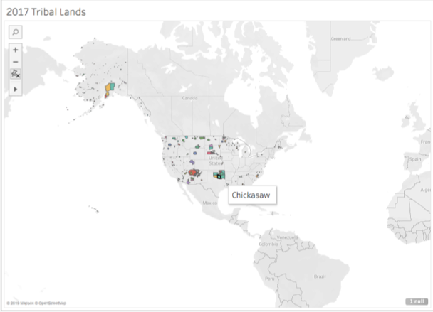
Screenshot of the Census Bureau’s mapped shapefile, with tooltip visible.
I did find a shapefile of Canadian aboriginal lands also from 2017, but couldn’t find a way to merge the geometries in one map. Mapping those Canadian reserves separately, I noted immediately how easy it is for political entities to be generous with lands they don’t value. (Of course, the map’s polar distortion may be enlarging that seeming, albeit self-serving, largesse.)
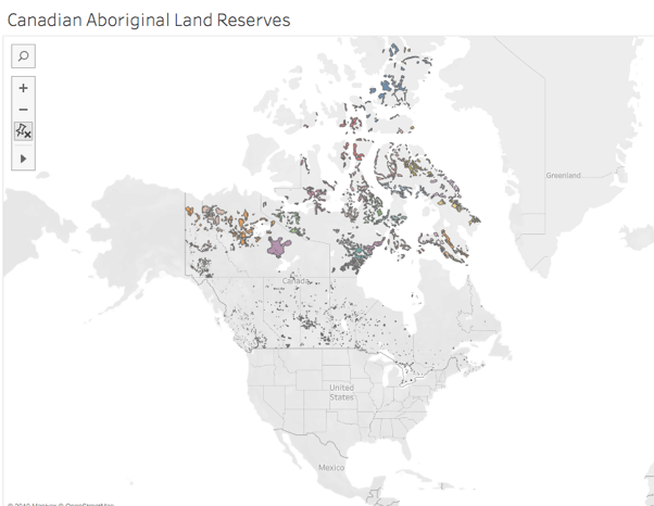
Screenshot of the Canadian government’s shapefile mapped.
I returned to the US visualization to see if similar land prioritization was made, changing the base map to a satellite rendering.
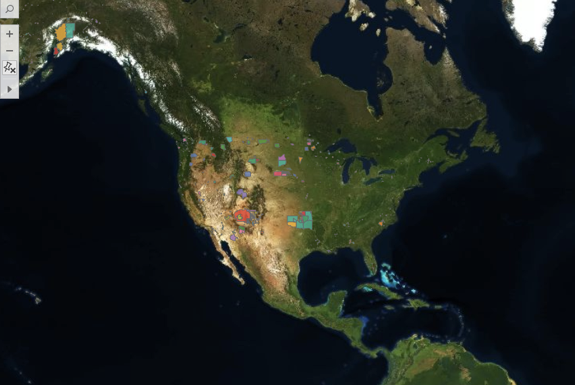
Screenshot of the Census Bureau’s shapefile on a satellite map.
Again, the new view offered some insights. The effect of the Indian Removal Act of 1830 is clear, as the wooded lands east of the Mississippi seem (from this height) nearly native-free. Reservations are carved in less desirable spots and are pushed toward the interior as, in addition to the westward push from the east, states began to be carved from the West Coast after the Gold Rush.
Next, eager to mirror Visualizing Sovereignty in turning the power tables, I removed the base map altogether. De Gaulle’s “specks of dust” quote sprang to mind, as I saw, in full view, this:

Screenshot of the Census Bureau’s shapefile mapped, with the base map washed out.
Just this one act changed the scene for me entirely. Suddenly, Hawaii came into the picture, calling to mind its colonization in the name of strategic desirability. The whole scene reminded me of what Bonilla and Hantal (borrowing from Rodriquez) called “a nonsovereign archipelago, where patterns of constrained and challenged sovereignty can be said to repeat themselves.” I longed for the inclusion of the Canadian lands to flesh out the archipelago, though the missing data points to one such constraint and challenge.
Revealing just a surface level of the shifting sands of sovereignty, this data set includes ten distinct “classes” of recognized lands, so I included those in the ToolTips and offered an interactive component to allow users to isolate each class, foregrounding spaces that were connected by the US government’s classification of them. For example, choosing the D9 class (which the Census defines denoting a “statistical American Indian area defined for a state-recognized tribe that does not have a reservation or off-reservation trust land, specifically a state-designated tribal statistical area”) reduces the archipelago to a small southeastern corner—strongholds resistant, perhaps, to Jackson’s plans or perhaps more probably ones who went underground until the mid 20th century when the Civil Rights Movement empowered indigenous communities and gave birth to Native American studies.

The D9 class of recognized indigenous “areas.”
This divide-and-conquer, 10-class variety of sovereignty was underscored by the significant contrast in tone in the definitions of tribal sovereignty between the National Congress of American Indians (NCAI) and the US Bureau of Indian Affairs (BIA). The NCAI contextualizes and defines sovereignty with active, empowering language: “Currently, 573 sovereign tribal nations…have a formal nation-to-nation relationship with the US government. … Sovereignty is a legal word for an ordinary concept—the authority to self-govern. Hundreds of treaties, along with the Supreme Court, the President, and Congress, have repeatedly affirmed that tribal nations retain their inherent powers of self-government.”
In sharp contrast, the BIA contextualizes and defines sovereignty with passive, anemic language, explaining that, historically, indigenous tribes’ “strength in numbers, the control they exerted over the natural resources within and between their territories, and the European practice of establishing relations with countries other than themselves and the recognition of tribal property rights led to tribes being seen by exploring foreign powers as sovereign nations, who treatied with them accordingly. However, as the foreign powers’ presence expanded and with the establishment and growth of the United States, tribal populations dropped dramatically and tribal sovereignty gradually eroded. While tribal sovereignty is limited today by the United States under treaties, acts of Congress, Executive Orders, federal administrative agreements and court decisions, what remains is nevertheless protected and maintained by the federally recognized tribes against further encroachment by other sovereigns, such as the states. Tribal sovereignty ensures that any decisions about the tribes with regard to their property and citizens are made with their participation and consent.” “Participation and consent” are a far cry from “the authority to self-govern,” and even though the NCAI boasts of the Constitutional language assuring that tribes are politically on par with states, they make no mention of lack of representation in Congress or other such evident inequalities.
Shocked by the juxtaposition of these interpretations of sovereignty (and in a slightly less academically rigorous side jaunt), I pulled population data from Wikipedia into an Excel spreadsheet which I joined to my Tableau data. Using the World Atlas to compare population density of these reservations to the least densely populated states, I created an interactive view to show which reservations are more densely populated than the least densely populated states. Not surprisingly, many beat Alaska. But, other surprises emerged, such as the Omaha reservation’s greater population density than South Dakota, their neighbor to the north.
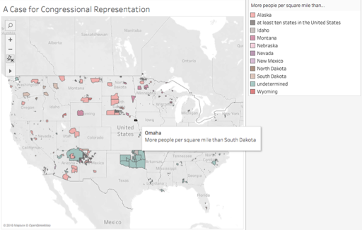
Screenshot of comparative population density.
I next wanted to recreate, in some way, the equalizing effect of the Visualizing Sovereignty project’s decision to same-size all of the Caribbean islands. But, with 573 federally recognized tribes, that seemed too ambitious for this assignment. So, I turned to video to record an exploration in zooming, giving some spots greater consideration than others, and starting in an oft-neglected place.
With Hawaii now foregrounded, the distortion of Tableau closer to the North Pole seemed too significant to neglect, so I learned a little QGIS in order to utilize its more size-righted mapping. Playing around with the new program, I found a powerful tool for foregrounding identity: labels. Merely including them turned the nonsovereign archipelago into a menacing swarm of equalized names. At all the same font size, they seemed like the Immortals of Xerxes’ Persian army, ever replenishing (as demonstrated in the linked, very rough video), regardless of how far away or close up I zoomed. They took over my RAM, slowing the display down with each change in scale, asserting themselves in greater detail the closer to the land I got and at their own pace. This view seemed to better represent the truth that contradicts Jackson’s prediction: the Indigenous have resisted and persisted despite all attempts to eradicate them. Further, this view points to the potential of collective action—a potential that may be best developed through DH, which can cut across geographic space.
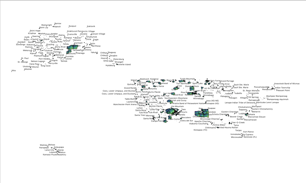
A screenshot of the labels in QGIS
This project has raised for me a host of questions. What about the nearly 300 unrecognized tribes not included by the Census Bureau? What might be revealed if data from Canada and Central America were included, restoring indigenous domains to their geographic boundaries rather than their political ones? What happens if we introduce the element of time, as Visualizing Sovereignty did, to this visualization? (And, thinking of the Sioux Winter Coat, what if that temporal consideration were made through an indigenous representation of time keeping?) What happens if we look at this data as capta, including in it profiles of those reduced to geographic entities and statistics or map views that begin from each region (for example, the Hopi are surrounded by Navajo—a very different experience from the Quinault)? And how might digital humanities provide a platform or opportunities for sharing culture and resources across these spaces and histories?
[1]For the fully appalling context, read the paragraph twelfth from the bottom of his address to Congress on December 3, 1833. https://millercenter.org/the-presidency/presidential-speeches/december-3-1833-fifth-annual-message-congress


