Author Archives: Eva Sibinga

How to See Race Online – syllabus reflections

This was one of the hardest assignments I’ve ever done… I feel like I’ve spent hours and hours getting closer to the end, and mostly didn’t feel any closer. I showed it to someone on Sunday and she said, “wow, looks like you’re almost done!” And I said, “Yeah!” And then I put another 20+ hours of work into it and still feel like I could do 10 more if I had the time. But I found a stopping point that feels adequate enough, so I’ve stopped for now. I don’t want to post it online, but if anyone wants to check it out, I’m happy to email it or post it in the forum.

Here are some reflections about my choices, since I don’t get to defend them in the syllabus itself.

(And first of all, this syllabus has much more detail about in-class assignments/activities than other syllabi I saw, but when I started taking them out to make it look like a real syllabus, I felt the pedagogical loss too keenly. Can’t kill my darlings this time.)

I chose to include some feminist texts without having a “feminism unit” because I’m only now realizing how useful and universally applicable I find feminist theory to be. (@Lisa Rhody, thank you!) I did not take a Gender & Women’s Studies class as an undergraduate, and as such I got pretty much zero exposure to academic articles or materials that were labeled as explicitly feminist, despite engaging with recognizably feminist ideas and many feminist scholars. I didn’t know that some of the core ideas of feminism are about standpoint, bias, and objectivity, but it’s clear to me that these ideas are important for any researcher or critical thinker. I was hesitant at first to include the Koen Leurs piece, for example, but talked myself into it by imagining how helpful it might have been for me as an undergraduate to read feminist methods in action, and see how they can be applied to any question. It would have upset my misguided notion that “learning feminist theory” could only mean taking GWS 101.

I tried to include art and multimedia, and that too was difficult. It feels just right to me to include Yoko Ono’s Grapefruit in a discussion of giving instructions/writing algorithms. It’s easy for me to imagine it as an extension of Rafa’s physical explanation of for loops, using chairs, at the Python workshop in October, and I think it would make for a similarly memorable and intuitive understanding of how computers work through problems and how algorithms are structured. I’m a little less clear on the value of including thewrong.com, an online biennial that is more or less unstructured and aims to disrupt the deeply entrenched hierarchies of the art fair world. In theory, I think it fits well in a discussion of online values and shaking up entrenched value norms. In practice, it may be too much of a leap for students, or its context may be too obscure for those with minimal knowledge of the art world.

And that leads me to the next difficulty. I struggled to balance making a course that could answer the very basic questions and not scare off students for whom “algorithms” are a complete mystery. But I also want to challenge students, and not underestimate their abilities. My guess is that if anything, this class can and should delve deeper, with more theory and more academic articles to build a more robust epistemological base for thinking about the internet. But I also wanted to keep the focus on the everyday, so although including as many media sources as I did may feel less challenging to the students, I hope that it would pay off in terms of relevance and applicability. 

I included free-writing for a couple reasons. Firstly, I appreciated it in our class as an opportunity of time and space to think about the readings without having to share with the whole class (although let’s be real, I clearly don’t have a problem sharing with the whole class…). Additionally, early on in creating my syllabus, I found Kris Macomber and Sarah Nell Rusche’s “Using Students’ Racial Memories to Teach About Racial Inequality” to be an incredibly accessible and helpful resource in imagining a classroom environment in which students were having meaningful conversations about race and the internet. Free-writing, as Macomber and Rusche write, gives an opportunity for all students to consider their own experiences, and then to share/connect those experiences to course concepts with whatever degree of structure and guidance seems most beneficial. 

Some last grab bag things: I included an open day, and put it in the middle of the semester so that student input could potentially shape the second half of the course beyond that day. I chose to use QGIS because it’s free and open source, and it works on Macs or PCs. I found it difficult to get scholarly sources on the history of digital advertising— I’d fix this up in the next draft. 

“Priming” became a really important consideration for me — on almost every single day, I found myself wondering if I should switch the order of the lecture and the readings. This was usually a response I could trace to my own lack of confidence in my imaginary students, and therefore one I dealt with by reminding myself that I have countless times learned or thought about something for the first time in a reading and then had it further explained and contextualized in a lecture or class discussion. I cannot control what my students take away from the class anyway (nor should I), so as long as I avoid leaving large contextual gaps or assigning anything that is too jargon-heavy to make sense of, it is probably best to let students sit with the material on their own first and begin class by asking what they think of it.

And finally, a note on confronting my accumulated academic privileges. I tried to take up the challenge to envision this course as part of the CUNY system, and the best spot I could find for it was the American Studies Department at City College. (I’d be curious to know if there’s a better place, though!). Figuring this out helped me to reflect critically on a few things about my own undergraduate experience.

I knew in the abstract that I was privileged to be at Bowdoin College while I was there. But designing this course for a CUNY school helped me to realize a couple of specific privileges inherent to taking an Interdisciplinary Studies Course called Data Driven Societies at Bowdoin College (an amazing course that inspired my pursuit of DH). Privilege went beyond the thirty brand new MacBook Pro computers connected to thirty brand new chargers in a neat little locked cart that were stored at the back of our classroom for lab periods. It extended to the fact that Bowdoin College even had an Interdisciplinary Studies department. How much less career-skill-oriented can you get than an interdisciplinary department at a liberal arts college? And my own privilege extended to the fact that my parents, who paid for my education, didn’t blink an eyelash when I told them that I would be taking the class. 

Part of recognizing my own privilege is recognizing that I didn’t ask “where does this syllabus fit into an existing scheme of funding” until the very end. Which is why at 11:30pm on Tuesday and I was frantically looking to figure out how I’d get laptops, whether City College has a computer lab I could use for the lab sections, and trying to figure out how I could change my syllabus for a more minimal-computing approach if a computer lab wasn’t possible. But it was a bit late to change the syllabus that much, and in fact I believe there could be computer labs available for a class like this one at City College! 

I may have failed at making a CUNY-ready syllabus. It’s easier for me to imagine the course being successful at a small private college, which I guess makes sense because I’m much more familiar with the resources available, the academic culture, the student body, and the classroom dynamics in that setting. Luckily it’s a first draft, though, and since I’m submitting it into the CUNY world, there’s more than a little hope for its improvement in this regard and others!

Finally, I’d like to acknowledge Professors Jack Gieseking and Kristen Mapes, whose pedagogical approaches and syllabi were invaluable to me in attempting this project.

text messaging: not a hot new epistolary form

This project aims to make some meaning from over a quarter million text messages exchanged over the course of a 6+ year relationship. It is an extension of a more qualitative project I began in 2017.

Here’a a recap of Part I:

In the spring of 2017, I was a senior in college. My iPhone was so low on storage that it hadn’t taken a picture in almost a year, and would quit applications without warning while I was using them (Google Maps in the middle of an intersection, for example). I knew that my increasingly lagging, hamstringed piece of technology was not at the necessary end of its life, but simply drowning in data. 

The cyborg in me refused to take action, because I knew exactly where the offending data was coming from: one text message conversation that extended back to 2013, which comprised nearly the entire written record of the relationship I was in, and which represented a fundamental change in the way I used technology (spoiler: the change was that I fell in love and suddenly desired to be constantly connected through technology, something I had not wanted before). And in the spring of 2017, I didn’t want to delete the conversation because I was anxious about whether the relationship would continue after we graduated college. 

Eventually, though, I paid for a software that allowed me to download my text messages and save them as .csv, .txt, and .pdf on my computer. (I also saved them to my external hard drive, because in addition to not knowing if my relationship would survive the end of college, I also had no job offers and was an English major and I really needed some reassurance.) So I did all of that, for all 150,000+ messages and nearly 3GB worth of [largely dog-related] media attachments. This is but one portrait of young love in the digital age.

I wrote a personal essay about the experience in 2017, which focused on the qualitative aspect of this techno-personal situation. Here is an excerpt of my thoughts on the project in 2017:

“I was sitting at my kitchen table when I downloaded the software to create those Excel sheets, and I allotted myself twenty minutes for the task. Four and a half hours later, I was still sitting there, addicted to the old texts. Starting from the very beginning, it was like picking up radio frequencies for old emotions as I read texts that I could remember agonizing over, and texts that had made my heart swell impossibly large as I read them the first time.

I had not known or realized that every text message would be a tiny historical document to my later self, but now that I had access to them going all the way back to the beginning, they were exactly that to me as I sat poring over them. It was archaeology to reconstruct forgotten days, but more often than not I was unable to reconstruct a day and just wondered what we had done in the intervening radio silences that meant we were together in person. These messages made the negative space of a relationship, and the positive form was not always distinguishable in unaided memory. “

The piece concluded with a reminiscence of a then-recent event, in which a friend of ours had tripped and needed a ride to the emergency room at 3 in the morning. We were up until 5am and ended up finishing the night, chin-stitches and all, at a place famous for opening for donuts at 4 in the morning. The only text message record of that now oft-retold story is one from me at 3:45am saying “How’s it going?” from the ER waiting room, and a reply saying “Good. Out soon”. I concluded that piece with the idea that while the text message data was powerful in its ability to bring back old emotions and reconstruct days I would have otherwise forgotten, it was obviously incomplete and liable to leave out some of the aspects most important to the experiences themselves.

So now, Part II of this project.

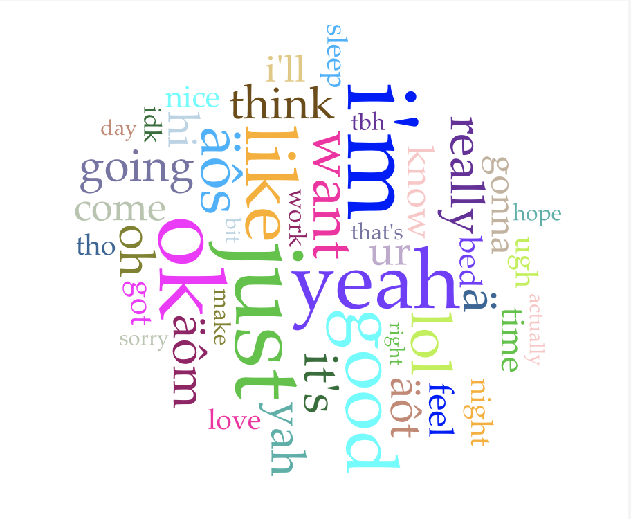
I compiled a new data set, taken from the last two years of backups I have done with the same software (and same relationship — we have thus far lasted beyond graduation). I loaded the data into Voyant, excited to do some exploratory data analysis. The word cloud greeted me immediately, and I thought to myself “is this really how dumb I am?”

Okay, maybe that’s a bit harsh, but truly, parsing through this data has made me feel like I spend day after day generating absolute drivel, one digital dumpster after another of “lol,” “ok,” “yeah,” “hi,” “u?” and more. I was imagining that this written record of a six year relationship would have some of the trappings of an epistolary correspondence, and that literary bar is 100% too high for this data. See the word cloud below for a quick glimpse of what it’s like to text me all day.

Some quick facts about the data set:

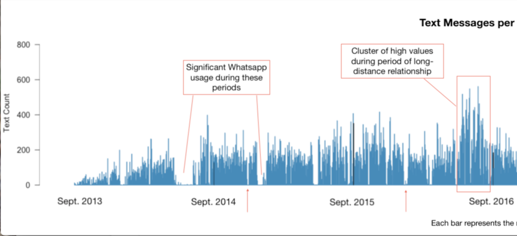
Source: all iMessages and text messages exchanged between August 31, 2013 and November 12, 2019, except a missing chunk of data from a 2-month lost backup (12-25-18 to 03-01-18). *****EDIT 11/19: I just found it!! iMessages switched from phone number to iCloud account, so were not found in phone number backup. Now there are just 18 days unaccounted for. As of now, the dataset still excludes WhatsApp messages, which has an impact on a few select parts of the dataset at times when that was our primary means of text communication (marked on the visualization below), but has relatively little impact overall.

The data set contains 294,065 messages total, exchanged over 6+ years. It averages out to 130.9 messages per day (including days on which 0 messages were sent, but excluding the dates for which there is no data). As per Voyant, the most frequent words in the corpus are just (23429); i’m (19488); ok (17799); like (13988); yeah (13845). The dataset contains 2,047,070 total words and 35,407 unique words. That gives it a stunningly low vocabulary density of 0.017, or 1.7%.

Counting only days where messages were exchanged, the minimum number of messages exchanged is 1 — this happened on 29 days. The maximum number of messages exchange in one day is 832. (For some qualitative context to go with that high number: it was not a remarkable day, just one with a lot of texting. The majority of those 832 messages were sent from iMessage on a computer, not a phone, which makes such a volume of messages more comprehensible, thumb-wise. I reread the whole conversation, and there were two points of interest that day that prompted lots of messages: an enormous, impending early-summer storm and ensuing conversation about the NOAA radar and where to buy umbrellas, and some last-minute scrambling to find an Airbnb that would sleep 8 people for less than $40 a night.)

I was curious about message counts per day — while it’s definitely more data viz than text analysis, I charted messages per day anyway, and added some qualitative notes to explain a few patterns I noticed.

Visualization of text messages per day over 6 years

Chopped in half so that the notes are readable:

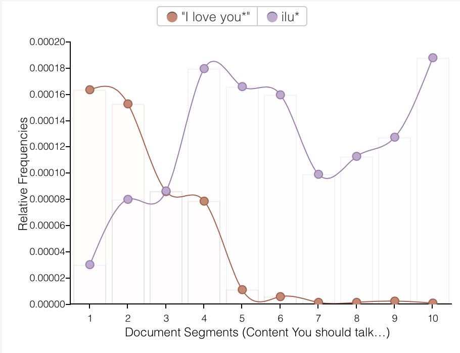
Despite my mild horror at the mundanity and ad nauseam repetition of “ok” and “lol,” I had fun playing around with different words in Voyant. I know from personal experience, and can now show with graphs, that we have become lazier texters: note the sudden replacement of “I love you” with “ilu” and the the rise of “lol,” often as a convenient, general shorthand for “I acknowledge the image or anecdote you just shared with me.”

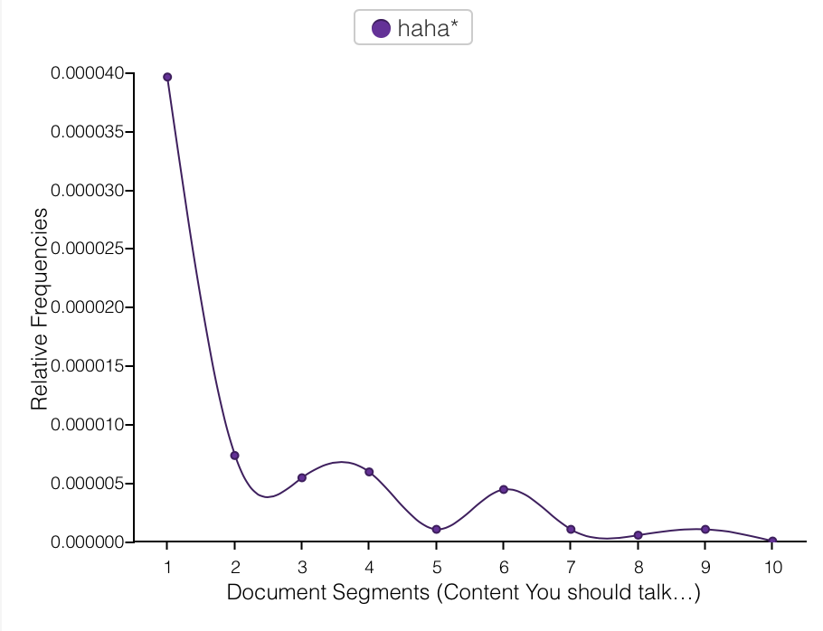
On the subject of “lol,” we have the lol/haha divide. Note the inverse relationship below: as “lol” usage increases, “haha” use decreases. (The two are best visualized on separate charts given that “lol” occurs more than 10 times as frequently as “haha” does.) I use “haha” when I don’t know people very well, for fear that they may feel, as I do, that people who say “lol” a lot are idiots. (“Lol” is the seventh most frequently used word in this corpus.) Once I have established if the person I’m texting also feels this way, i.e. if they use “lol,” I begin to use it or not use it accordingly. Despite this irrational and self-damning prejudice I have against “lol,” I use it all the time and find it to be one of the most helpful methods of connoting tone in text messages — much more so than “haha”, which may explain my preference for “lol”. “You are so late” and “You are so late lol” are completely different messages. But I’m getting away from the point… see “lol” and “haha” graphed below.

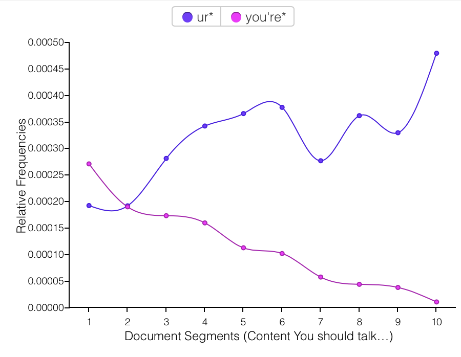
The replacement of “you” with “u,” however, I do not interpret as laziness, or as personal preference winning out, but as a form of ironical love language. At some point over the narrative span of this corpus, using “u” was introduced as a joke, because both of us were irked by people texting w/o putting any effort in2 their txts bc it makes it rly hard 2 read n doesnt even save u any time 2 write this way? And then it turned out it maybe does save a tiny bit of time to write “u” instead of “you,” and more importantly “u” began to mean something different in the context of our conversations. Every “u” was not just a shortcut or joke, but had, with humorous origins, entered our shared vocabulary as a now-legitimate convention of our communal language. Language formation in progress! “Ur” for “you’re” follows the same pattern.

With more time, I would like to evaluate language from each author in this corpus. It is co-written (52% from me, 48% to me) and each word is directly traceable back to one author. Do we write the same? Differently? Adopt the same conventions over time? My guess is that our language use converges over time, but I didn’t have time to answer that question for this project.

I began this text analysis feeling pretty disappointed with the data. But through the process of assigning meaning to some of the patterns I noticed, I have come to appreciate the data more. I also admit to myself that once I had the thought that text messaging– writing tiny updates about ourselves to others– is a modern epistolary form, I perhaps subconsciously expected it to follow in the footsteps of Evelina… which is an obviously ridiculous comparison to draw. Or for it to evoke to some extent the letters written between my grandparents and great-grandparents, which is a slightly less ridiculous expectation but one that was still by no means lived up to. Composing a letter is a world away from composing a text message. Editing vs. impulse. Text messages are “big data” in a way that letters will never be, regardless of the volume of a corpus.

Would it be fascinating or incredibly tedious to read through your grandparents’ text conversations? Probably a bit of both, satisfying in some ways and completely insufficient in others. It’s not a question that we can answer now, but let’s check again in fifty years.

A Tale of Two Train Lines (please forgive this egregious title)

I. Project background, map images, conclusions

I grew up mostly in Westchester, and viewed MetroNorth Railroad (MNR) as an escape route from the suburbs. I lived along the Harlem Line, which makes stops between Grand Central Terminal and the ambiguously-named Southeast. Less than 10% of trains each day also connect to a transfer at Southeast that runs further north, an 30 additional miles up to Wassaic in Dutchess County. My most-traveled path is from the town where my parents live to Grand Central, off peak. However, the more I’ve taken the train in recent years (particularly when I take a new combinations of stops to reach my students via public transport, or when I ride at an unusual time), the more I observe that the Harlem Line train serves, obviously, many more purposes than just my own. I guess it’s what I already had words for from Kevin Lynch’s mental maps, but each person’s map of the same geography will be different. 

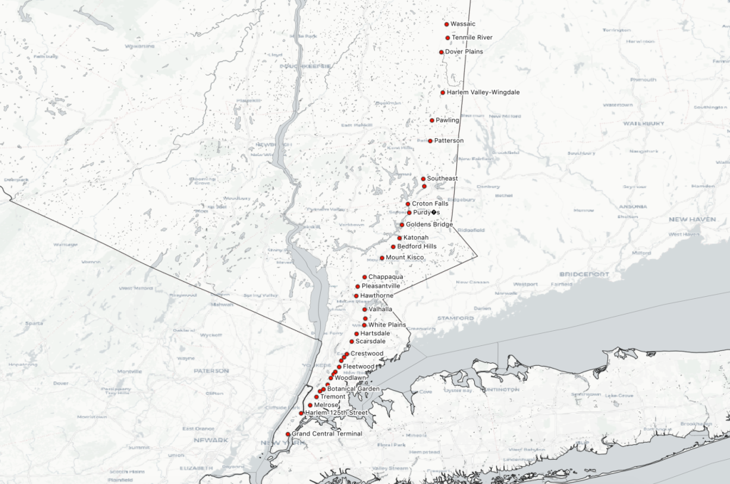
Harlem Line Metro North Stops

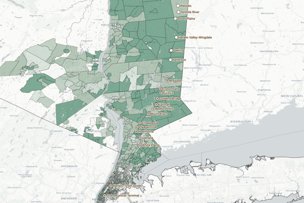
This particular project was motivated by a phrase I had heard used a couple times in reference to this train line: “the nanny train.” This is a blunt shorthand for the observed phenomenon of women of color riding from stations in affluent, majority-white towns in Northern Westchester (where they work) to stations further south that generally serve communities of color in the Bronx and Southern Westchester (where they live). The question that motivated this map was “Is there actually a ‘nanny train,’ and can I visualize its existence?”

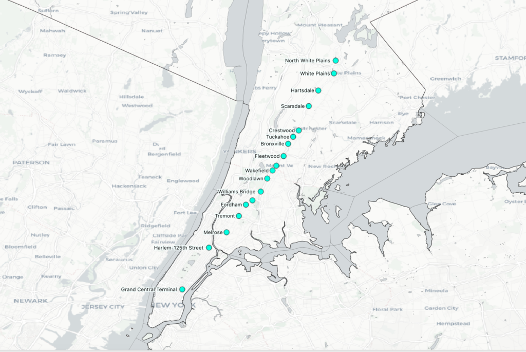
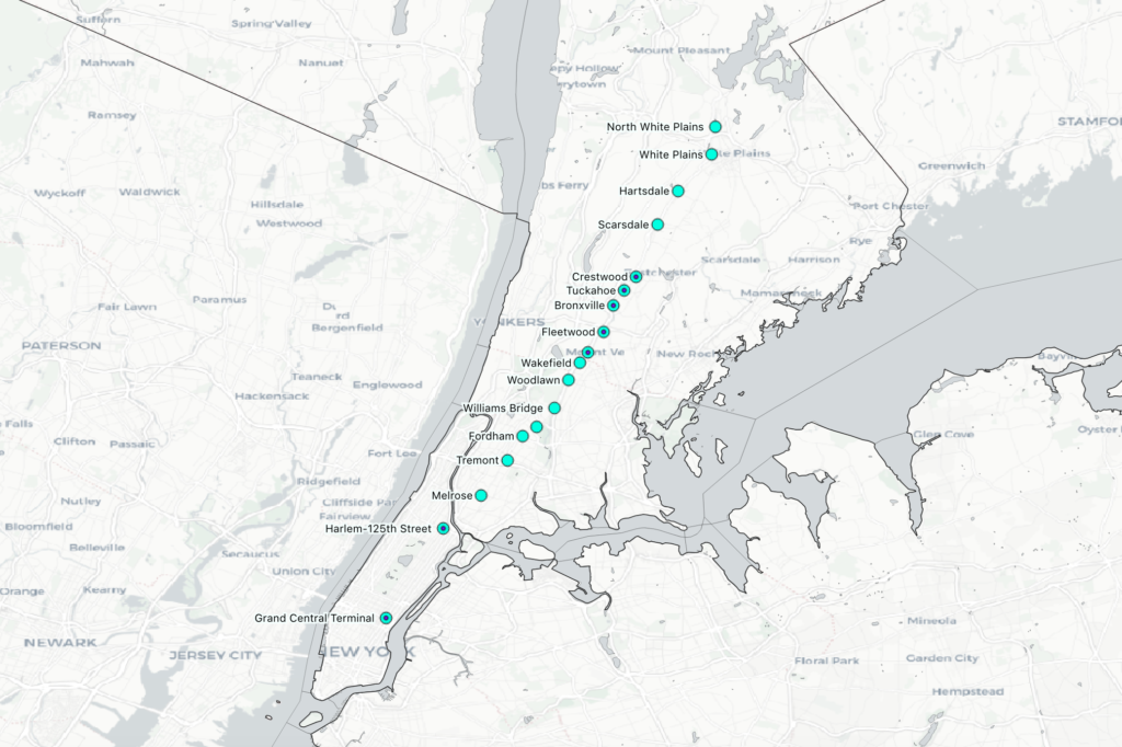
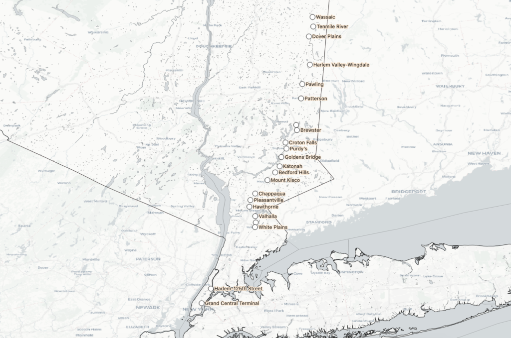
By and large, what I gleaned from scrutinizing the train schedule and counting up trips (not exhaustively, but carefully) is that Harlem Line trains make stops either south of White Plains and terminate at North White Plains (24 miles north of GCT), or begin making stops at White Plains and terminate at Southeast (53 miles north) or Wassaic (82 miles north). Out of 109 total trips per day to Grand Central (I did not include reverse trips in this map), 96 trips fell into one of these four patterns:

  1. Group 1: begin at North White Plains, make at least 5 stops (i.e. make local stops in the Bronx)
  2. Group 2: begin at Crestwood in Southern Westchester, make either 5 stops (express in peak hour) or 12 (all stops in the Bronx)
  3. Group 3: Start at Southeast, making all or most stops until either Chappaqua or White Plains, then run express through the Bronx
  4. Group 4: Start at Wassaic, and run express before reaching Southern Westchester
Group 1: from North White Plains to GCT, making local stops in the Bronx
Group 2: select stops from Crestwood, express during peak hours (overlaid on Group 1)
Group 4: from Wassaic to GCT, express at or before White Plains
Group 3: from Southeast to GCT, express from White Plains (overlaid on Group 4, from Wassaic)

The remaining 13 trains of the day generally make very specific, peak-hour stops. Sometimes they stop at only 3 or 4 stations total, and seem to be oriented towards moving people quickly into the city from specific high density areas along the whole line. I was surprised to see that there is actually no single train that makes every single stop — the closest is the 1:56am train from Grand Central to Southeast, which skips 2 stations in the Bronx (these areas are also served by MTA subway stations), and the 6 stops after Southeast (which are generally considered sort of an extension of the “regular” line). 

So, most trains make stops north of White Plains or south of it, but not both. Indeed, there are only two southbound trains to “bridge the gap” by making at least 4 stops in northern Westchester AND at least 4 stops in southern Westchester/the Bronx: the 8:14pm from Mt. Kisco, and the 11:21 from Wassaic, which makes many local stops and doesn’t arrive in Grand Central until 1:53am the next day. If there is such a thing as “the nanny train,” as the term seems to have been intended, it’s the 8:14 from Mt. Kisco. Otherwise, anyone commuting from Chappaqua to Woodlawn, for example, has to switch at White Plains from the “Northern Westchester Harlem Line” to the “Southern Westchester/Bronx Harlem Line.”

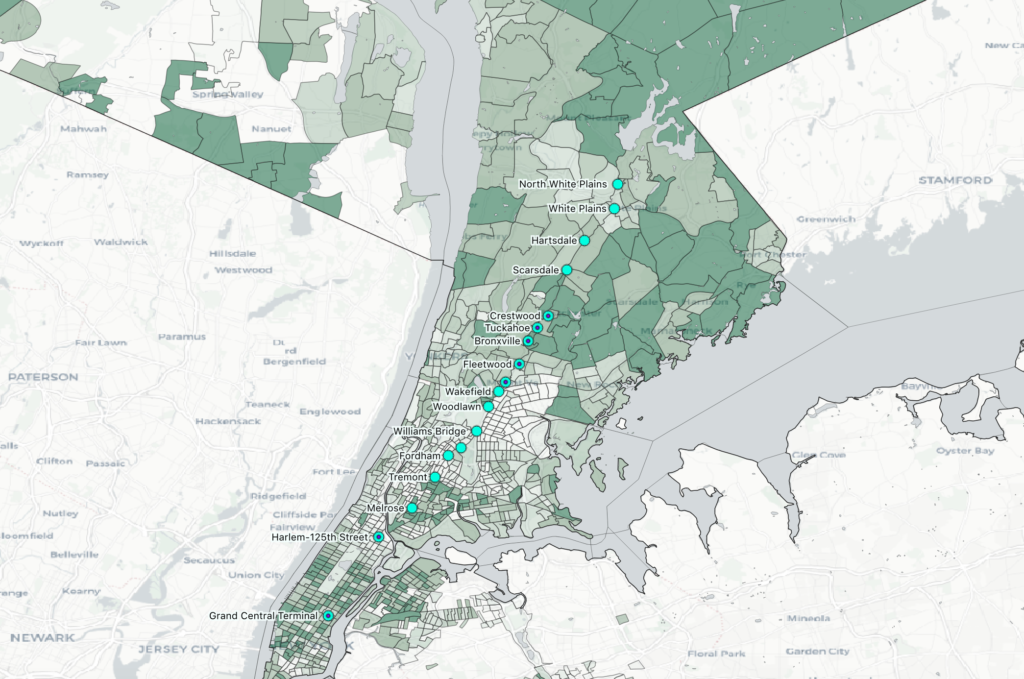
All groups, displaying “the two Harlem Lines” — note that GCT, Harlem 125th, White Plains, and North White Plains are stops in all 4 groups. I was unable to satisfyingly place these data points in QGIS so that all 4 were visualized at once, so they appear to be only part of groups 3 and 4.

In the end, I’m not very satisfied with my map. To say something meaningful about how train scheduling aligns or is at odds with the demographics of this train line would require a more nuanced visualization of race than just “percentage of white people per census tract,” which is what I have in the background now (see below). To a large degree, it only says what is already widely known: census tracts in northern Westchester generally have a higher percentage of white people than those in southern Westchester and the Bronx. On the train front, likewise, it’s already obvious that White Plains is a change-over station. This makes sense, since it’s about half the distance from GCT to Southeast and is the biggest municipality on the line outside of NYC. I guess I’m a little surprised at just how few trains stop in Northern AND Southern Westchester, but that’s about it in terms of breakthroughs on this map (and I got it mostly from the train schedule, rather than the map). 

I know it needs a legend! Groups 3&4, stopping mostly in census tracts with white populations of 70-100%.
Groups 1&2, stopping mostly in census tracts with white populations of 0-70%.

The process of making it was extremely enlightening, though. To have spent this many hours only to arrive at a lackluster conclusion and lackluster map is humbling, and helps me understand the pressure to produce results or give in to the temptation to say that our visualizations say what we desperately want them to say. I’m glad to be able to look at this project critically, without any need to make statements (or seek funding…) based on its conclusions. 

II. Method

I downloaded American Community Survey 2017 data from the American FactFinder website. I took data for New York, Bronx, Westchester, Putnam, and Dutchess counties, covering every county the Harlem Line MNR services. I took a pre-packaged “Race” dataset that gives a raw count breakdown of race in the generic [super limited] government categories: white, black or African American, American Indian and Alaska Native, Asian, Native Hawaiian and Other Pacific Islander. The raw counts are per census tract.

To display population counts with space factored in, I made the raw counts into percentages. I did this only for the white population, so the map shows the percentages of white and non-white people, with no option for a more specific racial breakdown. This would absolutely be possible based on my dataset, but added too much complexity for me on this project. 

I also downloaded a TIGER shapefile package for all census tracts in New York State. I joined this geographical file to my race data file from America FactFInder using the Join function in QGIS. This is done by linking two spreadsheets using a common column that puts the same, unique datapoint in each spreadsheet. This part of the process gave me the most trouble, as QGIS consistently read the same 11-digit number, the GEOid for each census tract, as a string of text in one file and an integer in the other. This seems like a fairly common problem, based on the information available on Stack Exchange and other forums. However, despite numerous attempts to troubleshoot this problem, I wasn’t able to fix it using any of the suggested methods. Instead, I eventually gave up on fixing the problem in QGIS and used Excel’s Text-to-Columns feature to modify my dataset and create a different, common, unique value. This was easily read as a string in QGIS and I was able to join my geography file to my data file.

My favorite part of the data-creation process was using latlong.net to record the point coordinates of all 36 stations on the Harlem Line of MNR. I literally just followed the train line up a digital map and clicked on each station to get its coordinates, then put these into a third spreadsheet. After spending so much time troubleshooting data types in QGIS (and with the problem still unresolved at this point), I took great pleasure in such a straightforward task that also allowed me to explore a bird’s-eye map I am very familiar with from a lived-experience standpoint. I eventually loaded this file into QGIS and was delighted to see every station appear on the map. 

Then came the data-creation that felt least scientific and most subject to my own bias and lived experience of this question. I spent many minutes examining the Harlem Line train schedule, trying alternately to pull patterns out and to just allow myself to absorb the schedule without consciously looking for patterns. Once I had counted up and figured out some parameters that seemed reasonable (very much capta, not data), I made each of these groups a layer on my map. 

I added labels, fussed endlessly with all the colors and was never satisfied, read about color theory and looked up pre-made ColorBrewer packages, still hated my map and finally called it a day and wrote this blog post. Then I went back and fussed some more after dinner, adding hydrology shapefiles from the state of New York to make my coastline cover the dangling edges of census tracts, and color matching the new water to the underlying knock-off ESRI basemap. And now I’m grudgingly saying goodbye (for now??) to this project at 3 o’clock in the morning so that I can go to sleep and not wake up to it.

Reflection on the Python Workshop

I attended the Python workshop on Wednesday night. Although I have spent probably about 200 hours coding in the last 5 years, this was the first time since 2013 that I have received in-person instruction in a coding language. I had never reflected on how self-directed and self-taught my coding experience has been thus far, and I find that one of my biggest takeaways from the Python workshop is a sense of empowerment about my own ability to teach myself to use code. (Not “code,” but “use code,” probably a similar distinction to Micki’s “I am a hacker, not a coder.”) I’d say I was already comfortable with about 90% of the material covered, but dang, has that 10% filled my brain for the last 28 hours.

I was first exposed to coding in my first year of college, when I took a course called “Data Driven Societies” to fulfill a math requirement. We learned Excel and some basic R to perform statistical analysis and make charts in ggplot2. Since then, I have learned R on and off exclusively through applied projects: an independent study (with a non-coding History professor), a summer internship (for a non-coding boss), an honors project (with a non-coding English professor), and a couple personal projects. It’s not until right now that I recognize that 1. I have done a lot on my own and am proud to feel the results of that work, and 2. It feels SO good to learn from a real person and to know that the troubleshooting sessions in my near future can involve more than just me searching in Stack Exchange. I am excited to reach out, and to embrace this physical, interpersonal aspect of coding that I haven’t connected with in years. Hooray for analog help on digital questions!

On that note, everyone in the workshop was given a pink and a green post-it to signal “I’ve completed the latest task” or “wait, I need help.” This not only gave an easy, non-verbal way to ask for help or more time, but also made it physically clear that each and every person in the workshop had the right and the means to do so. I like that this expectation was set so concretely, and think it helped make for a workshop with a pace and style that would feel accessible even to someone who considers themselves an absolute beginner. 

Re: Shani’s allusion to my analog solution — Rafa wanted to use the blackboard behind the projector screen, but without turning off the projector there was no apparent way to turn off/down the projected image. So I got up and put my pink post-it over the projector lens, and cut the image off at the analog level, rather than the digital. Which, along with the unexpected joy of being taught Python in a human voice, has now gotten me thinking about how I love analog and digital best when they work together. I love reading about coding projects on printed pages, and also experiencing those projects online. And I love iterating between the two myself: my hand and my consciousness feel resonant when I underline and annotate with a pen, and then again when I turn my fingers to my keyboard to compose new thoughts on a screen. I learn best when I have both. I’m very grateful for this workshop’s simple but profound reminder that and code help, along with code, comes from humans, and it takes only a little bit of effort for me to get myself into the same room as those humans and talk in more than ones and zeros. 

DH as disruptive innovation // outgrowing old definitions

One “defining DH” theme I heard in yesterday’s discussion was the challenge of finding balance in a definition of Digital Humanities — one that both leaves the door open to the new voices/perspectives/innovations that are essential to DH’s identity as a disruptive field and is exacting enough to actually define a meaningful scope and field of work. To some extent, this challenge reflects the growing pains of a brand new field that has outgrown the parameters of its original definitions; DH has reached a sort of adolescence that allows for the helpful narrowing scope of projects like the Digital Black Atlantic, whose mission and raison d’être do not reflect the same for DH as a whole. DH may have started with some illusion of a common thread based simply on a digital component, but by now the field seems too large for “the field” to be a universally meaningful grouping of scholars, projects, and aspirations.

But “growing pains” do not describe the full extent of the difficulty in defining DH. DH is not just a brand new field, but, to borrow a phrase from my [scant] economics knowledge, a disruptive innovation. From Wikipedia, “an innovation that creates a new market and value network and eventually disrupts an existing market and value network, displacing established market-leading firms, products, and alliances.” Much of yesterday’s discussion focused on the phenomenon and process of DH carving out a space for itself: justifying its own existence, determining to whom and for whom it produces knowledge and content, and grappling with the ethics of being an intensely public and publicly-relevant source. It is disruption, more than newness, that makes DH difficult to pin down. 

In (again) attempting a definition of DH, and now reflecting on yesterday’s conversation, I’m finding the idea of an “existing market and value network” helpful. It speaks to not only the physical aspects and processes of traditional scholarship (physical archive and research spaces/resources, anonymous and lengthy peer review, dominance of the Global North) but the way that scholarly values are continually reproduced and reified through the interactions of scholars (anonymous peer review structures, a “stately pace” for knowledge production, emphasis on seniority even in the face of digital worlds being created by teenagers). DH directly challenges the “existing market” structures through several of the sources we read and viewed last week: digital archive access (ECDA), changes in peer review processes (DDH intro 2012, Digital Black Atlantic intro), the ability to initiate a new canon (Digital Black Atlantic intro), and projects, sometimes techno-minimalist, that can be started and worked on outside of the historic sites of academic production (Create Caribbean). It also challenges the “value network” by promoting collaboration over ownership (DDH review, to some extent, and others I think I’m missing), applicability over theory (Separados), public relevance/activism over neutrality/objectivity (Separados), and speed/connection over slower academic processes (scholarly debates on Twitter, whether traditional academics approve or not). 

So I probably couldn’t get that all out in an elevator pitch next time someone asks me what I’m doing with my life, but if we’re going more than 3 floors together, I’ll probably bring up the word disruptive.