Author Archives: Zara Ali

Rap albums, sorted by the size of their vocabulary.


A few years ago, I came across Matt Daniels’ study on rappers, ranked by the size of their vocabulary. The study regularly is updated throughout the years, to take into account of newer artists, or new albums artists have released. Being a fan of this visual essay, along with being a fan of modern rap, I wanted to center my praxis assignment as a smaller-scale version of the study: the top five rap albums of the past year, sorted by the size of their vocabulary. 

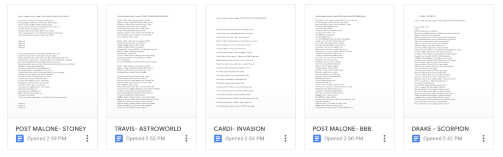
I decided to visit Billboard to choose the top five albums. Although we are approaching the end of 2019, the franchise did not scale rap albums for the year. I looked to 2018’s top rap albums, which (in order) are Drake’s Scorpion, Post Malone’s beerbongs & bentleys, Cardi B’s Invasion of Privacy, Travis Scott’s Astroworld, and Post Malone’s other album, Stoney. To locate lyrics, I chose Genius. Unlike other lyric sites like Metrolyrics or AZlyrics, many artists directly contribute their lyrics to this site. Additionally, the site also serves as a community, in which both artists and listeners can select verses from lyrics and annotate and interpret rappers’ play on words, disses to other artists, and their overall, unique rhetoric. 

I decided to use Voyant, as I wanted to document each album’s number count of unique words, a term used in the original study– in which multiple presentations of the same word is counted once. Admittedly, I had to blush once I had uploaded the lyrics to one song–to find expletive words profoundly appear on Voyant’s cirrus. To make the assignment appropriate, I have ranked the same five albums, based on its unique word forms, with its corresponding album covers. 

Scorpion, Drake

10,095 total words

1,745 unique word forms

25 Tracks

Invasion of Privacy, Cardi B

7,727 total words

1,418 unique word forms

13 Tracks

ASTROWORLD, Travis Scott

5,710 total words

1,244 unique word forms

17 Tracks

beerbongs & bentleys, Post Malone

8,707 total words

1,178 unique word forms

18 Tracks

Stoney, Post Malone

6,814 total words

983 unique word forms

14 Tracks

Initially, I was excited to drop Genius URLs directly into Voyant’s field box and quickly collect data. However, I soon realized Voyant collected all text from the site– including the site’s header, breaking text such as [Chorus], [Verse 1], [Bridge],  usernames on the side, annotations and supplemental articles listed to the side of the lyrics. To create a more accurate word count, I created a Google document for each album, and copied and pasted the lyrics directly there. Doing so also helped with slimming down the text, as there were many featured artists and sampled artists that I did not want to inflate the primary artists’ unique word count. I then selected the entire text of each document into Voyant, and I immediately collected the unique word count of each album. Overall, Voyant was a straightforward guide for this assignment, but my learning lesson here was the importance of organizing the data first, as it was tempting to drop the links to each lyric on the field box, but only to collect inaccurate word counts.

Looking back now, I would have liked to explore this same project in my own form of a data visualization. Granted, many of the lyrics are inappropriate to discuss in an academic setting, and I am a bit embarrassed to share the Voyant links of my album documents, but there are other ways to present data.

I strongly appreciate Daniels’ visualizations for his essay, in which he presents an image of the rapper, and from the motion of the cursor, viewers can discover each of their metrics. I plan to render a a data set similar to this, one day.


Mapping Local Businesses in Brooklyn

Coming down from a summer filled with local events and good eats, as well as being a proud Brooklynite, I couldn’t help but focus my mapping project on nearby food spots in my borough. Particularly, my map is a visual marking of Black-owned bars and restaurants in my borough. I came across Genese Jamilah’s article list, “Black Owned Restaurants and Bars in New York City and Brooklyn.” There, I extracted Brooklyn based businesses and pinned them on ArcGIS Story Maps. With zero familiarity with ArcGIS, I opted to explore a site cost-friendly and user-friendly. After figuring out gestures–such as dragging mistakes to the trash bin, marking an area with a diamond cursor to create a text box, I gradually grew comfortable with using ArcGIS for a linear map.

While pinning a business, I had access to provide a description of the place, along with a hyperlink to their websites or contact information, and even provide a picture. It can be seen that I attempted to provide an image of the restaurant Amarachi. However, ArcGIS does not provide a function in which users can drag the image to scale. It can be seen that the restaurant sign is partially cut off.

Image cutoff seen above.

Besides the procedural, this assignment led more personal inquiry on the topic. As I was mapping these businesses, I quickly realized the error in that I was mapping from a singular source. Jamilah’s article has many bars and restaurants users may find elsewhere, and more. These businesses all have websites, or Facebook, or Yelp. However, any Flatbush native can assert Jamaican-Guyanese restaurant, McBeans, or Peppa’s Jerk Chicken should be added to the map as well. Another error worth pointing out is that a few internet searches may not provide a comprehensive list, as there is a probability some establishments do not have an online existence.

Another personal inquiry while mapping was the non-existence of black-owned bars and restaurants to the left of Flatbush Avenue. Granted, although it was asserted before the businesses were listed from a single article, along with the knowledge that there may be a probable chance businesses are not present online, I could not help but obsess over the missing marking of black Brooklyn to the left.

Overall, ArcGIS Story Maps is a source I could rely on again for linear maps, and possibly integrate in a K-12 classroom on local history and businesses.

Link: https://storymaps.arcgis.com/stories/2517486f82ec45058e41db67abdb5b88

How would DH be defined (or outlined)?

My Intro to Digital Humanities

My apologies for the uber late submission!  

Prior to the first day of class, my definition of DH was a short statement— an interdisciplinary field which merges computational methods in pedagogy and research. Of course, my statement was further explored after reading “How Do We Do Things with Words: Analyzing Text as Social and Cultural Data.” The exploration of DH was outlined as follows: identify research questions, proceed with data selection, conceptualization, and operationalization. Then, ends with analysis and interpretation. Though not an assigned reading, but text I stumbled upon, I find this breakdown applicable to my quest to further comprehend DH. 

Torn Apart/Separados, a powerful visual study, could be interpreted with this breakdown. Research questions that may have probably been asked were, “How can we engage and inform internet users about an ongoing geopolitical crisis? What information can we provide? How can scholarly journals/works receive a visual renovation? How, in the form of visual research, provide a solution?” Other questions might also be those Matt Gold asked in The Digital Humanities Movement, Debates in the Digital Humanities (2012) — “Does media studies leave off and digital humanities begin? …Can it save the humanities?” Selected data seen are state and district’s financial contributions to ICE, but to counteract, a list of organizations which support undocumented immigrants. Much more data can be found when exploring the site. Under “Reflections” tab, it was made a point that a small group of historians, activists, artists and writers supplemented the site with writings of their own. More context was added to generate discussion of the crisis. Under the “Credits” tab, these two sentences instantly grabbed my attention: “Torn Apart is a part of our Mobilized Humanities interventions. Mobilized Humanities brings together digital tools to equip broad social awareness and help in a global critical situation.” This explanation of “Mobilized Humanities” both aligned with my original definition of DH, as well as provide a concrete conceptualization of the project as a whole. To reflect, the operationalization of the study was one I have not seen before– an interactive map which information will spill at just a swipe of your cursor. My interpretation of the site was that it empowered viewers to be resources of their own. The “Allies” tab alone gave me the sense of empowerment of possessing useful information in this critical geopolitcal crisis.  

I want to revisit my definition of DH at the end of the semester, as I explore more outlines, similar to the one I mentioned above, to more coursework, to create a collective definition.

In case my hyperlink does not work, here is the direct link to the text I mentioned above: https://arxiv.org/pdf/1907.01468.pdf